CSS basics
For this chapter, we won’t be using our Simple.css site. We’ll be writing our own styles, and for that, I want to use a simpler page. You can apply what you learn here to your Simple site. But for this chapter, I want to show you how to start from scratch to make a nice webpage.
We’ll look specifically at styling typographic elements to make a pleasant, readable webpage. But CSS can do much, much more. All of the sophisticated designs you are used to seeing on pages across the web are done with CSS. It is a potent tool. If this chapter gives you a taste for it, I encourage you to explore CSS beyond what we cover here.
Introducing the planets of the solar system
I put together this straightforward HTML page that uses a handful of typographic elements and presents a good starting point for applying styles. You can use any content you want if you have something in mind. But you are also welcome to use the same HTML page I will use.
You can see the source code either in your browser with the view source command or by checking out the code on GitHub. And you can see the end result here if you want a sneak peek of what it’ll look like.
This page introduces the planets in the solar system and gives a little information about each one. It is super simple and basic on purpose. It is placeholder text I don’t intend for anyone to read seriously (but the information is accurate to the best of my knowledge).
Starting point
I made an index.html and put the following code in there. It assumes that you have a styles.css in the same directory. It also assumes you have an image, PIA06193~large.jpg, in the same directory. You can get this image from NASA’s website.
Expand to see the full HTML code
<!DOCTYPE html>
<html lang="en">
  <head>
    <meta charset="UTF-8">
    <title>Planets of the Solar System</title>
    <link rel="stylesheet" href="styles.css">
  </head>
  <body>
    <main>
      <h1>Planets of the Solar System</h1>

      <p class="intro"><span class="caps">Our solar system</span> is a vast and fascinating place, consisting of the Sun and the various celestial bodies that orbit it, including eight major planets. Each planet offers unique characteristics and features. In this article, we will explore the distinctive attributes of each planet, providing an overview of what makes them unique (and learn a little <abbr title="Cascading style sheets">CSS</abbr> while doing it).</p>

      <h2>Mercury</h2>
      <p>
        Mercury is the closest planet to the Sun and the smallest planet in our
        solar system. It has a very thin atmosphere and its surface is covered
        with craters.
      </p>

      <h2>Venus</h2>
      <p>
        Venus is the second planet from the Sun and is known for its thick,
        toxic atmosphere and extreme surface temperatures. It's often called
        Earth's "sister planet" because of their similar size and composition.
      </p>

      <h2>Earth</h2>
      <p>
        Earth is the third planet from the Sun and the only known planet to
        support life. It has a diverse climate and surface, with large bodies of
        water, mountains, and forests.
      </p>
      <blockquote>
        <p>
          The Earth is a very small stage in a vast cosmic arena. Think of the
          rivers of blood spilled by all those generals and emperors so that in
          glory and triumph they could become the momentary masters of a
          fraction of a dot.
        </p>
        <cite>— Carl Sagan</cite>
      </blockquote>

      <h2>Mars</h2>
      <p>
        Mars, the fourth planet from the Sun, is often called the "Red Planet"
        due to its reddish appearance. It has the largest volcano and canyon in
        the solar system.
      </p>

      <h2>Jupiter</h2>
      <p>
        Jupiter is the fifth planet from the Sun and the largest in the solar
        system. It has a Great Red Spot, which is a giant storm, and dozens of
        moons.
      </p>

      <h2>Saturn</h2>
      <p>
        Saturn, the sixth planet from the Sun, is famous for its extensive ring
        system. It's the second-largest planet in the solar system.
      </p>

      <figure>
        <img src="PIA06193~large.jpg" alt="This grand mosaic consists of 126 images acquired in a tile-like fashion, covering one end of Saturn's rings to the other and the entire planet in between.">

        <figcaption>
          Source: <a href="https://images.nasa.gov/details/PIA11141">https://images.nasa.gov/details/PIA11141</a>
        </figcaption>
      </figure>

      <h2>Uranus</h2>
      <p>
        Uranus is the seventh planet from the Sun and has a unique blue-green
        color due to methane in its atmosphere. It rotates on its side, making
        it unique among the planets.
      </p>

      <h2>Neptune</h2>
      <p>
        Neptune is the eighth and farthest known planet from the Sun in our
        solar system. It's known for its deep blue color and strong winds, some
        of the fastest in the solar system.
      </p>

      <h2>Additional Resources</h2>
      <p>
        For more information about the planets, visit the
        <a href="https://solarsystem.nasa.gov/planets/overview/"
          >NASA Solar System Exploration</a
        >
        website.
      </p>

      <h2>Other Major Bodies</h2>
      <ul>
        <li>Pluto</li>
        <li>Ceres</li>
        <li>Haumea</li>
        <li>Makemake</li>
        <li>Eris</li>
        <li>Ganymede</li>
        <li>Titan</li>
        <li>Europa</li>
      </ul>

      <h2>Sample Code</h2>
      <pre><code>function getPlanetInfo(planet) {
    const planets = {
        Mercury: 'The smallest planet and closest to the Sun.',
        Venus: 'Known for its thick, toxic atmosphere.',
        Earth: 'The only planet known to support life.',
        Mars: 'The Red Planet with the largest volcano.',
        Jupiter: 'The largest planet with a Great Red Spot.',
        Saturn: 'Famous for its ring system.',
        Uranus: 'Unique for its sideways rotation.',
        Neptune: 'Known for its deep blue color and strong winds.'
    };
    return planets[planet] || 'Planet not found';

}</code></pre>
</main>

    <footer>
      <p>
        A demo website for learning CSS. Part of <a href="https://htmlforpeople.com/">HTML for People</a> by <a href="https://blakewatson.com/">Blake Watson</a>. Check out the <a href="https://github.com/blakewatson/css-basics">source code on GitHub</a>.
      </p>

  </body>
</html>
Since the styles.css file is empty, we get only the browser default styles. This is what it looks like:
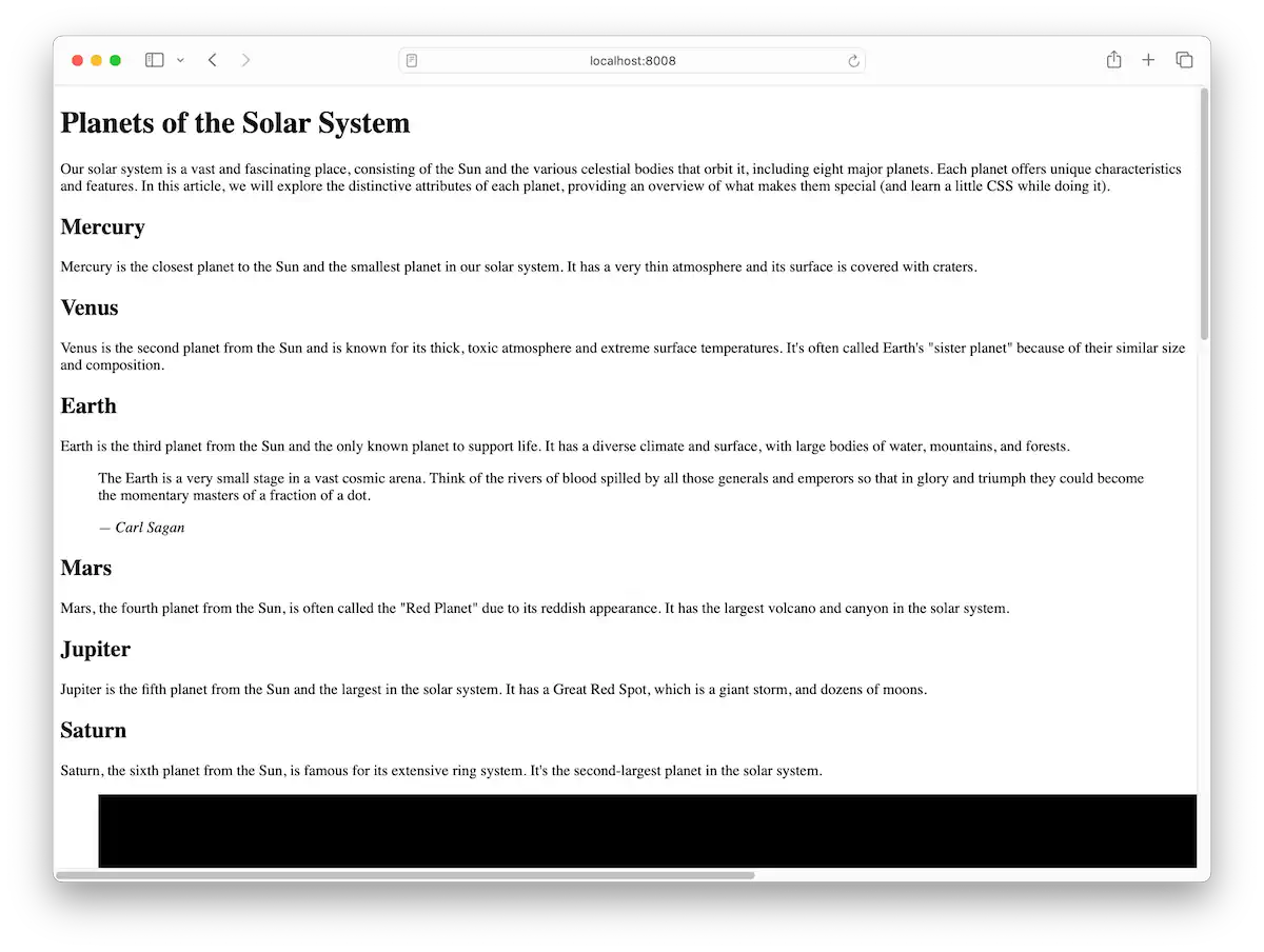
Good ol’ Times New Roman and lines of text that run the entire width of the browser window. It doesn’t look great, but there’s something nice and quaint about it. And, crucially, it’s not broken. Many sites are overdone with gratuitous designs, megabytes of images and JavaScript, and user-hostile behaviors (you know, like, “I see you’ve only read two sentences of this article, but I just know you must be dying to subscribe to my newsletter so let me just show you this here giant pop-up.”).
So we’re going to fancy ourselves web doctors of a sort. First, we will do no harm. We’ll improve the page’s readability and make it pretty (well, what I think is pretty, anyway—feel free to diverge and add your own styles as we go). But we’ll refrain from doing anything so drastic that it makes the page harder to read than it is right now.
The style tag
We can write CSS directly in our index.html file using a special HTML tag, <style>. We can put the <style> tag inside of the <head> section of our file. Like this:
<!DOCTYPE html>
<html>
  <head>
    <title>My website</title>
    <meta charset="utf-8">

    <style>
      CSS code goes here
    </style>
  </head>

  <body>
    ...
  </body>
</html>
This is perfectly valid, but if you have more than one page on your website, you would have to copy and paste your <style> tag onto each page to have the same styles on every page. Instead, it’s common to put all your CSS in a separate file and then link that file to every page with a <link> tag in your website’s <head> section.
<link rel="stylesheet" href="styles.css">First steps to improving the page
If you haven’t already, create a style.css file. This is where we’ll write all our custom CSS. If you’re not using my starting HTML code, you’ll need to add the <link> tag to your page’s <head> section to hook up your styles to the page, as described above.
We can immediately achieve some big wins with only a few lines of CSS. For example, one problem is that the page is too wide on a desktop browser window. Long lines of text are hard to read. Let’s fix it by giving the page a maximum width. According to Butterick’s Practical Typography, we should be able to fit between two and three alphabets on one line. I’m going to make it 65 characters wide.
main {
  max-width: 65ch;
}
This CSS rule targets the <main> element on our page and instructs it to never exceed our stated width.
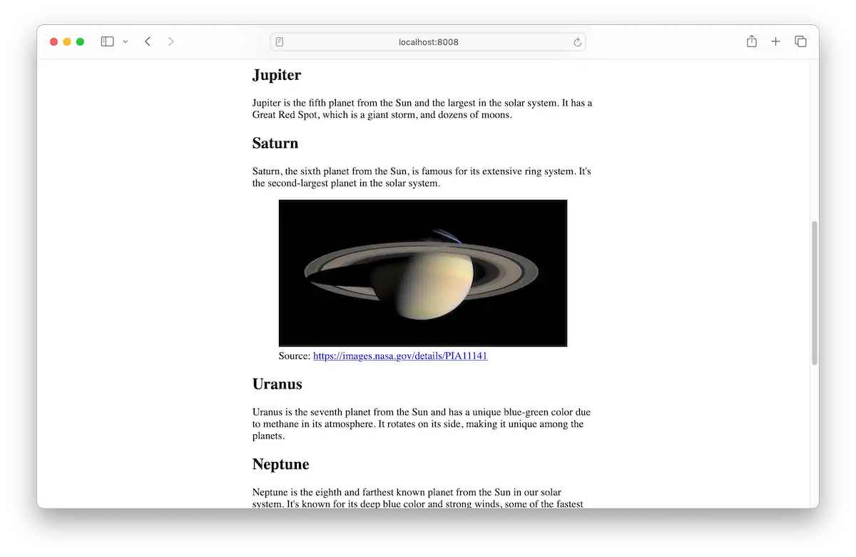
Ignoring the giant image of Saturn—which we’ll deal with in a bit—it looks much better already. But modern sensibilities prefer a centered page, so let’s do that while we’re here.
main {
  margin-inline: auto;
  max-width: 65ch;
}
In left-to-right languages like English, margin-inline is the horizontal, or left and right, margin. By setting it to auto, we’re saying, “I don’t care how wide the left and right margin is, just make it equal.” The browser knows how wide we want the page, so it will calculate the margin needed to make it equal on both sides, centering the page.
We also have a <footer> element that lives outside the <main> element, so we’ll style it separately with the same width and margin.
footer {
  margin-inline: auto;
  max-width: 65ch;
}
And to round off this line of thinking, let’s prevent the image of Saturn from bursting out of the page.
img {
  max-width: 100%;
}
The max-width can be stated as a percentage of its containing element. Setting it to 100% means, “Don’t let image elements go wider than their containers.”
And now our page is looking much nicer.
Anatomy of a CSS rule
Take a look at one of our rules so far. This rule limits the width of images to the width of their containers.
img {
  max-width: 100%;
}
What’s going on here is a sort of two-part thing. First, we specify what elements on the page we want to affect. That’s the part before the squiggly brackets ({}). It’s called the selector because it selects elements on the page to change.
The part inside the brackets is where we put the properties we want to change. Each declaration consists of a property and a value. In this case, there’s one declaration. The property is max-width, and the value is 100%.
Text size, line height, and spacing between elements
The default font size is a little small. I’ll target the html element (i.e., the entire document) and set the font-size and line-height.
html {
  font-size: 20px;
  line-height: 1.45;
}
One of the units we can use for sizing things is the pixel unit, px. I’m just now learning that 1px equals 1/96th of an inch (although that varies with the display’s pixel density). Huh. You never stop learning.
There are all kinds of ways to set the size of text. We’ll see some more ways in a bit.
I’ll set the line-height using a unitless value of 1.45. This is a number that looks good. Consult Butterick’s Practical Typography and your own eye to find a good line height for your specific font. I’m using a unitless number instead of something like px because of how child elements will inherit the value, but you don’t need to worry too much about that right now.
Moving on, I’d like to ensure elements have equal spacing between them. I will target everything inside the <main> element using a universal selector, the asterisk (*).
main * {
  margin-block-start: 0;
  margin-block-end: 1rem;
  /* or we could use the shortcut syntax like this */
  margin-block: 0 1rem;
}
A selector can be a chain of things. For example, main p selects every <p> element inside the <main> element. But I want to target everything in the <main> element, so I use the asterisk.
I’m setting the margin above and below every element. Similar to margin-inline, which controls horizontal space around elements, margin-block controls the vertical space around elements (in left-to-right languages). I’m setting the margin above elements to 0 and the margin below them to 1rem. The rem is a unit equal to the font size of the root element (the <html> element). Since I set the root font size at 20px, that’s what the value of 1rem becomes.
The cool thing about the rem unit is that, by allowing us to base values off the document’s font size, it makes our designs feel more cohesive.
Our text looks nice.
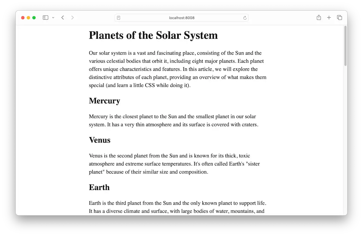
Nothing against Times New Roman, but it’s very… default looking. We can do better.
Installing webfonts
You can only use a font if your visitors have it available on their devices. While there are some common system fonts and common default fonts, we have another option for customizing the font. Web fonts are those that are made available by being downloaded with the rest of your website. In addition to the document, CSS files, JavaScript files, images, and so on, custom fonts can also be downloaded.
Web fonts need to be in a specific format, and installed a certain way, for lack of a better term. Typically, people will use a service like Google Fonts (free) or Adobe Fonts (paid). There are a lot of options, including hosting the fonts on your own server next to your other website files. Just ensure that your font license covers it.
For simplicity, we’ll use a couple of fonts from Google Fonts. Head over to fonts.google.com. Search for “Oswald” and select it from the results. Then click Get Font.
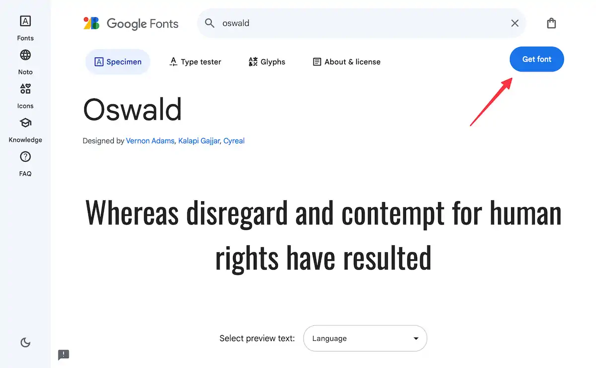
After selecting it, don’t download anything yet. Do a search for “source sans.” Source Sans 3 is the available version at the time of this writing. Select it and click Get Font.
Once you have both fonts selected, click Get embed code. We’re looking for the block labeled Embed code in the <head> of your html.
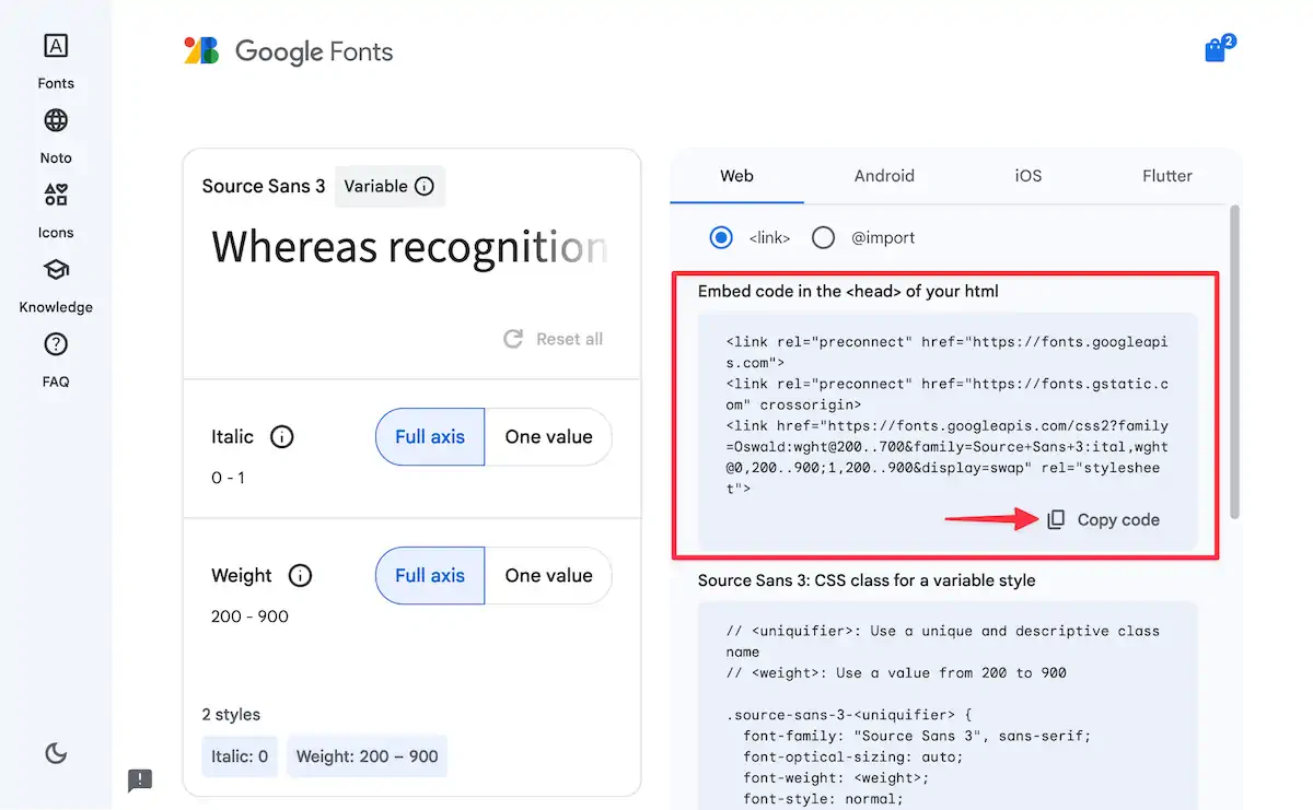
Copy and paste the embed code into your website’s <head> section.
<head>
  <meta charset="UTF-8">
  <title>Planets of the Solar System</title>

  <link rel="preconnect" href="https://fonts.googleapis.com">
  <link rel="preconnect" href="https://fonts.gstatic.com" crossorigin>
  <link href="https://fonts.googleapis.com/css2?family=Oswald:[email protected]&family=Source+Sans+3:ital,wght@0,200..900;1,200..900&display=swap" rel="stylesheet">

  <link rel="stylesheet" href="styles.css">
</head>
Add a font-family declaration to the html block to check that it’s working.
html {
  font-family: 'Source Sans 3', sans-serif;
  font-size: 20px;
  line-height: 1.45;
}
This will set the font for the whole document. The browser will first try Source Sans 3. If, for some reason, that font isn’t available (if, say, Google Fonts is down), then sans-serif will instruct the browser to use whatever sans-serif font is available. You can put other fallback fonts in the font stack. Just separate them with commas, as you see above.
Refresh the page, and you should see the new font! But let’s do a better setup and properly integrate both fonts.
Setting up colors and variables
If you read the Customizing Simple.css chapter, you’ll remember it used CSS variables to control color and fonts. We’ll do that here too. This will make it easier to customize things later (which you may want to do if you don’t like my choices).
:root {
  --text-color: #303036;
  --muted-text-color: #5e5e67;
  --heading-color: #cd2807;
  --link-color: #028090;
  --background-color: #fffdf7;

  --heading-font: 'Oswald', sans-serif;
  --body-font: 'Source Sans 3', sans-serif;
}
You can name variables whatever you want so long as they start with a --. Here, I’m setting up several colors and a couple of fonts.
Once I have defined these variables, I can use them to apply my fonts and color to the text.
html {
  font-family: var(--body-font);
  font-size: 20px;
  line-height: 1.45;
  color: var(--text-color);
  background-color: var(--background-color);
}
Use the var function to use the variables we created.
Heading styles
I’m using an <h1> for the page title and <h2> elements for the sub-headings. Let’s target those and apply some styles.
h1 {
  border-block-start: 10px solid var(--heading-color);
  margin-block-start: 4rem;
  margin-block-end: 2rem;
  font-family: var(--heading-font);
  font-weight: normal;
}

h2 {
  margin-block-start: 1.5rem;
  margin-block-end: 0.5rem;
  font-family: var(--heading-font);
  font-size: 1.2em;
  font-weight: normal;
  color: var(--heading-color);
}
I’m doing several things here. I’m adding a little extra margin above <h2> elements and a good bit of extra space above the <h1>.
I like how Oswald—the font I’m using for headings—looks without bolding. So I’m setting font-weight to normal rather than bold, which is the default for headings.
For the <h1>, I’m keeping the default font-size. For the <h2>, I’m setting the font-size to 1.2em, which is to say 1.2 times the current font size.
A handful of typographic changes transformed our page, and it has an entirely different feel.
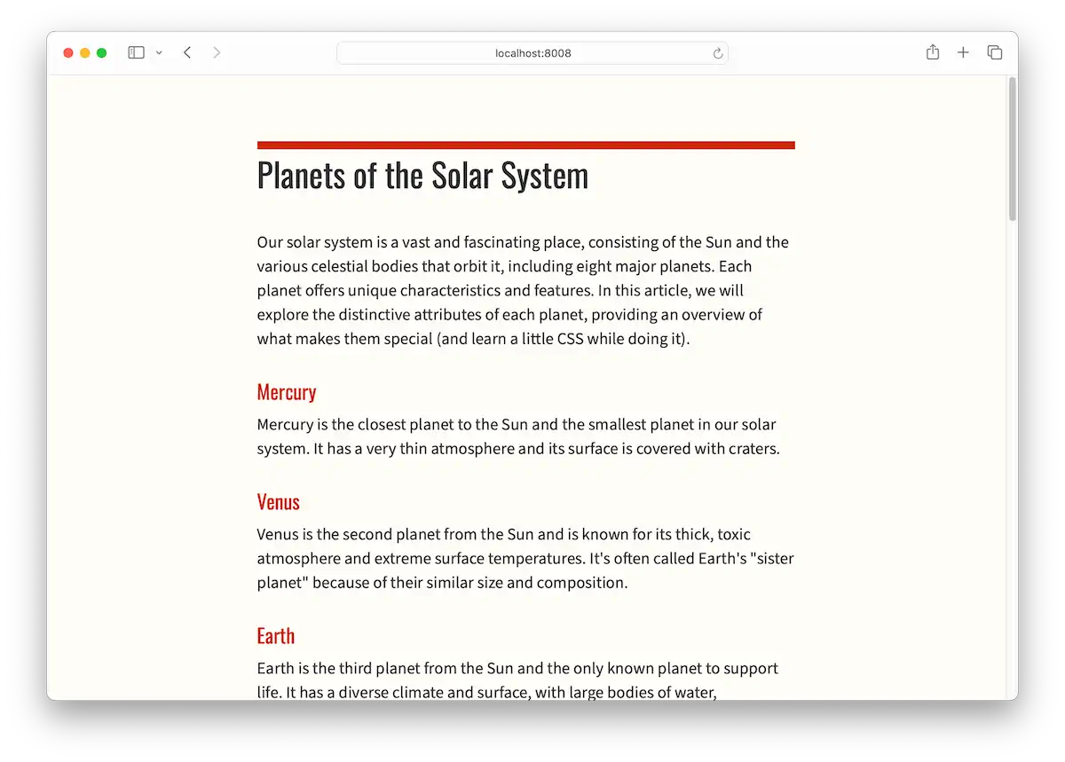
We could almost stop here. There’s nothing too terrible going on. But let’s style some of the elements we’ve not covered yet.
Links
If you’re using my HTML document, you’ll notice a handful of hyperlinks or <a> tags. One links to the source of the Saturn image I used, and the other to the NASA Solar System Exploration website. The rest are in the site footer.
Let’s style these a bit. I’ve chosen a blue-green color and set it as a variable, which we saw earlier.
:root {
  /* ... other code ... */

  --link-color: #028090;

  /* ... other code ... */
}
I’ll use that to set the color of all <a> elements, like so:
a {
  color: var(--link-color);
}
It’s not a hard rule, but most people correlate blue underlined text as a clickable link. I’ve decided not to stray too far from that. But I would like to add a little effect where the underline disappears when I hover over it.
We’ll use the :hover pseudo-class selector to set that up. These are typically used for styling elements in different states—for example, a text input that is disabled (:disabled) or, in our case, a link that is being hovered over by a mouse pointer.
a:hover {
  text-decoration: none;
}
The property we want is text-decoration. By default, links have a text-decoration of underline. You have a few options here, but I’m going with none.
This gives us a subtle visual interaction with the link.
Abbreviations
On the subject of hover effects, there is one that you may not have noticed. If you look at the HTML in the first paragraph, you’ll find the following sentence.
In this article, we will explore the distinctive attributes of each planet,
providing an overview of what makes them unique (and learn a little
<abbr title="Cascading style sheets">CSS</abbr> while doing it).
The <abbr> tag helps visitors know what certain abbreviations or acronyms stand for. When you hover the term, CSS, in the document, you’ll get a helpful tooltip showing what it stands for. You put the abbreviation inside the tags, then use the title attribute for the full text.
Let’s give it some text-decoration to hint that visitors can interact with it.
abbr {
  text-decoration: underline;
  text-decoration-style: dotted;
  text-decoration-color: var(--heading-color);
  text-decoration-thickness: 2px;
}
We’re giving it an underline like links have by default. But we’ll make it the red color we’re using for headings and use the dotted style to help differentiate it from a link. I decided to increase the thickness a bit, too, to make it easier to see.
Blockquotes
I’d be remiss not to quote Carl Sagan in an article about the solar system—even if this is just a technical demo. So, I included an epic excerpt of his in the section about Earth.
It’s serviceable as-is—it’s already indented and looks like a quote. But we can improve on this for sure. I’ll show you the code, then explain what I’m doing.
blockquote {
  margin-inline: 1.5rem 0;
  border-inline-start: 4px solid var(--heading-color);
  padding-inline: 1rem;
  font-size: 0.9rem;
  color: var(--muted-text-color);
}
I want to rein in the indentation and make it more consistent by basing it on the document’s font size. In left-to-right languages, margin-inline controls the left and right margins. I’m providing two values, 1.5rem and 0, to specify the left and right margins, respectively. The left margin will be 1.5 times the document font size, and we’ll remove the right margin entirely.
A perhaps all-too-common stylizing of a <blockquote> element is giving it a thick left border that uses an accent. I see no reason to be a nonconformist here, so I’ll slap a left border there using border-inline-start. Remember, inline refers to the horizontal axis. And start means the first one (which is left for me; end would be the right one).
I’ll set it to be a solid line that’s 4px wide and uses the heading color, which we’ve established as the accent color for our palette.
But we have a problem. If we stopped there, we’d have a border that bumps right up against the text. Ew.
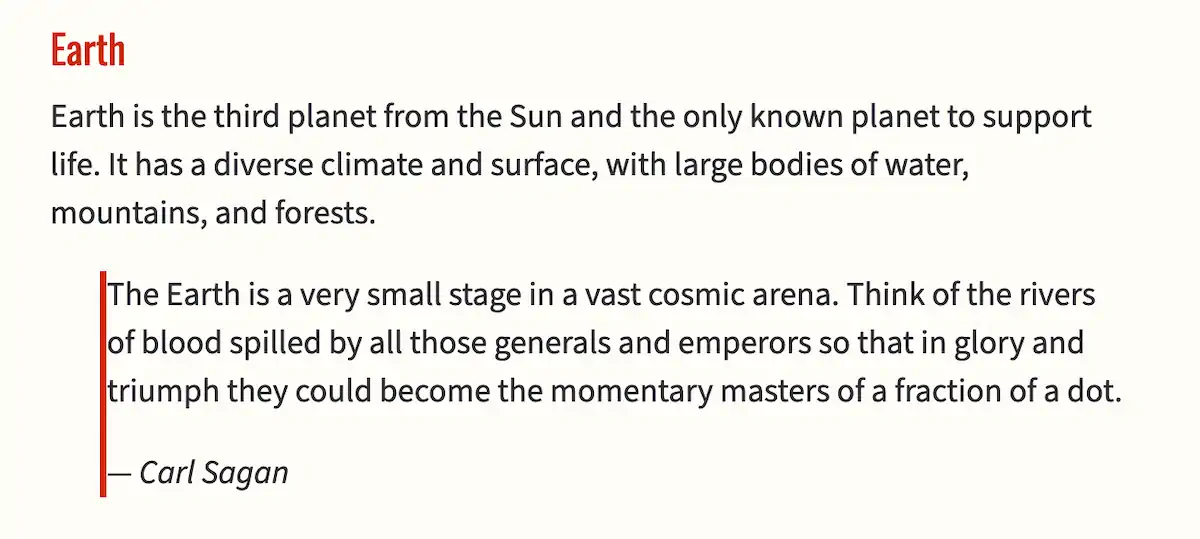
Fortunately, we can fix that by adding some padding. I’ll give you a quick intro to the box model. Every element has space outside of it (margin), space around the inside of it (padding), and an optional layer that separates the two (the border).
With that knowledge, we’ll add some space inside the element, which will push the content away from the border. We’ll make both left and right padding the same by setting padding-inline to just one value, 1rem, which is equivalent to the document’s font size.
Finally, I’ll round off the effect by making the font size slightly smaller and the text color slightly lighter. The final result is a nice-looking blockquote with a bit of flair.
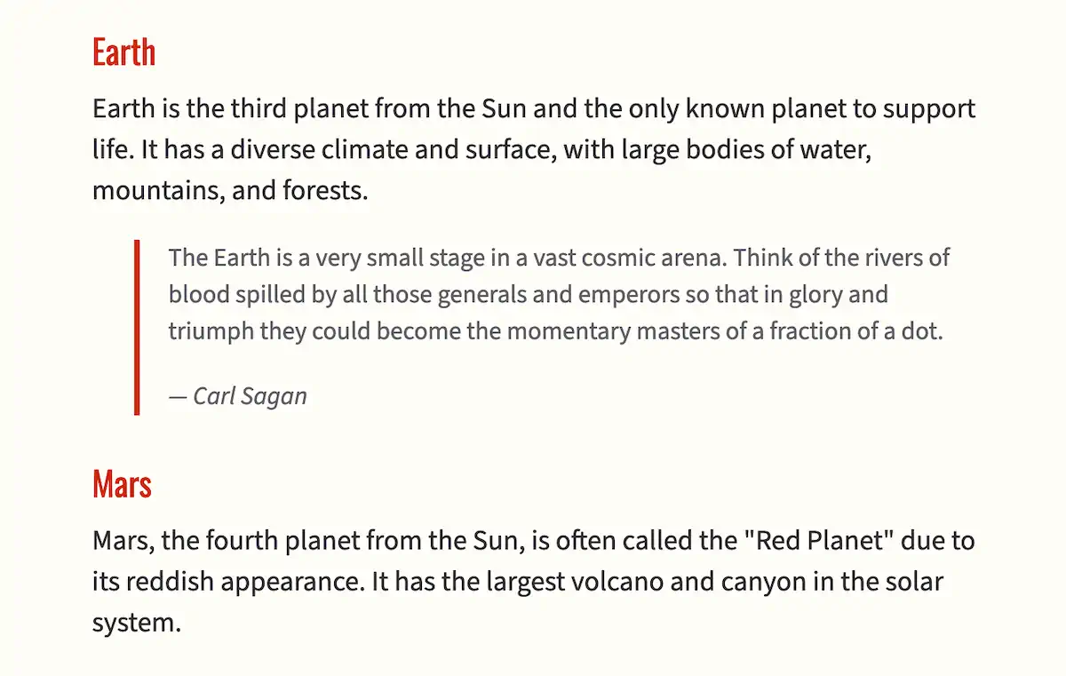
I designed this blockquote style to fit most use cases, but you could go in another direction—pithy callouts with large italicized text, for example.
Lists
Let’s make quick work of the bulleted list of Pluto and the gang. We’ll give the list a little indentation, as is common with bulleted lists. Remember, HTML has numbered lists, too. We’re not using one on this page (if you’re using my HTML markup), but we might as well write the style for both types of lists.
You already know that the selector targets the elements we want to style. But you can also have multiple selectors! We can target the <ul> element and the <ol> element and give both the same indentation by doing the following.
ul, ol {
  padding-inline-start: 1.5rem;
}
You add multiple selectors by separating them with a comma. This creates a selector list. The padding we’re using to achieve the indentation effect will be applied to unordered lists (bulleted) and ordered lists (numbered).
Let’s also adjust the spacing between the individual list items (<li> elements). I like to use half of whatever I’m using for paragraphs because I want list-items closer together than paragraphs, but still with a bit of space between. Since I used 1rem for spacing out my paragraphs and other elements, I’ll use half of that, 0.5rem, for the bottom margin.
li {
  margin-block: 0 0.5rem;
}
Remember, margin-block is the top and bottom margin in a left-to-right language like English. We can set both values at the same time. The above is equivalent to:
li {
  margin-block-start: 0;
  margin-block-end: 0.5rem;
}
That means, for left-to-right languages, the margin above the list item is zero, and the margin below is about ten pixels (0.5rem means 0.5 times the font size of the root element, which we defined as 20px).
The spacing should look pretty good now, but let’s do something that would make 2000s-era web designers jealous. Let’s change the color of the bullets. This used to be tricky, but now it’s easy peasy.
li::marker {
  color: var(--heading-color);
}
The ::marker bit is called a pseudo-element because it represents a piece of an HTML element. The ::marker is a part of the list item or <li> element. It contains the bullet (or number) of the list item. We can target it with our selector and change the color to our red heading color.
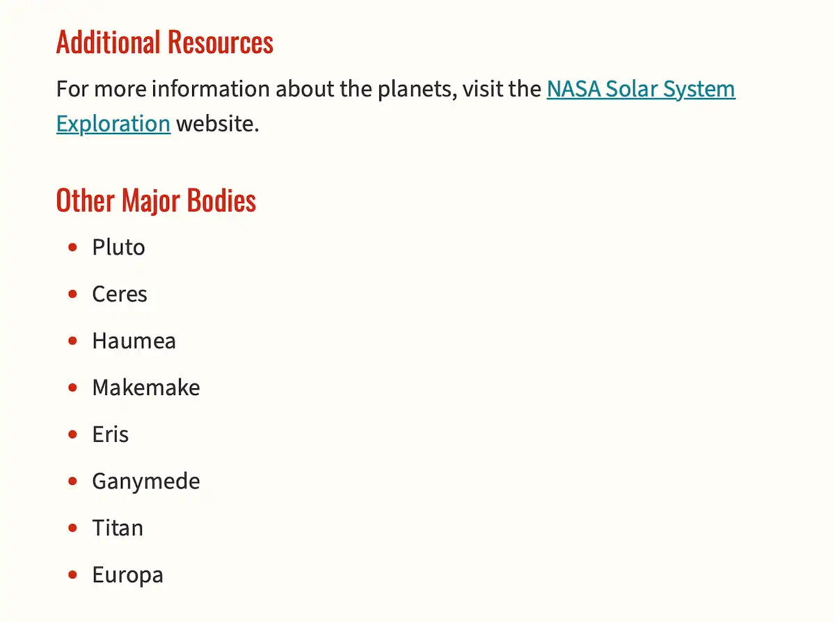
Looking good!
Pre-formatted text
Most of the time, in our HTML documents, we don’t care about preserving the exact spacing of everything. In fact, that would be counterproductive since we typically indent HTML or include empty lines to make the code more readable. But sometimes, we want to display text exactly as it is formatted. Examples include ASCII art and computer code.
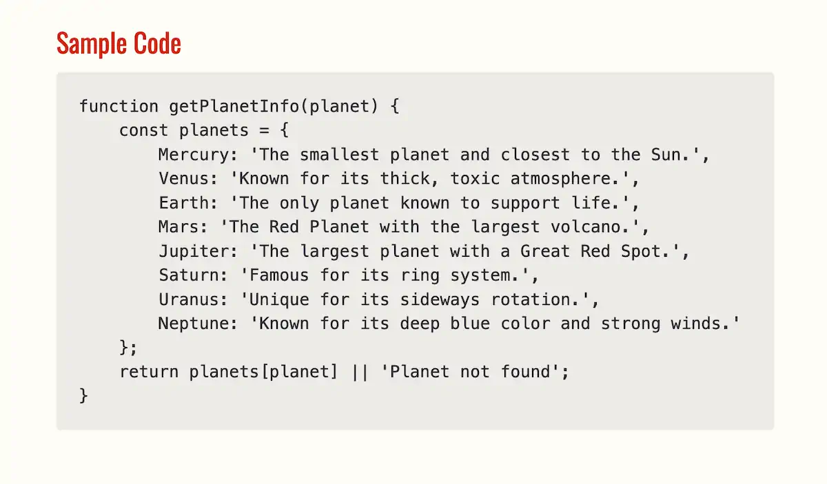
We typically display this kind of text with the <pre> tag in HTML. It preserves all the spacing and uses a monospaced font to make everything consistent. It’s often combined with the <code> tag to signify that the text is computer code. I’ve included some planet-related JavaScript code as an example.
We’ll style the <pre> tag as follows.
pre {
  padding: 1rem;
  background-color: #edebe7;
  border-radius: 4px;
  overflow-x: auto;
  font-size: 0.75rem;
}
We want the code to appear as if it’s inside a container, so we will supply padding all the way around. Next, we’ll set a light background color that’s just visible against our page background but not so dark as to hurt the contrast of the text. Sharp boxes look a bit unnatural, so we’ll add a small border-radius, which is just a fancy term for how much we want to round the corners.
We could have long lines of code, so we need to specify what should happen if a line of code overflows the side of the container. In this case, we will set it to auto, which will cause the browser to show a horizontal scrollbar on the element if needed.
Finally, monospaced code can look large, so we’ll tone it down by saying it should be three-fourths of standard text size.
Better image styling
Here’s what the image of Saturn looks like right now.
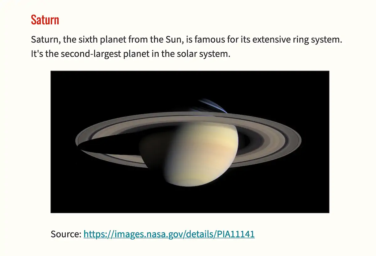
It’s not too bad, but it looks like the <figure> tag is adding margin on either side. I want the image to be full-width. I also want the photo caption to be smaller.
figure {
  margin-inline: 0;
}

figure img {
  display: block;
  margin-inline: auto;
  border-radius: 4px;
}

figcaption {
  margin-block-start: 0.5rem;
  font-size: 0.8rem;
}
We’ll remove the inline margin from the <figure>. Then we’ll target images that are inside figures (we only have one, but this could be a nice pattern to use if we add more) and do the following:
- Set
displaytoblock. Images are set toinlineby default, but the behavior ofblockworks more like you would expect an image like this to work. - Set the inline margin to
autojust in case we use an image smaller than the width of the page—it’ll be centered in that case. - Setting
border-radiusto4pxwill round the image’s corners just a touch. - Finally, we’ll reduce the margin above the caption and reduce the
font-sizeto 80% of the document’s font size.
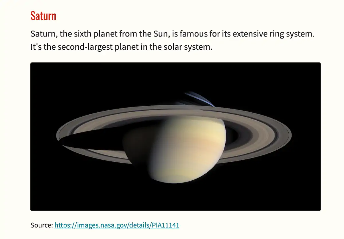
Looking classy! Minor adjustments can make a big difference.
The footer
We already have some footer styles—earlier, we set the width and ensured it was centered. But we can improve it by giving it some space to breathe, giving it a little top border, shrinking the text, and using a muted text color.
footer {
  margin-block-start: 3rem;
  margin-inline: auto;
  padding-block: 1.5rem 3rem;
  border-block-start: 2px solid var(--heading-color);
  max-width: 65ch;
  color: var(--muted-text-color);
}
Some of this should start to look familiar. We’re creating some margin above the element with margin-block-start. We’re adding a 2px wide border above the footer using our go-to red heading color. Using padding-block, we’re adding some space between the text and the border and a good chunk of padding below to provide breathing room at the bottom of the page. Finally, we’ll use the same muted text color we used on the blockquote.
Since we already added the margin we want to the <footer> element itself, let’s remove all the margin on stuff inside the footer. We’ll use our friend, the universal selector (*).
footer * {
  margin: 0;
  font-size: 0.9rem;
}
This selector will target everything inside the <footer> tag. We’ll set margin to 0 and shrink the text to 90% of the document font size.
Extra typographic fun
We could totally stop here, but… let’s have some fun.
Looking at the first paragraph in the markup, I gave it a class of intro. Let’s give it a bit of emphasis by making the text a little larger.
.intro {
  margin-block-end: 2rem;
  font-size: 1.2em;
}
When we put a period before a term in a CSS selector, that means we want to target every element that has that class (a class of intro in this case). This will make the font-size larger than the document’s default text size. And with the larger font, it needs some extra margin underneath.
Okay, cool, but now let’s get really extra. Look at the markup again, and you will notice I wrapped the first three words in a <span> tag with a class of caps.
.caps {
  text-transform: uppercase;
  font-size: 0.78em;
  font-weight: 600;
  letter-spacing: 0.1em;
}
This will give us that fancy bookish effect where the first few words are in small caps. Usually, you would want to use a font with proper small-caps, but we can do a decent forgery since Source Sans 3 is a variable font.
The text-transform declaration will make all the letters uppercased. It’s better to do that with CSS than manually typing all caps, as it’s more of a style thing. For the font-size, I just played around with it until I got it to feel right. Mostly, I wanted the caps to be the same height as the intro text’s lowercase letters (i.e., the x-height).
To help with balance, I’m increasing the font-weight a bit. In addition to values like normal and bold, you can use the numerical values 100 to 900 if the font supports it—and our variable font does.
Finally, you benefit from increasing the space between letters when using all caps. I’m using the em unit, which is based on the current font-size. This is useful because if you change the font-size in the future, the spacing will change proportionately.
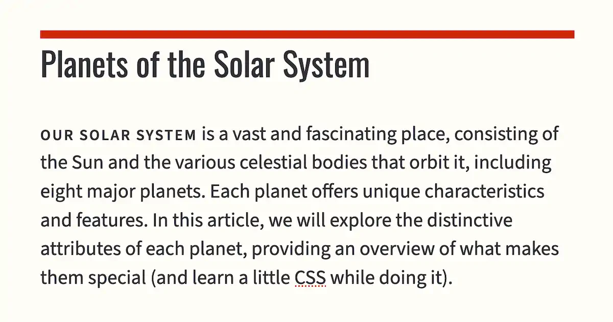
And there we go. From its humble beginnings as a stark unstyled page with quaint appeal, it’s now looking like an authoritative article.
Limitless potential
These are just the styles I chose based on my preferences. You could go in all sorts of different directions. I’m not necessarily trying to push a style on you—though I did point you toward some generally good typographic principles to follow. I just wanted to give you a taste of how you can apply your own styles to a page.
The magic of CSS is that you could take my exact HTML code—no changes—and create an entirely different design from that same starting point. That’s the premise of a web experiment called CSS Zen Garden, where people submit designs based on identical markup.
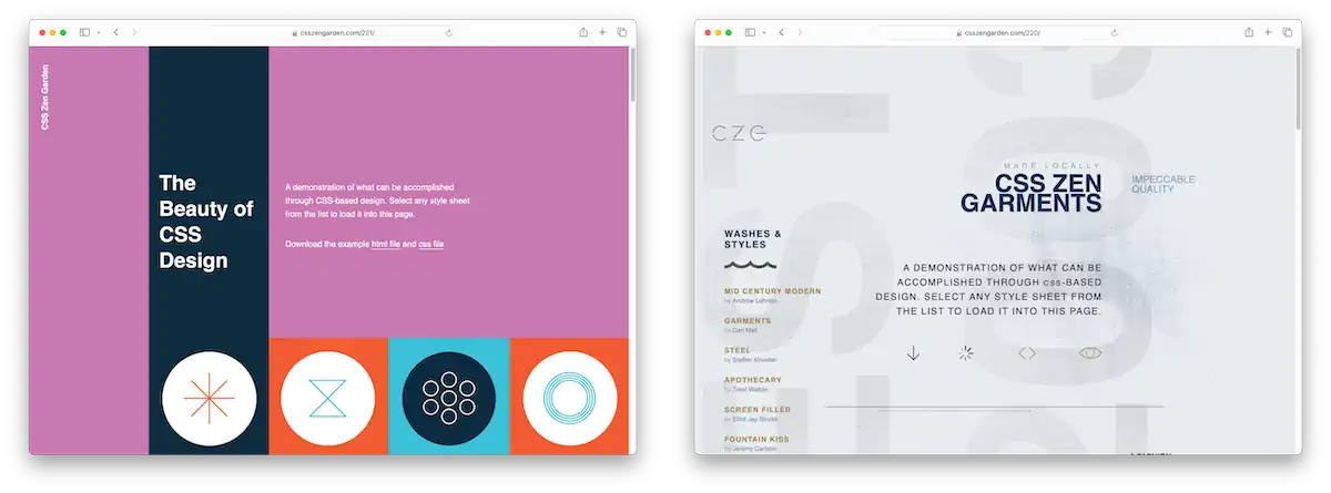
I hope this bonus chapter gave you a taste of what’s possible with CSS. Much like with HTML, even a little CSS knowledge is valuable—a simple change of font and color, for example, can make a huge difference. I encourage you to continue exploring CSS if you want to create custom designs. It’s a rewarding skill to have.