Customizing Simple.css
Simple.css gives us a foundation for a nice, clean website. But it also provides a means of customization without a ton of extra work on our part. It uses a feature of CSS called custom properties (often called variables). These variables allow us to change colors and fonts in one place with minimal coding needed.
Peeking inside Simple.css
Let’s open the simple.css file we previously added to our site to see what variables we can access. Don’t be deterred by how much code is in the file. We’re only concerned with a little bit of it. At the top of the file, you will see some code that looks like the following.
/* Global variables. */
:root,
::backdrop {
  /* Set sans-serif & mono fonts */
  --sans-font: -apple-system, BlinkMacSystemFont, 'Avenir Next', Avenir,
    'Nimbus Sans L', Roboto, 'Noto Sans', 'Segoe UI', Arial, Helvetica,
    'Helvetica Neue', sans-serif;
  --mono-font: Consolas, Menlo, Monaco, 'Andale Mono', 'Ubuntu Mono', monospace;
  --standard-border-radius: 5px;

  /* Default (light) theme */
  --bg: #fff;
  --accent-bg: #f5f7ff;
  --text: #212121;
  --text-light: #585858;
  --border: #898ea4;
  --accent: #0d47a1;
  --accent-hover: #1266e2;
  --accent-text: var(--bg);
  --code: #d81b60;
  --preformatted: #444;
  --marked: #ffdd33;
  --disabled: #efefef;
}
We’re getting into some CSS syntax here, but it’s perhaps not as scary as it first appears. Let’s break it down.
In CSS, the browser ignores text between /* and */. It’s a way to write notes to yourself—or others reading your source code—called comments. In this case, the comments help to separate the code into related groups.
The bit that says :root means that the following block of code—the part between the squiggly brackets, {}—applies to the whole page. Ignore ::backdrop for now.
Inside the squiggly brackets, we find a list of properties. We’ve seen CSS properties in a previous chapter. For example, we used columns: 2 on the resume page to arrange a bulleted list into two columns. In that case, columns is a property and 2 is a value.
Any property that starts with -- is a custom property, or variable. It’s a way to reuse a value in multiple places. For example, if we had a variable --accent: blue, we could simultaneously use the --accent color in multiple elements. And if we ever decided to make the accent another color, say red, we could update it in one place—by writing --accent: red—and every element using the --accent variable will be updated automatically.
Looking back at the Simple.css code above, we see that we have two groups of variables. There are properties related to the fonts used, followed by a list of color-related variables representing what Simple calls the “default (light) theme.”
We’ll look at fonts later. Let’s first look at the colors.
In this case, most of the color variables are represented as hex codes. All you need to know about hex codes is that they are one of several ways to specify a color in CSS. Go to almost any search engine and search for “color picker.” You’ll be greeted with a widget you can use to pick out a color and retrieve its hex code along with other formats.
Okay, so how do we set our own colors? Do we change them here inside simple.css? You could do that; it would work. But there’s a better way.
Creating a custom stylesheet
CSS stands for Cascading Style Sheets. The cascading bit is particularly useful. Putting it simply, it means the order of CSS rules matters—rules that come later override rules before them. For our purposes, it means we can create our own CSS file, and so long as it’s processed by the browser after simple.css, the rules we write there will take precedence. So we’re not changing simple.css. We’re overriding it.
Create a file in your assets/css folder called custom.css.
Now, let’s hook it up to the site. You’ll need to do this for every page on your site, but let’s start with the homepage, the top-level index.html file. In the <head> section, we’re already referencing simple.css with a <link> tag. Let’s do the same for our new custom.css file right underneath. Order matters here. We want our stylesheet to come after Simple’s so we can override its variables.
<head>
  <title>Blake's Homepage</title>
  <meta charset="utf-8">

  <link rel="stylesheet" href="css/simple.css">
  <link rel="stylesheet" href="css/custom.css">
</head>Now, let’s add some overrides. In our custom.css file, we’ll first set up a :root code block similar to the one in simple.css. Then let’s take one of the variables, say --bg (the background color), and set it to red.
:root {
  --bg: red;
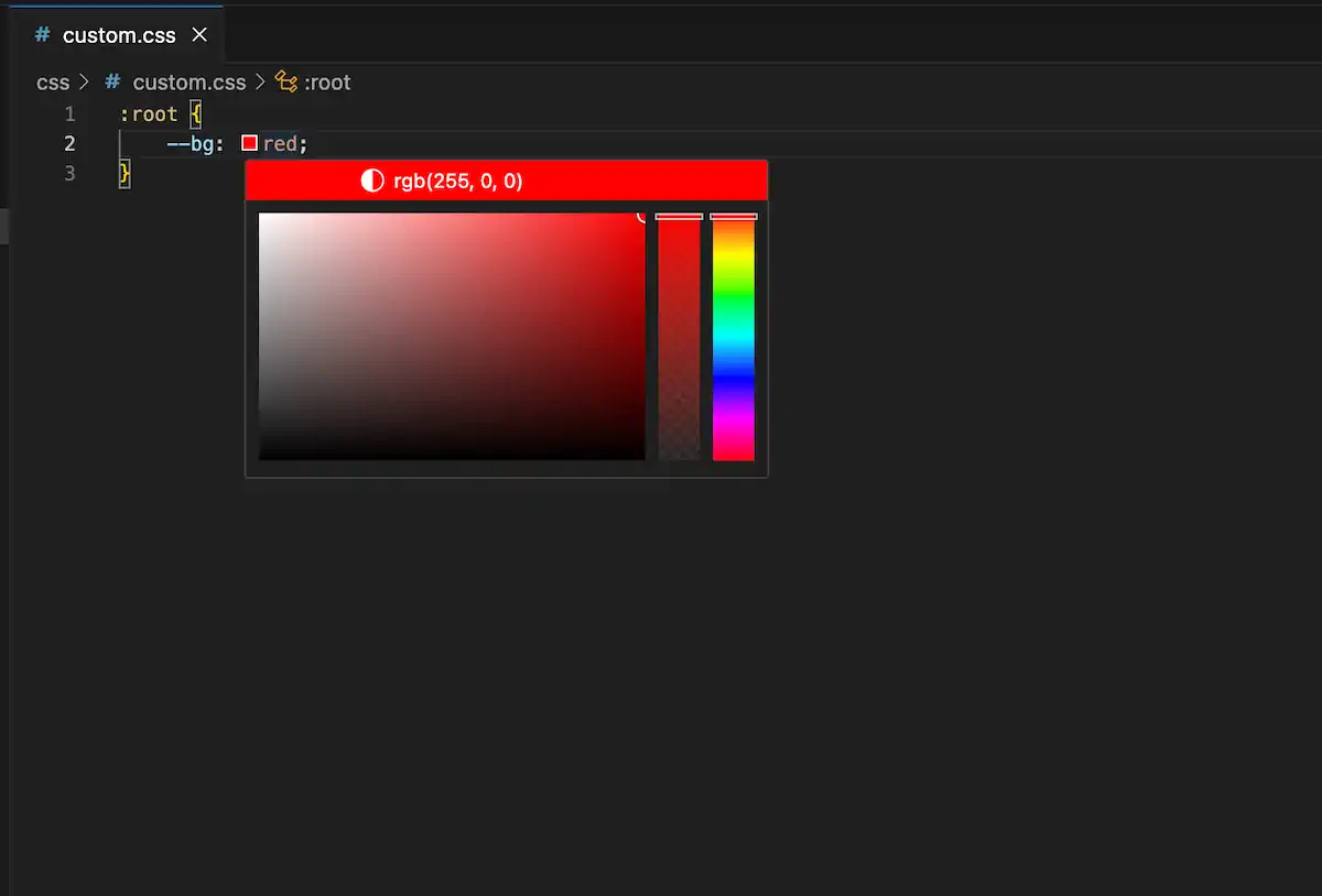
}If you reload the page, you should see an admittedly hideous red background. Let’s pick a better color. You can search for a color picking tool of your choice on the web, use one of the many named CSS colors, or, if you are using Visual Studio Code, use the built-in color picker by hovering over a color value.

But before picking out colors, let’s talk about dark mode.
Dark mode
Simple automatically supports light and dark modes based on the visitor’s system setting. You may have noticed this if you have turned on dark mode in your system settings. If we look at the simple.css file, we can see the dark mode version of all of the variables just below the other variables we looked at previously.
/* Dark theme */
@media (prefers-color-scheme: dark) {
  :root,
  ::backdrop {
    color-scheme: dark;
    --bg: #212121;
    --accent-bg: #2b2b2b;
    --text: #dcdcdc;
    --text-light: #ababab;
    --accent: #ffb300;
    --accent-hover: #ffe099;
    --accent-text: var(--bg);
    --code: #f06292;
    --preformatted: #ccc;
    --disabled: #111;
  }
  /* Add a bit of transparency so light media isn't so glaring in dark mode */
  img,
  video {
    opacity: 0.8;
  }
}
This block uses a CSS feature called media queries. In this case, the @media rule specifies that the style rules inside the block should apply if the user has indicated a preference for dark mode.
The first rule sets the default color scheme to dark and then redefines the color variables that apply to the root document (i.e., the whole page). The second rule makes images and video slightly transparent so as not to appear “so glaring in dark mode.”
We don’t know whether visitors to our website prefer light or dark mode, so we should set appropriate colors for both modes. If you want, you could copy over these two code blocks (i.e., the “Global variables” block and the “Dark theme” block) from simple.css into your custom.css file and then proceed to change the color values as desired. Or you could specify only the ones you want to change. Either way, ensure you have the right colors in the right section.
An example customization
For the default light theme, I decided to stick with only named CSS colors as a fun exercise. You can think of named colors like a box of crayons—there are many, but they don’t represent every possible color. But they are an easy way to refer to colors in a human-friendly way.
On the other hand, the dark mode colors needed a more nuanced touch. I used the built-in color picker in Visual Studio Code to select a few specific colors. They are represented in the rbg format here because that’s what the editor did by default when I selected the colors.
This is the code I put in my custom.css file.
:root {
  --bg: mintcream;
  --border: darkslategray;
  --accent-bg: honeydew;
  --text: darkslategray;
  --accent: mediumvioletred;
  --accent-hover: mediumvioletred;
  --marked: mediumspringgreen;
}

/* Dark theme */
@media (prefers-color-scheme: dark) {
  :root,
  ::backdrop {
    color-scheme: dark;
    --bg: rgb(17, 18, 18);
    --border: rgb(80, 90, 90);
    --accent-bg: rgb(35, 35, 36);
    --text: ghostwhite;
    --accent: lightskyblue;
    --accent-hover: lightblue;
    --marked: gold;
  }
}
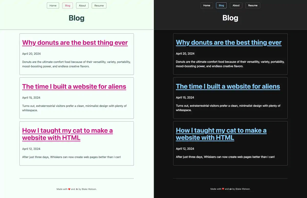
Here is a side-by-side preview of the blog index page’s appearance in light and dark modes.

Choosing accessible colors
Some color combinations can make text hard to read because of limited contrast. You want to ensure there is plenty of contrast between your text color and your background color.
You can rely on your eyes to an extent, but everyone is different. Fortunately, there are standards around how much contrast text should have. You can use a handy contrast checker like this one. Give it two colors, and it will tell you if there is sufficient contrast between them.
Changing the font
I glossed over this earlier, but you may have noticed a couple of variables related to fonts above the color variables defined in simple.css. One of them, --sans-font, is responsible for most of the text on the page (the other one, --mono-font, is used for things like showing code, as I am doing in this paragraph).
If you aren’t familiar, sans-serif fonts are those that don’t have serifs, the little feet-like protrusions you find on other fonts like Times New Roman. Simple uses the --sans-font variable for most text on the page by default, but we can override it with whatever we want.
First, let’s talk about fonts on the web.
Fonts on the web
Your site’s visitors can only see fonts installed on their system. That means if you, the author of the webpage, specify in CSS some random font you downloaded from a website, you will see that font on the webpage. But your visitors will see a fallback, unless they also happen to have that font installed.
That’s why multiple fonts are typically specified in CSS. If the first font specified isn’t available on the visitor’s computer or device, the browser will try the next one, and so on.
body {
  /* the first font needs quotes because the name includes spaces */
  font-family: "Some Rando Font", Georgia, serif;
}
The above style rule sets the font for the <body>. The browser will first try to use “Some Rando Font.” If that isn’t available on the visitor’s device, it will attempt to use Georgia instead. If that isn’t available, we’ve told the browser to use whatever default serif font it has available.
Here’s a good reference for finding fonts commonly found on people’s devices to see your options. You always want to provide a handful of decent fallbacks as well.
Sometimes, you have a font that you really want visitors to see even though you know they aren’t going to have it installed on their system already. Fortunately, there is a way to deal with this. They’re called web fonts. They are too involved to cover here, but I will cover them briefly in the next chapter, CSS basics. In short, it’s a method of automatically providing the font to your visitors.
Overriding the font variable
Let’s use a serif font. Even though Simple calls the variable --sans-font, there is nothing magical about the variable name. We can set it to whatever we want. Let’s use Georgia, which is always a pleasure to read.
We can override Simple’s --sans-font variable inside the :root block so that it applies to the whole page.
:root {
  --sans-font: Georgia, "Times New Roman", serif;
  --bg: mintcream;
  --border: darkslategray;
  --accent-bg: honeydew;
  --text: darkslategray;
  --accent: mediumvioletred;
  --accent-hover: mediumvioletred;
  --marked: mediumspringgreen;
}
We specified the font, Georgia, but we also provided two fallback options. We specified Times New Roman as our second choice. Note that this one needs to be inside quotes because the name has spaces.
We use a CSS keyword, serif, for the third option. That tells the browser to use its default serif font, whatever that may be. Often, it will be Times New Roman. Other keywords you have available here are sans-serif, monospace, and cursive, among others
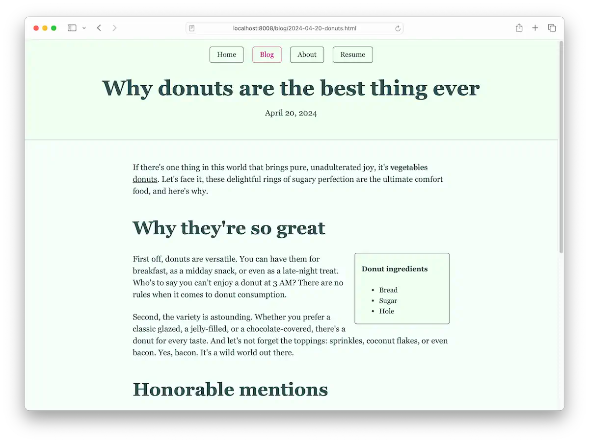
Here’s a look at one of the blog posts set in Georgia.

Make it yours
I chose Simple.css for this book because it makes HTML look good without any extra work. But I also chose it because it can be customized with a handful of CSS variables. Even though it’s just colors and fonts, there are endless possibilities for making your site unique.
I encourage you to explore the world of color and experiment with different combinations. In the next bonus chapter, I’ll cover even more CSS so you can go beyond Simple and write your own styles.