Introduction
I don’t think websites were ever intended to be made only by “web professionals.” Websites are documents at heart. Just about everyone knows how to make a document in this digital age, be it Word, Google Docs, Markdown, or something else. HTML shouldn’t be an exception. Sure it’s a bit more technical than other types of documents, but it’s also very special.
It’s the document format of the web. The humble HTML document is ubiquitous. It’s everywhere. If you looked at a website today, you almost certainly saw HTML.
HTML is robust. You could look at a website made today or one made twenty years ago. They both use HTML and they both work. That is an achievement that not many document formats can claim. You also don’t need any special program to make an HTML document. Many exist, and you could use any of them. You could also just open Notepad and write HTML by hand (spoiler: we are going to do just that).
I created this web book because I wanted something for people who don’t consider themselves professional web developers. Imagine if Word documents were only ever created by “Word professionals.” No. Knowing how to write some HTML and put it on the web is a valuable skill that is useful to all sorts of professional and personal pursuits. It doesn’t belong only to those of us who make websites as a career. HTML is for everyone. HTML is for people.
Who is this book for?
This book is aimed at people who have no prior coding experience of any kind. I won’t assume you know the first thing about HTML. We will start small. But by the end of the book we will have built a personal website complete with multiple pages, images, a blog, and more.
I will assume you have some experience using a computer and performing basic tasks like creating files and folders. This is a necessary prerequisite because (again, spoiler alert) websites are essentially just files and folders.
What do I need?
You need a computer with internet access. I wrote this book in a generic way so that it would be applicable for people using macOS, Windows, or Linux. If I point you toward software to install, it will be free (or have a usable free tier) and will be cross-platform (or I will offer platform alternatives).
Table of contents
- Zero to internet: your first website
- Add content to your website
- Intermission: upgrade your text editor
- A website with style
- Adding an about page
- Adding a blog
- Adding a resume
- Intermission: installing a local web server
- Adding a fun page
- Achievement unlocked: Hypertexter
Bonus chapters
This is the stuff I wanted to cover but felt that it was a little bit out of scope. CSS and PHP both have a bit of a steeper learning curve compared to HTML. I don’t think they’re out of reach for anyone who wants to explore them, though. And a little bit of both of them can go a long way. So this is my way of giving you a little taste of each one.
Up next
Now that you know the why behind this book, it’s time to take the first step. In the next chapter, you will learn how to make a website from scratch and put it on the web.
Zero to internet: your first website
You, my friend, are about to go from zero to internet by putting your very first homemade page on the web.
I will let you in on a little secret—websites are just files with text. They don’t require fancy, expensive software to create. You can make a website with the free text-editing tools that come with your computer. In fact, that’s what we’ll do right now.
Step 1. Create a folder on your computer
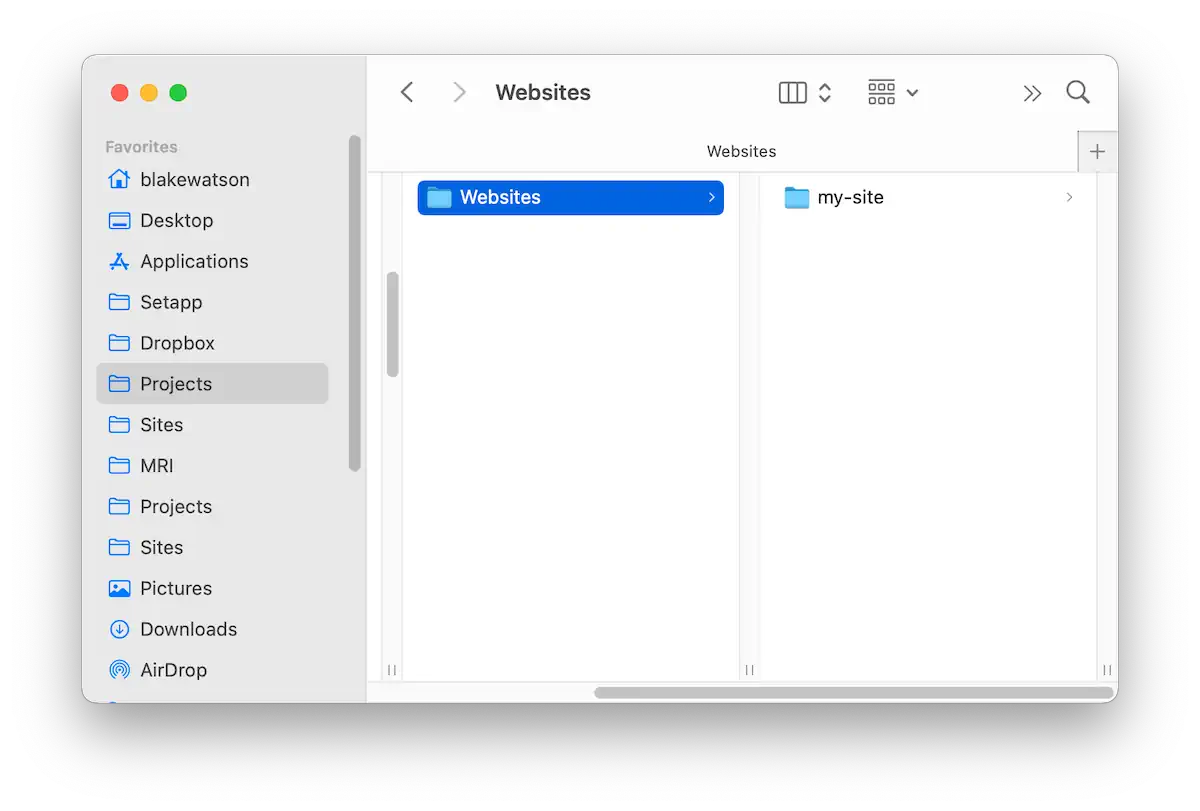
Pick a location on your computer and create a folder. Call it my-site or something similar. It’s best to name your website folders and files with lowercase letters, numbers, dashes, and underscores. Avoid spaces in filenames. This ensures your files will be compatible with many different computers and servers.
Step 2. Create index.html
By convention, a website’s homepage is index.html. You may have other pages (like about-me.html or anything else you want), but we’ll get there later.
To create index.html, open TextEdit on a Mac or Notepad on Windows.
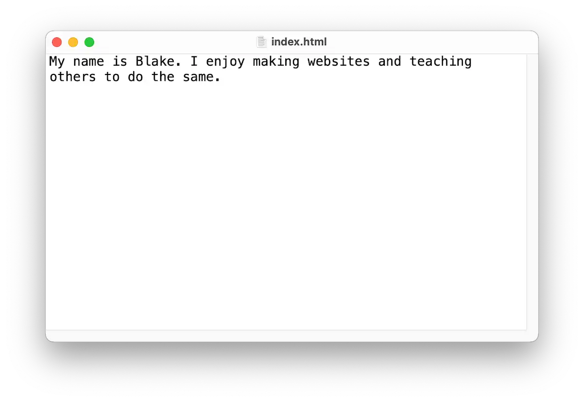
Write a sentence or two about yourself. Here’s mine, for example:
My name is Blake. I enjoy making websites and teaching others to do the same.Now save this file. Name it index.html and put it in the my-site folder you created in step 1.
Step 3. Preview your website
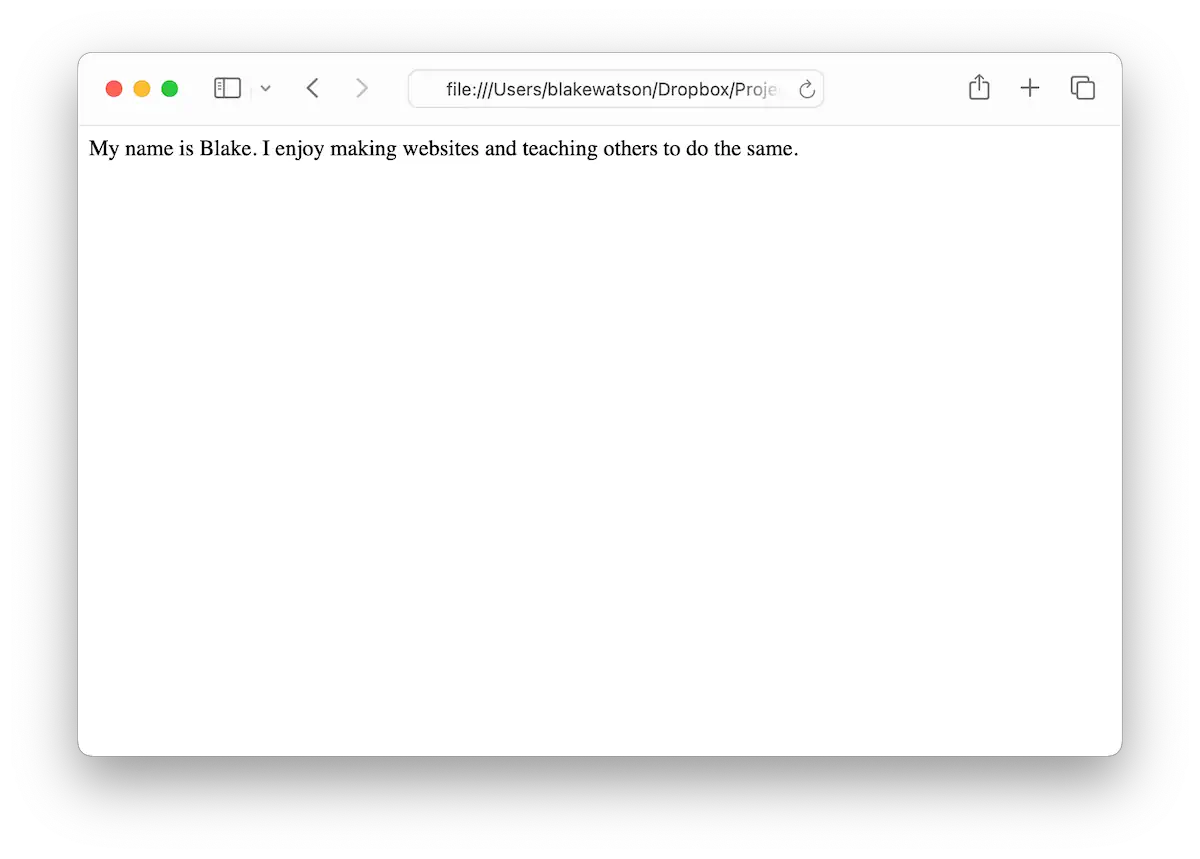
You can open your website by double-clicking index.html. It should open in your default browser. Alternatively, you can launch your browser first, click File > Open File…, then navigate to your index.html file.
You should see your (admittedly plain) website in your browser! Feel free to adjust your text and fix any typos because we’re about to publish this page to the world.
Don’t worry about how it looks. We’ll fix that later.
Step 4. Publish your website
There are many options for publishing your website. For our purposes, we need something free, easy, and geared toward individuals instead of businesses. Fortunately, we get just that with Neocities.
Head over to Neocities and create an account. It’s free. You’ll also need to choose a username/sitename. Your website will ultimately be on a subdomain at YOURNAME.neocities.org. I suggest using your real name or an online username if you have one. Or, if you know what you want your page to be about, you could choose something befitting the topic (for example, dndfanpage).
Once you’ve created your account, go to your site’s dashboard. You’ll see that you have some starting files there. You can ignore them for now. To publish the page you just made on your computer, drag index.html from your computer onto your Neocities dashboard. That will replace the index.html that’s already there.
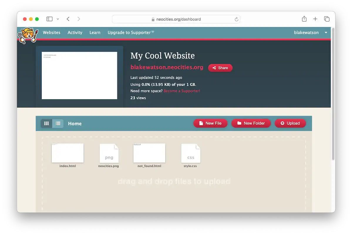
Once you’ve done that, click the link to your site at the top of the dashboard.
Congratulations, you just made a website! 🎉
Up next
In the next chapter, we’ll add more content to our website and learn about a handful of HTML tags.
Add content to your website
First, pat yourself on the back because you now have a live, homemade website! Now it’s time to make it more interesting.
Add a heading
Let’s give it a name! It depends on what kind of site you’re making, but mine will be a personal homepage. Everyone and their mom have a social media profile, but those are boring and same-y. We deserve more. And our old friend, the personal homepage, is a perfect place to start.
Blake's Homepage

My name is Blake. I enjoy making websites and teaching others to do the same.
Nice! Let’s view it in the browser.
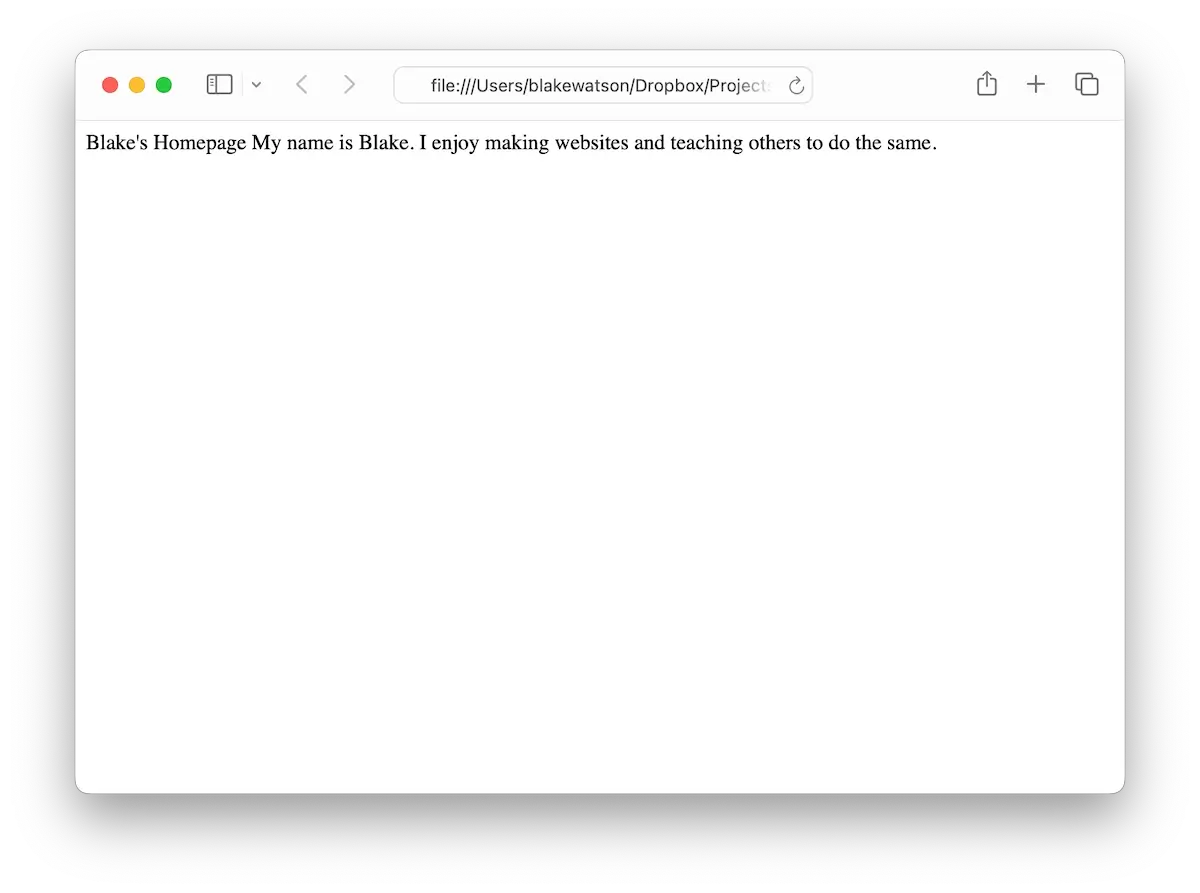
Well, that’s not what we wanted. The browser slammed our text together on one line. What gives?!
We’re missing the markup in Hypertext Markup Language. We must tell the browser we want our site name to be a heading. In HTML, you can have up to six levels of headings. We’ll set our site name as the most prominent heading, a level 1 heading, or <h1>.
What is this weird pill-shaped code I just wrote? It’s called an HTML tag. We wrap parts of our page in tags to tell the web browser what they are. Let’s do that now.
<h1>Blake's Homepage</h1>

<p>
  My name is Blake. I enjoy making websites and teaching others to do the same.
</p>
Here, we’ve separated the two elements of our page and wrapped each one inside tags. We’re saying our site name should be a level 1 heading, and our first paragraph should be, well, a paragraph—that’s what the p stands for.
Notice that a pair of tags has an opening tag and a closing tag. The closing tag looks identical to the opening tag, except it begins with a slash, /.
Now, save the file and reload the browser. This is often the flow of website creation: You change some code, save it, and then hit reload on your browser. Then, feel the power coursing through your veins as you create a website from nothing!
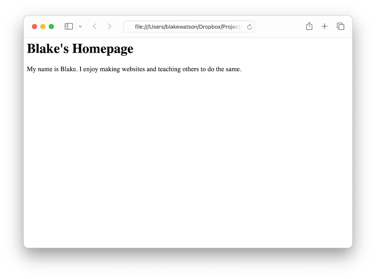
Whoa, that’s much better! Let’s keep going by adding some more content.
Linking to other websites
Do you ever wonder why it’s called the web? Like what does that even mean? The special sauce that makes it a web is the hyperlink, or as we usually call it, a link. You know, it’s the often blue, often underlined text you can click to hop to another page, site, image, cat video, or anything!
It’s made possible by the anchor element, or “A tag,” as it’s commonly known. It looks like this:
<a>This will go somewhere eventually</a>Whatever is inside the <a> tags becomes clickable. But where does the link take us? Currently, nowhere. We need to specify a destination. We can do that by giving the <a> an attribute called href. It’s the hypertext reference—the place you want to go when you click the link.
<a href="https://www.wikipedia.org/">Go to Wikipedia</a>Let’s add a link to our website—pick one of your favorite websites or something fun and interesting.
<h1>Blake's Homepage</h1>

<p>
  My name is Blake. I enjoy making websites and teaching others to do the same.
</p>

<p>
  Check out these cool web games at <a href="https://neal.fun/">Neal.fun</a>!
</p>
Save and reload!
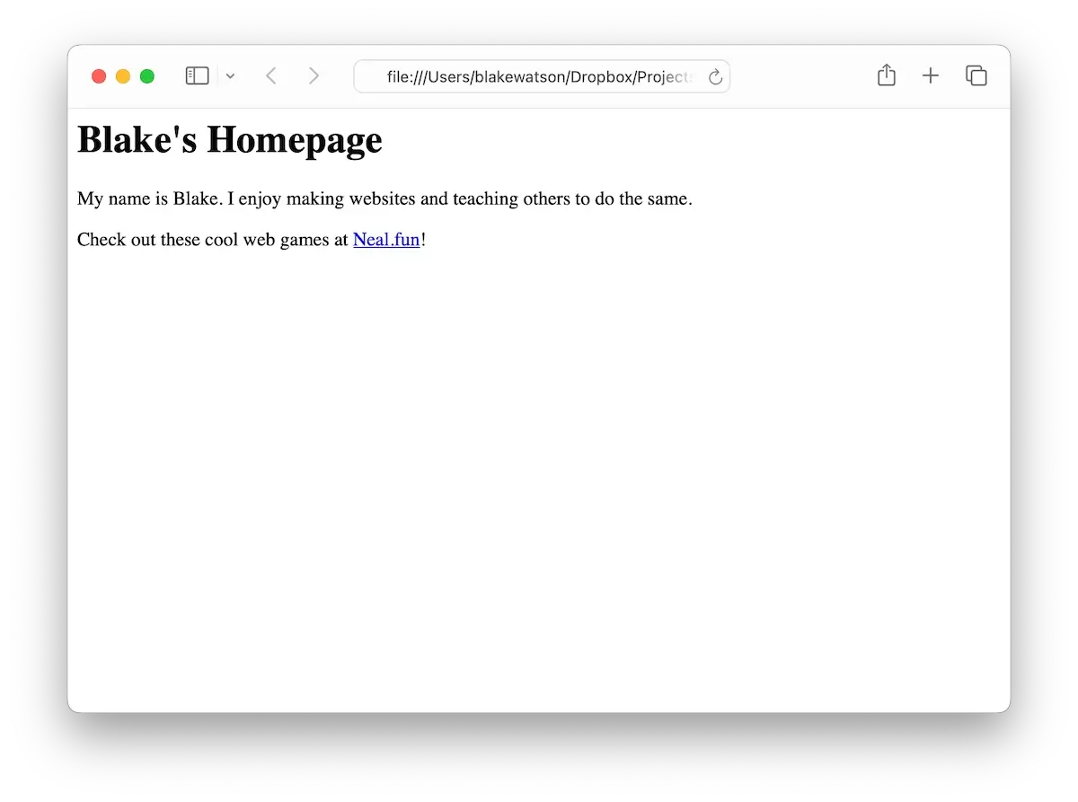
With the help of the humble <a> tag, your website becomes a part of the living, breathing web. There are over a hundred HTML tags, but you don’t need to memorize them to build a website. You can do a lot with a little. Let’s look at a few more tags that can get you started.
Lists of things
List lovers, this set of tags is for you. We’ll use the unordered list element, <ul>, to add a bulleted list. The <ul> defines the list, while the list item tag, <li>, defines each item. Like this:
<ul>
  <li>The first thing</li>
  <li>Another thing</li>
  <li>And lastly, this thing</li>
</ul>
The above code becomes a bulleted list like so:
- The first thing
- Another thing
- And lastly, this thing
If you want a numbered list instead, change <ul> to <ol> (for ordered list). That’s it! You will create a numbered list instead.
- The first thing
- Another thing
- And lastly, this thing
Let’s add a list to our website. Here’s the full site so far:
<h1>Blake's Homepage</h1>

<p>
  My name is Blake. I enjoy making websites and teaching others to do the same.
</p>

<p>
  Check out these cool web games at <a href="https://neal.fun/">Neal.fun</a>!
</p>

<h2>Favorite board games</h2>

<ul>
  <li>Dungeons & Dragons</li>
  <li>Risk</li>
  <li>Pandemic</li>
</ul>

<h2>How to make a website</h2>

<ol>
  <li>Create an HTML file</li>
  <li>Write some HTML in it</li>
  <li>Open it with your web browser</li>
</ol>
Hey, this thing is slowly starting to look like a website now!
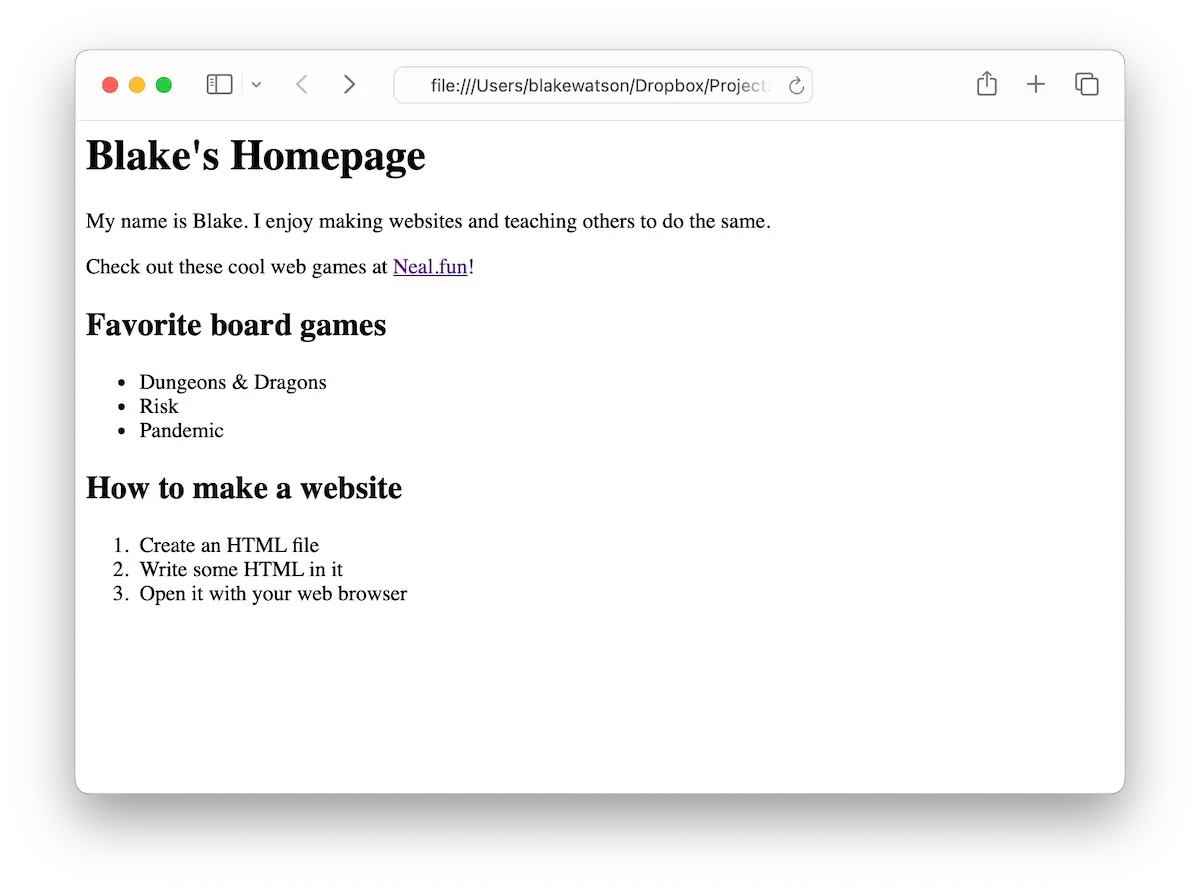
You’ll notice I snuck a new tag in there without mentioning it. It’s a level 2 heading, or <h2> tag. Headings add structure to a page, making it easier for visitors to find what they want.
There’s another subtle difference between the tags we’ve been using. Some of them, like the <a> tag, are inline elements, meaning they do not start new lines and only take up the necessary width. Other tags—like <h1>, <ul>, and <p>—are known as block elements. A block element starts on a new line and occupies the full width of its container.
So far, we’ve got a lot of words, but do you know what’s worth a thousand of them?
Add images to your website
Let’s add a cool image to our website. While it might be tempting to go to Google Images and grab the first thing you find, that’s not the way to go. You must make sure you have the proper rights to the image. There are a lot of places on the web to find images to use (look for images with a Creative Commons license). For simplicity, let’s use the popular free image site, Unsplash.
I found a cool image of space. I downloaded the small-size version and renamed it space.jpg to make it easier to refer to. Find an image you like and drop it in the folder next to your index.html.
You can add it to your page using the image tag or <img>. Unlike the tags we’ve seen so far, the <img> tag is self-closing. That means there isn’t a closing tag. It looks like this:
<img src="space.jpg" alt="Photograph of space with stars and stardust.">Just like with the <a> tag, the <img> tag uses attributes to provide more information about how you want to use the tag.
Use the src attribute to tell your image tag the source of your image, that is, where it’s located. In this example, we’re saying the image is in the same folder as our index.html page (as opposed to a subfolder) and specifying that the image’s filename is space.jpg.
We also need to describe the image in case some visitors to our website cannot see it. This could happen for several reasons—maybe our visitor is blind and uses a screen reader to access websites. Or maybe a glitch causes the image not to load for some reason. If that happens, our alternative text, or alt text, will be shown instead.
Let’s save and refresh the browser.
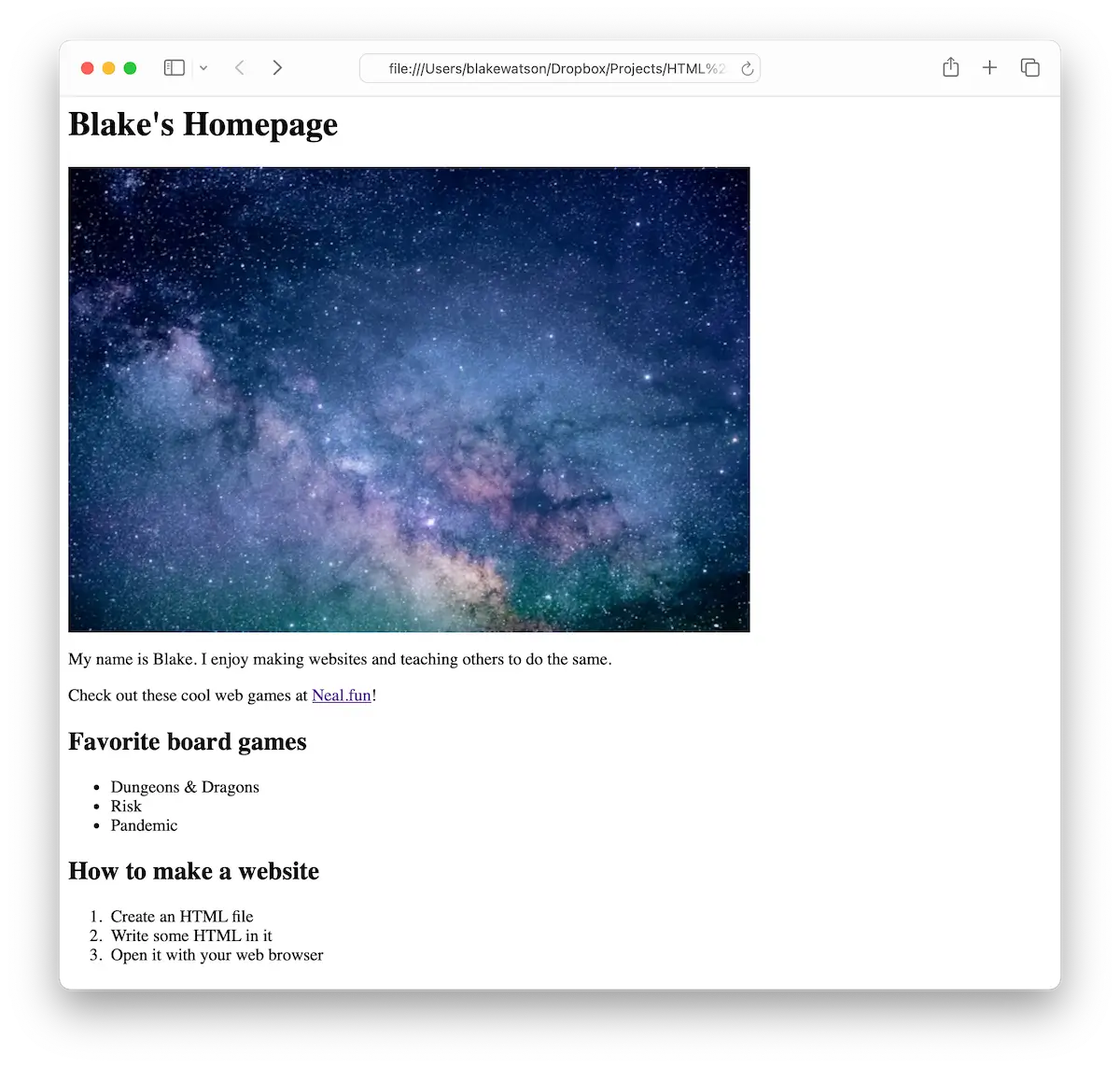
I resized the window so the whole page would fit in the screenshot, but if you’re seeing a scrollbar, that’s totally fine!
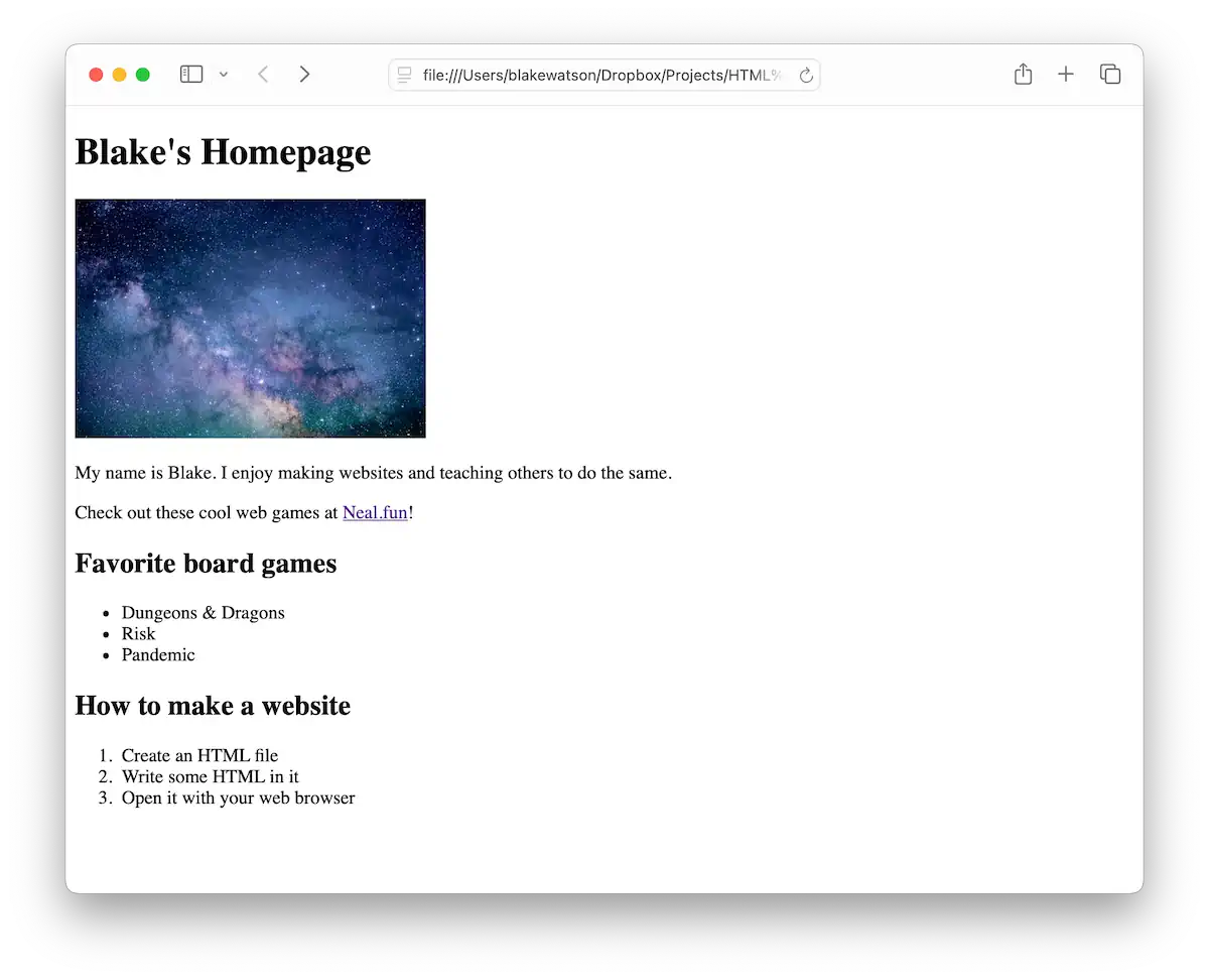
Depending on your image, you might want to make it smaller or larger. You can use the width and or height attributes for this. If you specify either the width or height, the browser will maintain the image’s aspect ratio—it won’t stretch or squish it. To set a width or height for the image, you provide a number which represents an amount of pixels.
<img src="space.jpg" alt="Photograph of space with stars and stardust." width="300">If we set the width to 300, it looks like this:
Add notes to your code
Sometimes, you want to put notes in your code—text that isn’t displayed on the page but remains visible in the code. You might do this to help organize a document, leave notes (like todos) for your future self, or even hide some work-in-progress code you don’t want displayed yet.
For example, I could leave a note to return and update my favorite board games.
<h2>Favorite board games</h2>

<!-- Todo: after playing some new games,
see if any deserve to make this list. -->

<ul>
  <li>Dungeons & Dragons</li>
  <li>Risk</li>
  <li>Pandemic</li>
</ul>
The browser will ignore anything between <!-- and --> and will not render it on the page. This type of text is called a comment. Comments give you a nice way to annotate code since they’re only visible in the code—not on the rendered webpage.
Here’s another example of how I’ve wrapped multiple HTML tags inside a comment. Nothing in the comment will appear on the page—only in the source code.
<!--
Work in progress. When I finalize this list, I'll remove the comment markers.

<h2>Favorite board games</h2>

<ul>
    <li>Dungeons & Dragons</li>
    <li>Risk</li>
    <li>Pandemic</li>
</ul>
-->
Your HTML code is public, even the comments. Anyone can view the source code of your website, so don’t put anything secret or sensitive inside comments. To view the source code of a page, you can press a keyboard shortcut or find the option in your web browser’s menu. It varies by browser. Check out this reference on Lifewire.
Give your website a head and a body
I haven’t been totally honest with you so far. We’ve been taking a shortcut. We’ve been writing only the stuff the browser will display in our index.html file. But every website has an invisible section. And now yours needs it.
Remember how we wrap most elements in tags? We actually need to wrap the whole page in the <html> tag. An HTML page is further divided into an invisible <head> section containing information about your site, and the <body>, where all your content goes.
<html>
  <head>
    <!-- info about your site goes here -->
  </head>

  <body>
    <!-- stuff you want to show up on your page goes here -->
  </body>
</html>
To make our HTML document official, let’s add a doctype line at the very beginning. The doctype is mainly needed for historical reasons, but it tells the browser, “Hey, I’m an HTML document, so please proceed to display me accordingly!” It’s okay to copy and paste that line and move on—don’t feel like you need to memorize every little thing.
<!doctype html>
<html>
  <head>
    ...
  </head>

  <body>
    ...
  </body>
</html>
For now, let’s include two things in the <head>: a title tag and a meta tag.
<head>
  <meta charset="utf-8">
  <title>Blake's Homepage</title>
</head>
The <title> tag controls the text that appears in your website’s browser tab and the name of your site when it appears in search results. Nice!
We can use the <meta> tag multiple times to give the browser extra info about our page. In this case, we’re telling it which character set to use. All you need to know here is that UTF-8 text means special symbols like emojis will appear as expected. We’ll include it first, before any other text elements, to make sure all our text is displayed properly.
Here’s the whole index.html file for reference:
<!doctype html>
<html>
  <head>
    <meta charset="utf-8">
    <title>Blake's Homepage</title>
  </head>

  <body>
    <h1>Blake's Homepage</h1>

    <img src="space.jpg" alt="Photograph of space with stars and stardust.">

    <p>
      My name is Blake. I enjoy making websites and teaching others to do thesame.
    </p>

    <p>
      Check out these cool web games at
      <a href="https://neal.fun/">Neal.fun</a>!
    </p>

    <h2>Favorite board games</h2>

    <ul>
      <li>Dungeons & Dragons</li>
      <li>Risk</li>
      <li>Pandemic</li>
    </ul>

    <h2>How to make a website</h2>

    <ol>
      <li>Create an HTML file</li>
      <li>Write some HTML in it</li>
      <li>Open it with your web browser</li>
    </ol>
  </body>
</html>
Update your live website
These changes are looking pretty good. Let’s publish this page to the world. Head over to your Neocities dashboard. You’ll see the starting files plus the index.html file you uploaded in chapter 1 of this book. To make things a bit cleaner, I’m switching to the list view and deleting the PNG image and CSS file that were there initially.
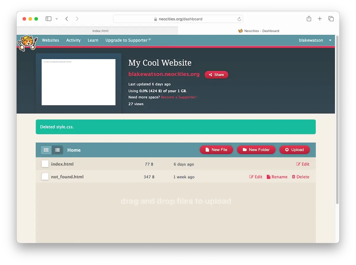
Now click the Upload button or just drag your updated files (the index page and the image) onto the file list.
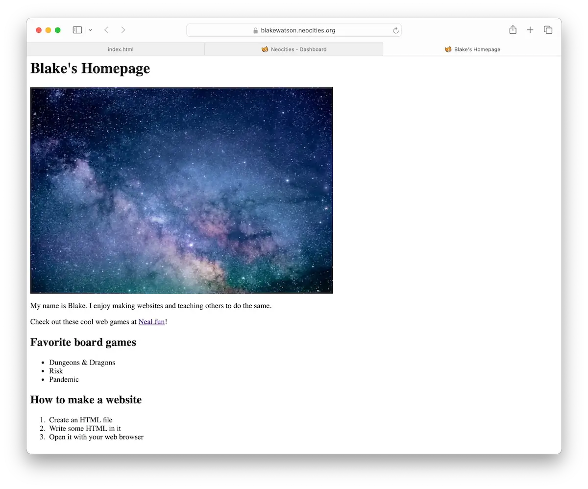
Once you’ve done that, click the link to your site at the top of the dashboard. That’s your newly updated LIVE website, which you made from scratch. How cool!
Up next
In the next chapter, we’ll take a brief intermission and get a text editor made for writing HTML.
Intermission: upgrade your text editor
You’ve come a long way. Let’s take a second to appreciate that you opened up a simple text editor and created a freaking website by writing some HTML code. Way to go!
Speaking of simple text editors, keeping everything indented nicely in HTML can get annoying. It can also be challenging to distinguish HTML code from our written content.
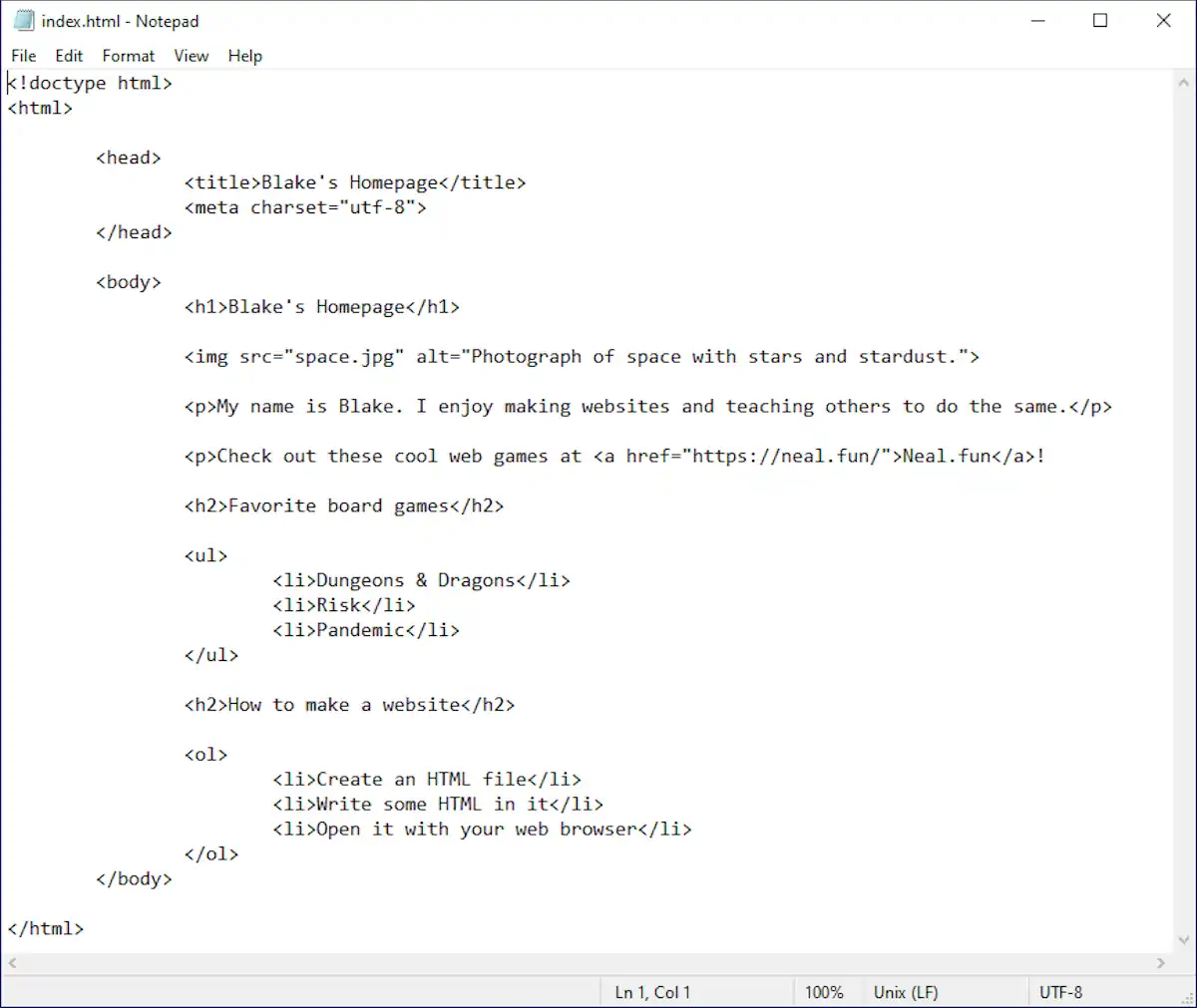
It’s not terrible, but we can do better. Let’s download an editor that’s made for writing code.
Download Visual Studio Code
Head over to https://code.visualstudio.com/. This free code editor from Microsoft works on Mac, Windows, and Linux. It can do many things, but we’ll keep it nice and easy for this book.
Don’t let the busy screenshot on the homepage scare you. We don’t need all those advanced features for what we’re doing.
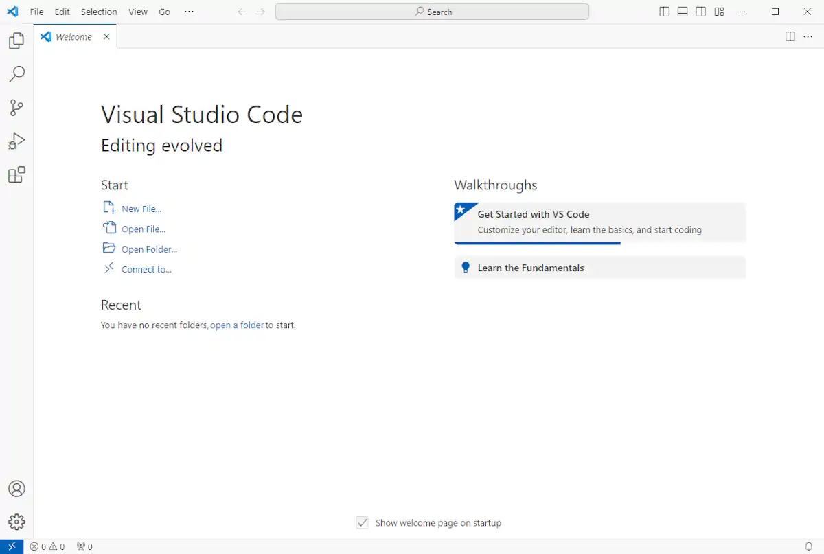
Once you download and install VS Code, start it up. You may see a few instructional screens, but then you’ll be presented with a screen like this:
Open your project
On the VS Code welcome screen, click Open Folder, then select the folder containing your web project. You’ll see your website files in the sidebar. When you open the index.html file, you’ll see your code in a nice view with line numbers and what is called syntax highlighting—parts of the code are colorized to be more easily distinguished from other parts.
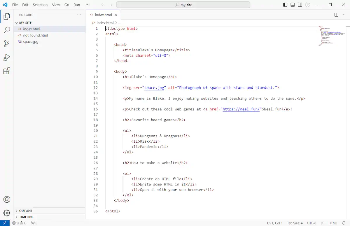
VS Code also helps by making it easier to write code. It understands HTML and many other languages. When you start to type, it will give you code completion suggestions, which you can accept by clicking or pressing enter. It’ll also automatically indent when you create a new line, so you don’t have to manually enter tabs or spaces.
VS Code opens your files in tabs. This is convenient later when your website has multiple pages.
Explore when you’re ready
There are many cool things VS Code can do, but what we have covered here is enough to get you started. Think of it as a fancier Notepad. At the end of the day, it’s still just text in a file. We started our journey with Notepad or TextEdit to show that you can make a website with simple tools you already have installed on your computer—no magic or expensive software required.
That said, using a code editor makes the HTML writing process nicer and more manageable. And when you’re ready, you can explore all the features VS Code offers. You can also try other code editors to see how you like them.
For now, let’s get back to making our website!
Up next
Now that we’ve leveled up our text editor, let’s learn how to add style to our website.
A website with style
I think our website is nice. Its quiet simplicity is welcoming in a world full of distractions. However, it does look very plain and un-styled.
We’re seeing the browser’s default styles—how it displays text and images without further instructions on how they should look. But most websites you visit don’t look this way. They have been designed to look differently. Their designers have given instructions for what fonts to use, what colors, and what page layout.
In the land of HTML, we are only concerned with what things are—this thing is a heading, this other thing is a paragraph, here is an image, and so on. To define how things look the browser uses HTML’s sibling language, Cascading Style Sheets, or CSS.
One way to include CSS is by using the <style> tag and putting CSS code directly into it. For example, consider the following:
<style>
  body {
    font-family: 'Gill Sans', sans-serif;
  }
</style>
If you included this code somewhere on your webpage, it would change the font of the <body> tag—in effect, all of the visible text on the page. This CSS ruleset says, “Set the body font to Gill Sans or, if that font isn’t available, set it to whatever your default sans-serif font is.”
That’s a totally valid way to use CSS. But you will often find people putting their style rules in a separate file. Something like styles.css. The main reason for doing that is that it makes it easier to share styles across multiple pages—it prevents you from copying and pasting your <style> tag around to each page you create.
CSS is a powerful language. Every website you see is using it. All of those intricate designs, much of the animation, and the positioning of images and typography—that’s CSS.
However, there is also a learning curve to CSS. And while I totally encourage you to explore CSS, this book is HTML for People—I want to keep the focus on HTML. But that’s okay! We can still use CSS to make our website look nice without writing everything ourselves.
CSS frameworks
Even professional web developers who know CSS will use pre-written CSS as a starting point. We will do something similar. Some CSS frameworks are made for web developers—they include a lot of bells and whistles and require that you write your HTML code in a particular way. However, other frameworks are designed for simpler websites. They make your HTML look nice without you doing much extra work. They’re called classless CSS frameworks.
For our purposes, that’s perfect. We’ll use one called Simple.css. But here are some other ones you might want to look at. They’re similar in spirit but with different styles.
These will make your HTML look nice and give you a great starting point for a basic website. Get comfortable using stuff other people have made because there’s a lot of great stuff out there!
Simple.css
I encourage you to check out the Simple.css website, particularly the demo page, as it shows you how to use different HTML elements and what they look like with Simple. Let’s download Simple.css.
The Simple.css docs give us a few ways to get started, but for simplicity’s sake (see what I did there?), I’ll give you the URL to the CSS file:
https://cdn.simplecss.org/simple.css
Don’t be intimidated by all the code in there! You don’t need to understand it right now (or ever, really). Just hit File > Save Page As in your browser (Command-S on macOS and Control-S on Windows) and save this file in your website project folder where your index.html file is.
Alright, you’ve saved it, and we’ll add it to the page soon. But first, let’s do a little housekeeping.
Organizing our files
So far, we only have three files—our webpage, an image file, and the simple.css file we just downloaded. But we’ll add more files soon. Let’s create a couple of folders and move things around. We want our new file structure to look like this:
cssfoldersimple.css
imagesfolderspace.jpg
index.html
Nice and clean. Using Visual Studio Code, you can create files and folders directly in the sidebar. Hover your mouse over your files, and you’ll see these buttons.
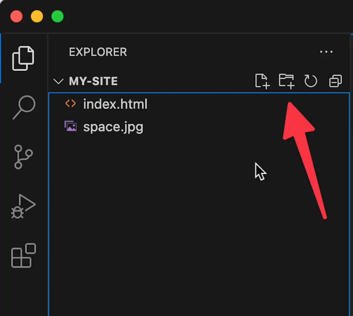
Once you make the changes, if you reload the page in the browser, you will notice that our image no longer works. Notice how the browser falls back to showing the alt text we provided in place of the image.
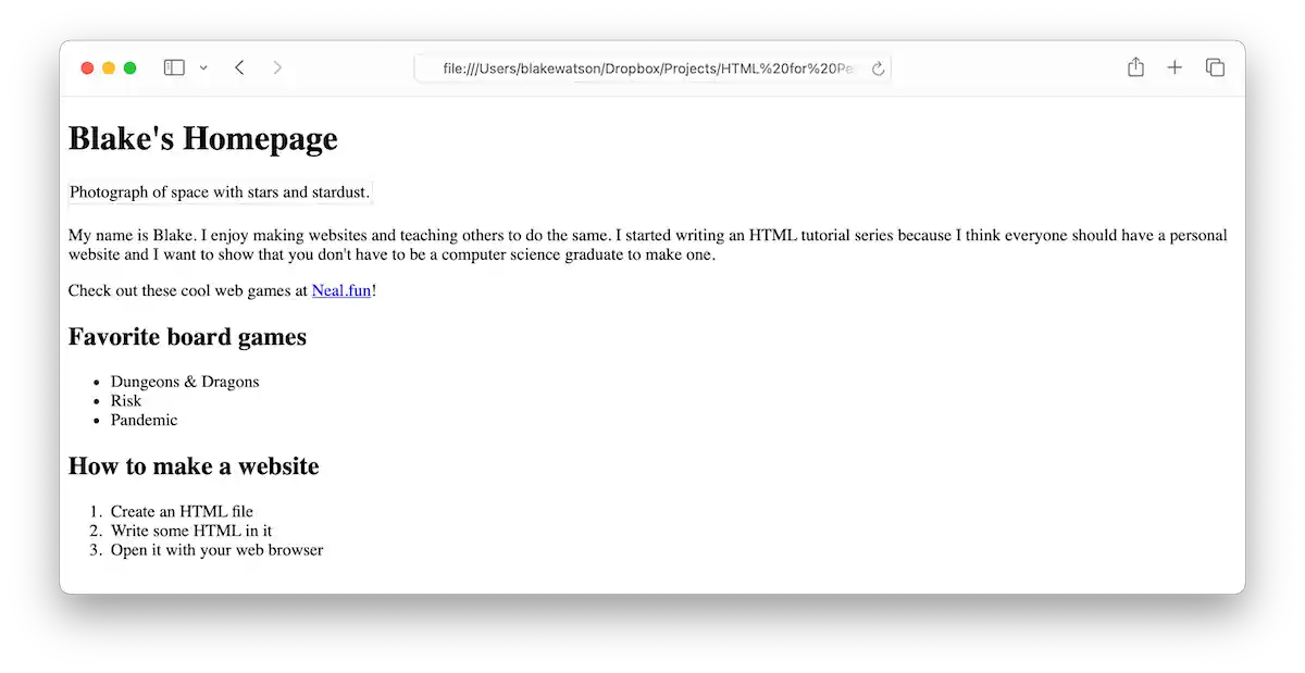
This is because we moved the space.jpg image file relative to our homepage. It’s now located in a folder called images. We can fix this by updating the image’s src value. Add the folder name and a slash before the filename.
<img src="images/space.jpg" alt="Photograph of space with stars and stardust.">Adding Simple.css to the page
We can add a stylesheet to our page similarly to how we added the image. We’ll use a <link> tag to reference the CSS file. We’ll put it in our site’s <head> tag.
<head>
  <title>Blake's Homepage</title>
  <meta charset="utf-8">

  <link rel="stylesheet" href="css/simple.css">
</head>
The <link> tag is self-closing—there isn’t a closing tag. We need to give it two attributes. rel specifies the relationship the file we’re linking has with our webpage. CSS files are called stylesheets so we provide that as the relationship (singular). The href is where we specify the file, including the folder path.
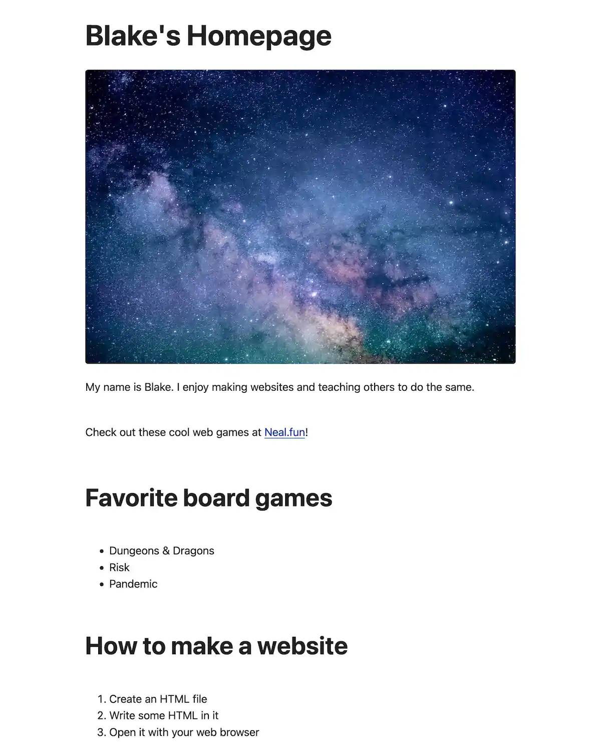
Just like that, our website transforms. We now see a centered page, larger text, and a sans-serif font.
Adding a header, footer, and main content
We can see that the Simple.css file took immediate effect. But things will look even better once we add some sections to our website that Simple.css expects—a <header> for the website’s title and <main> for the main content area. We didn’t use these earlier—they aren’t required—but using them is a best practice.
And this is totally optional, but we might as well add a <footer> too while we’re at it. Sometimes, people put copyright info here. Sometimes, people have large footers with lots of links to things. Sometimes, it’s just their name. I’ll keep it simple, but you can add what you want here.
So we’ll put our website’s name in a <header> tag and our main content in the <main> tag. Then, we’ll add a <footer> with a bit of info.
<body>
  <header>
    <h1>Blake's Homepage</h1>
  </header>

  <main>PAGE CONTENT GOES HERE</main>

  <footer>
    <p>Made with ❤️ and ☕️ by Blake Watson.</p>
  </footer>
</body>
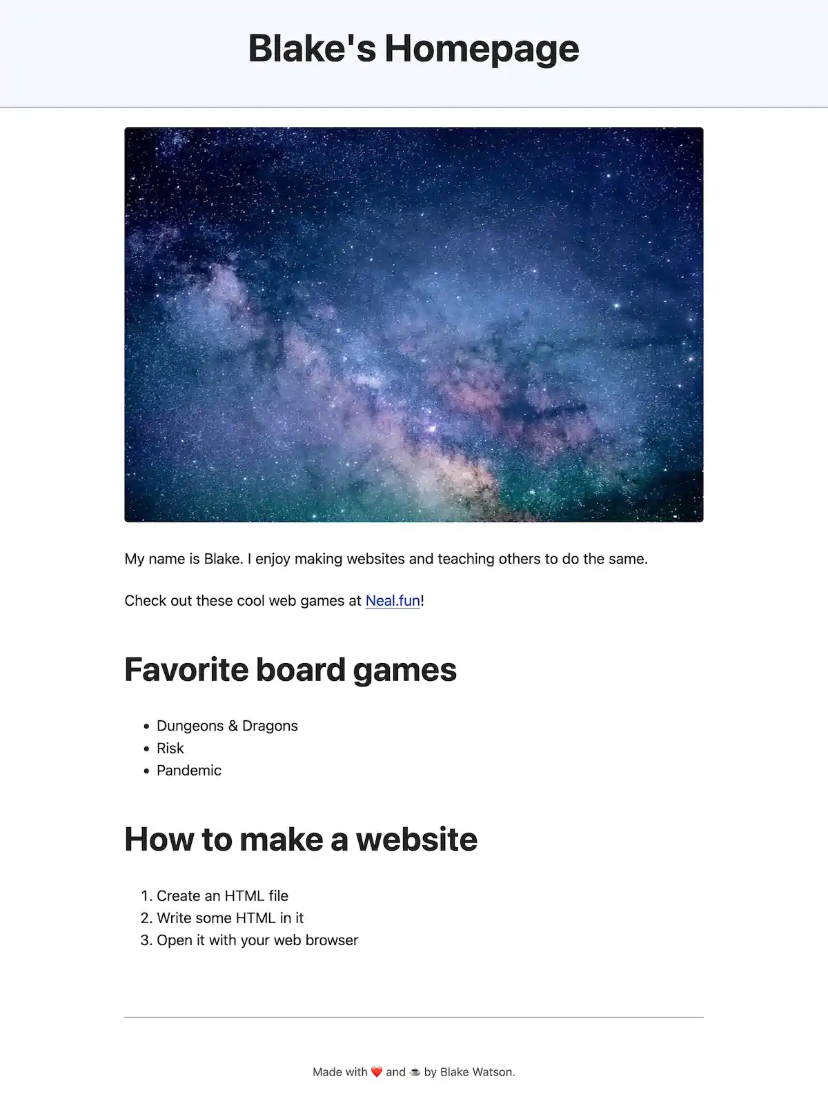
After these adjustments, our website title has some special styling, and paragraphs and lists are spaced more appropriately.
Update the live site
Let’s put our new stuff online! In Neocities, you can’t upload folders using the upload button. You either need to create the folder in the dashboard by clicking "New Folder, " or you can drag the folder from your computer to the drop zone.
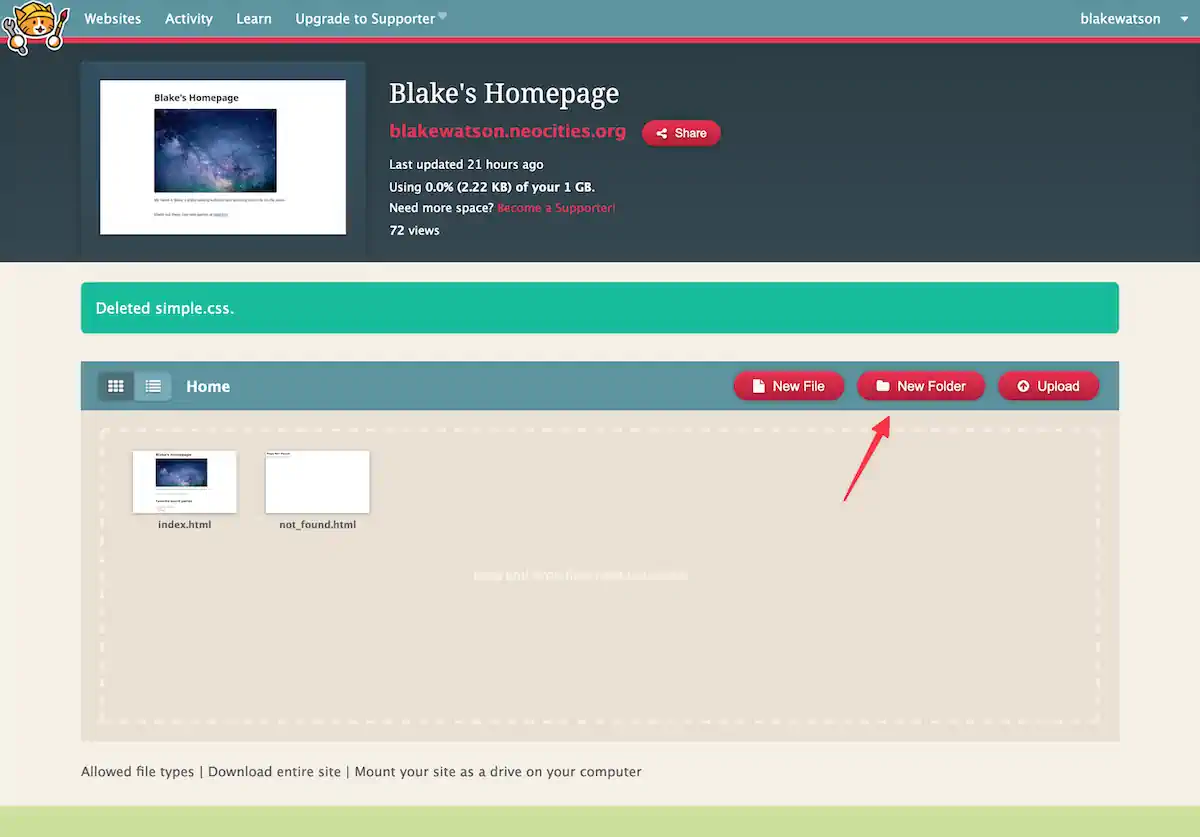
It’s probably easier to drag the folders over, but if you create them manually, you must open each folder and upload its contents. Once a folder is created, you can hover your mouse over it to see options. You’ll want to click “Manage” to open the folder. From there, you can click “Upload” to upload the appropriate files to that folder.
Move existing files by renaming them. For example, if I want to move space.jpg down into the images folder, I can click “Rename” and include the folder in the path: images/space.jpg.
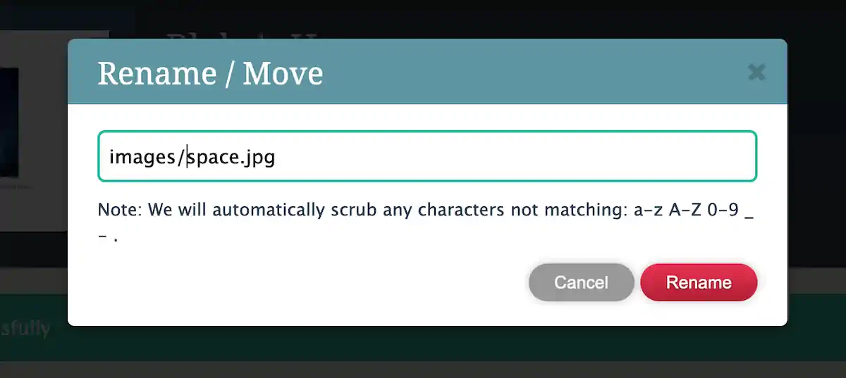
It’s cumbersome but not too bad. Whichever way you do it, ensure the files in Neocities match what you have on your computer.
Up next
We only added a little in terms of writing code in this chapter, but we set ourselves up for success by getting organized, acquiring some styles, and sectioning our webpage.
The rest of this web book will focus on building our website. In the next chapter, we’ll add an About page.
Adding an about page
For the rest of this book, we’ll expand our personal homepage into a complete website with multiple pages and a blog. The example will continue to be Blake’s Homepage, and the content will relate to me. You’ll want to customize things as necessary to fit what you want to see on your own website.
If you don’t want to build a personal homepage, that’s cool too! The concepts we cover apply to all kinds of websites, so you can follow along and adapt as necessary.
If you want a sneak peek, visit the complete demo of Blake’s Homepage.
It has the following pages and features:
- Header with navigation
- A blog with three posts
- About page with a photo
- A digital resume
- A fun page with embedded YouTube videos
I will include many code samples in the coming chapters, but you can also go to the demo site and view the source code of any page for reference at any point.
Pages are just files that you link to
We will create a new page on our site by creating a new file. Create about.html to go alongside index.html. To save some typing, copy all the contents of index.html and paste it into about.html.
And now, let’s clean it up a little. I’ll remove the “How to make a website” heading and the paragraph with the link to neal.fun. This page should be about me. Speaking of which, I’ll also change the image to a photo of myself (if you don’t feel comfortable using a picture of yourself, use any image you want here).
I’ll expand the content by adding a couple of paragraphs. This is also an excellent place to provide any contact information you want. I’ll add a link to my Mastodon account (with an elephant emoji).
<p>🐘 <a href="https://social.lol/@bw">Drop me a line on Mastodon</a></p>Remember, a link is an <a> tag. Whatever text you wrap the tag around becomes clickable. Then you provide the href attribute, which is the link’s destination—typically a URL.
Here’s my code inside the <body> tag.
<header>
  <h1>About Blake</h1>
</header>

<main>
  <img src="images/blake.jpg" alt="Photograph of space with stars and stardust.">

  <p>
    My name is Blake. I enjoy making websites and teaching others to do the same. I started writing an HTML web book because I think everyone should have a personal website and I want to show that you don't have to be a computer science graduate to make one.
  </p>

  <p>
    I'm a side project enthusiast and have put various sites, apps, and (bad) games into the world. My hobbies include web-related nerdery, D&D and board games, and writing. I like to participate in National Novel Writing Month, the annual novel-writing challenge
  </p>

  <p>🐘 <a href="https://social.lol/@bw">Drop me a line on Mastodon</a></p>

  <h2>Favorite board games</h2>

  <ul>
    <li>Dungeons & Dragons</li>
    <li>Risk</li>
    <li>Pandemic</li>
  </ul>
</main>

<footer>
  <p>Made with ❤️ and ☕️ by Blake Watson.</p>
</footer>
And this is what it looks like.
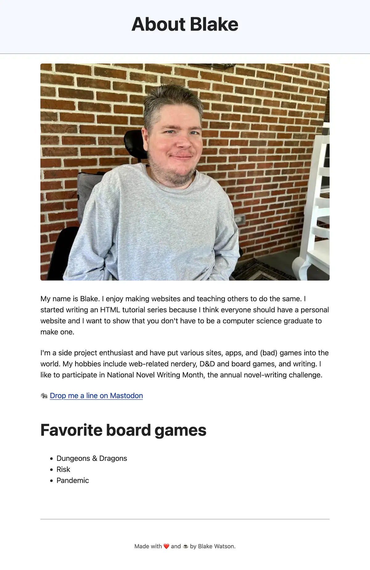
Surprise, that’s me! Anyway, this is looking like a proper about page. I admit it’s a bit contrived. You should feel free to write as much as you want here.
Navigating between pages
We have an About page now but need a way to navigate between our two pages. We need a navigation, or nav, menu. A nav menu is just a list of links. Simple.css seems to like the nav menu to sit above the header, so I’ll do that, although you could put it below instead.
HTML has a <nav> tag for exactly this purpose. We’ll put two links in our nav menu—one to the home page and one to the About page.
<header>
  <nav>
    <a href="index.html">Home</a>
    <a href="about.html" aria-current="page">About</a>
  </nav>

  <h1>About Blake</h1>
</header>
Since this is currently the About page, I’ve added a special attribute to the link. ARIA stands for Accessible Rich Internet Applications. We can make our site more accessible by adding the aria-current="page" attribute. It does a couple of things for us.
- It’ll make our page more accessible to assistive technologies like screen readers.
- Simple.css will style the link differently so it’s easy to tell which page we are on.

Let’s add the same nav menu to the home page. Open index.html and add the menu as we did on the About page. Since this is the home page, we should put the aria-current attribute on the Home link.
<header>
  <nav>
    <a href="index.html" aria-current="page">Home</a>
    <a href="about.html">About</a>
  </nav>

  <h1>Blake's Homepage</h1>
</header>
Load it up in the browser and marvel at your multi-page website! Click. Click. Click…
Homepage cleanup
Since we now have an About page, some of our homepage content is redundant. Some of this is on the About page. I’ll remove the bio text, the Neal.fun link, and the board games list. I will keep the space image and add a little welcome paragraph. I might as well keep the “how to make a website” list.
Although, speaking of the space image, let’s make it more interesting. I want to give this image a caption and link to where I got it. We can further mark up an image by wrapping it in a <figure> tag and including a <figcaption>.
<figure>
  <img src="images/space.jpg" alt="Photograph of space with stars and stardust.">

  <figcaption>
    Space is cool. <a href="https://unsplash.com/photos/blue-and-purple-galaxy-digital-wallpaper-E0AHdsENmDg">Photo source</a>
  </figcaption>
</figure>
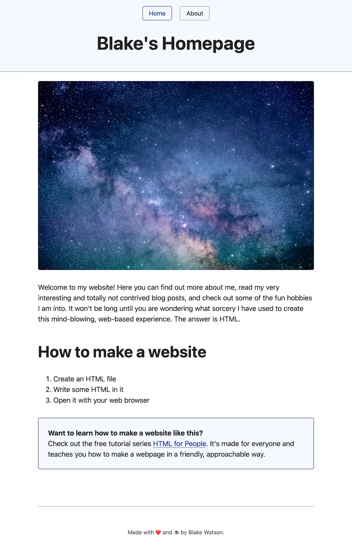
My <main> content on the homepage now looks like this.
<main>
  <figure>
    <img src="images/space.jpg" alt="Photograph of space with stars and stardust.">

    <figcaption>
      Space is cool. <a href="https://unsplash.com/photos/blue-and-purple-galaxy-digital-wallpaper-E0AHdsENmDg">Photo source</a>
    </figcaption>
  </figure>

  <p>
    Welcome to my website! Here you can find out more about me, read my very interesting and totally not contrived blog posts, and check out some of the fun hobbies I am into. It won't be long until you are wondering what sorcery I have used to create this mind-blowing, web-based experience. The answer is HTML.
  </p>

  <h2>How to make a website</h2>

  <ol>
    <li>Create an HTML file</li>
    <li>Write some HTML in it</li>
    <li>Open it with your web browser</li>
  </ol>

  <p class="notice">
    <strong>Want to learn how to make a website like this?</strong><br> Check out the free web book <a href="https://htmlforpeople.com/">HTML for People</a>. It's made for everyone and teaches you how to make a webpage in a friendly, approachable way.
  </p>
</main>
What is this class="notice"? You can learn more about classes in the bonus CSS chapters at the end of this book. But, in short, this will activate some styles provided by Simple.css to make a little box with some text in it.
Update the live site
If you want to. It’s also okay to keep working on it on your computer. Many websites are built that way—the person works on their website on their own computer until they are finished, then publishes it. But plenty of people also build their website in public, updating the live site as they go.
If you want to update it, head back to your Neocities dashboard and upload both index.html and about.html since those files have changed. If you added any images, you must click into the images folder in Neocities and upload them there (or you can drag the images folder onto the drop zone, which will replace the whole folder and contents).
Up next
We turned our webpage into a website! Next, we will add a blog and explore various HTML tags.
Adding a blog
Blogs are a huge part of the web. You’ve likely heard of several popular blogging platforms like WordPress, Tumblr, and Blogger. And there are tons of smaller indie blogging platforms.
But you don’t need one of these platforms to have a blog. A blog is just a series of posts in chronological order (typically reverse chronological with the newest posts first). We can totally do that with HTML!
I’ll add three blog posts. I won’t put all the code here in this chapter since that would be a bit wordy. You can check out the demo site to see the completed articles. But I will show you how to structure the files and review some of the different HTML tags we can use.
Create the blog home
Follow these steps to make the blog available at sitename.neocities.org/blog.
- Create a folder called
blog; inside it, create a file calledindex.html. - Copy the contents of one of your other pages and paste it into this new, empty
index.htmlfile. - Change the
<h1>to “Blog,” “My Blog,” or whatever you’d like to name it. - Change the
<title>to change what appears on the tab. For instance, “Blog - Blake’s Homepage.” - Clear out the main content so you have an empty
<main>tag. We’ll add content later.
Let’s open it in the browser and see how it looks.
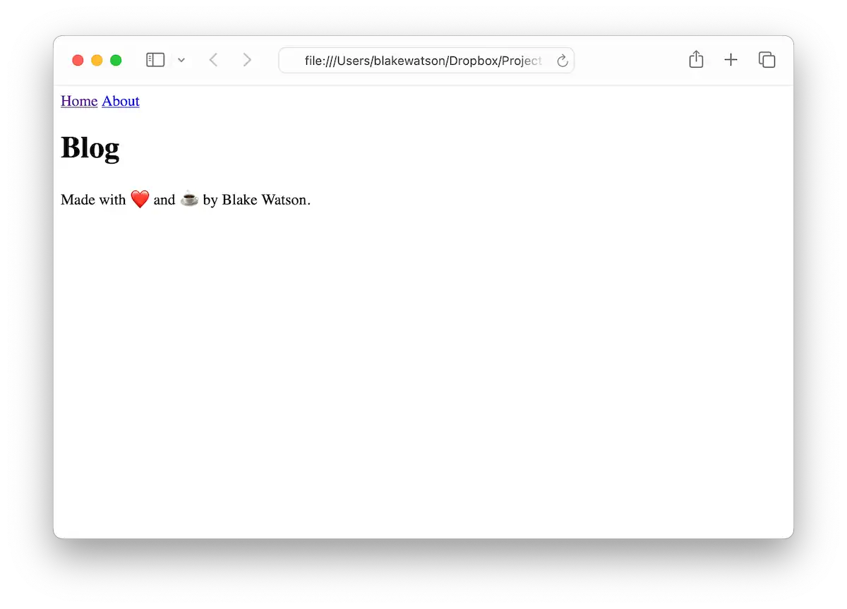
Whoa, we broke it; what happened!? It has to do with the file structure. Look at our <link> tag, where we added our Simple.css styles.
<link rel="stylesheet" href="css/simple.css">It’s looking for css/simple.css but can’t find it. Why? The path we gave it is relative to the current file. The current file is in the blog folder, so it looks for blog/css/simple.css, which doesn’t exist.
So, how do we refer to files that aren’t in the current folder? We can use the .. syntax like this.
<link rel="stylesheet" href="../css/simple.css">That means “move up one level, then look for css/simple.css.”
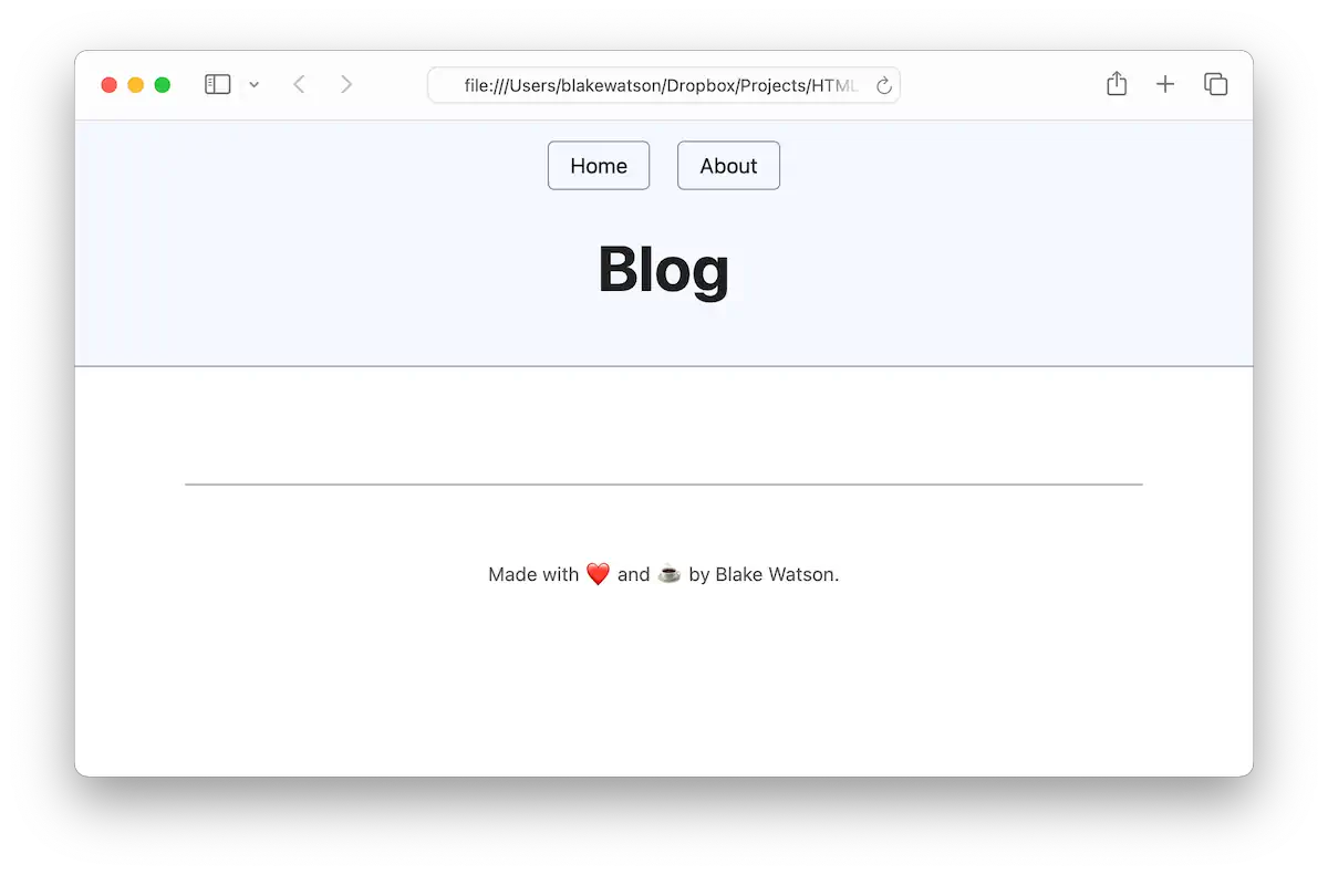
That’s better! Now, let’s update the navigation. Since the home page and the About page aren’t in the current folder, we’ll need to use the same .. syntax to link to them.
<nav>
  <a href="../index.html">Home</a>
  <a href="index.html" aria-current="page">Blog</a>
  <a href="../about.html">About</a>
</nav>
You’ll also need to update the navigation on the other pages to include a link to the blog. For example, the homepage nav should look like this.
<nav>
  <a href="index.html" aria-current="page">Home</a>
  <a href="blog/index.html">Blog</a>
  <a href="about.html">About</a>
</nav>Create the first post
I’m going to write a silly post about teaching a cat HTML. I’ll create a 2024-04-12-whiskers.html file in the blog folder. You can name your blog post file whatever you want. The nice thing about including the date is that, as you create more posts, they’ll appear in order on your computer’s filesystem.
As a starting point, we’ll copy the contents of blog/index.html into our new file. I’ll change the <h1> (and the <title>) to be the name of my article, “How I taught my cat to make a website with HTML.” I will also modify the navigation. We aren’t on the Blog listing page, so it’s inaccurate to say aria-current="page" on the blog nav link. But it is within the Blog section of the site. So I will change the attribute to the more general aria-current="true". This is only for individual blog post pages.
<nav>
  <a href="../index.html">Home</a>
  <a href="index.html" aria-current="true">Blog</a>
  <a href="../about.html">About</a>
</nav>
I’ll add a link back to the blog at the end of the post. Since we’re already in the blog folder, linking to index.html is all we need to reach the blog home.
<a href="index.html" class="button">← Back to the blog</a>The class="button" bit is a style that Simple.css provides that makes a text link look like a button. The ← is a special code called an HTML entity. They are used for encoding special characters. This particular one is a left arrow. You can see a list of other entities here.
I’ll add three blog posts dated a few days apart, just for example purposes. When I’m done, I’ll have these posts.
- How I taught my cat to make a website with HTML
- The time I built a website for aliens
- Why donuts are the best thing ever
My file structure will look like this:
blog2024-04-12-whiskers.html2024-04-15-aliens.html2024-04-20-donuts.htmlindex.html
csssimple.css
imagesblake.jpgspace.jpg
about.htmlindex.html
Text formatting
Let’s see some tags you can use in your blog posts and other pages.
For bold and italics, we can use the tags <strong> and <em>, respectively.
<p>
  After just three days, <strong>Whiskers can now create web pages</strong> better than <em>I</em> can!
</p>
Which would render like this.

Block quotes
We can use the <blockquote> tag to quote a person, a book, another website, or even ourselves.
<blockquote>
"HTML is <strong>elementary</strong> my dear Watson."<br>
<cite>— Whiskers, probably</cite>
</blockquote>Here, I’m using <strong> to give extra emphasis. I’m using the <cite> tag to display the source of the quote. The self-closing <br> tag creates a manual line break, which pushes the <cite> element to the following line. I used another special character, —, to create an em dash.

Block quotes are typically styled as indented blocks of text, often with a border or background color for extra emphasis. The above image shows how Simple.css styles them (unless noted otherwise, all of the example images I post are HTML styled with Simple.css).
Recap: headings and lists
We covered these briefly in Chapter 2, Add content to your website, but it’s worth recapping. Our blog posts already use the topmost heading, the <h1>, but if you’re writing a blog post that needs more headings, that’s totally fine!
Headings in HTML are hierarchical, meaning <h2> headings should follow <h1> headings, <h3> headings should follow <h2> headings, and so on. Technically, HTML gives us six heading levels—<h1> through <h6>. But moderation is key here. Ask yourself if you’re really making your page easier to understand by adding so many levels of headings. My advice is to stick with three levels or less.
And, of course, we have lists. We covered these in Chapter 2, but let’s look at them again. You’ve got two options here—a bulleted list (called unordered) and a numbered list (called ordered).
Here’s a bulleted or unordered list using the <ul> tag for the list and <li> for each list item.
<ul>
  <li>Bread</li>
  <li>Sugar</li>
  <li>Hole</li>
</ul>
Which renders like this.
- Bread
- Sugar
- Hole
And here’s a numbered or ordered list (with some bolded points for emphasis).
<ol>
  <li>
    <strong>Portable Happiness:</strong> Donuts are the perfect grab-and-go
    food. You can take them anywhere: to work, to the park, or on a road trip.
    They're like little circles of happiness that fit in your hand.
  </li>
  <li>
    <strong>Instant Mood Boost:</strong> Feeling down? Have a donut. It's
    scientifically proven* that donuts can turn a frown upside down. (*Not
    actually proven, but we all know it's true.)
  </li>
  <li>
    <strong>Endless Creativity:</strong> Donut shops are constantly coming up
    with new and exciting flavors. From maple bacon to matcha green tea, the
    possibilities are endless. It's like a delicious adventure every time you
    visit.
  </li>
</ol>
Here’s how that looks.
- Portable Happiness: Donuts are the perfect grab-and-go food. You can take them anywhere: to work, to the park, or on a road trip. They’re like little circles of happiness that fit in your hand.
- Instant Mood Boost: Feeling down? Have a donut. It’s scientifically proven* that donuts can turn a frown upside down. (*Not actually proven, but we all know it’s true.)
- Endless Creativity: Donut shops are constantly coming up with new and exciting flavors. From maple bacon to matcha green tea, the possibilities are endless. It’s like a delicious adventure every time you visit.
You can even nest lists like this.
<ul>
  <li>
    First main point
    <ul>
      <li>Sub point</li>
      <li>Another sub point</li>
    </ul>
  </li>

  <li>
    Second main point
    <ul>
      <li>Sub-point</li>
      <li>Another sub-point</li>
    </ul>
  </li>
</ul>
That would render something like this.
- First main point
- Sub point
- Another sub-point
- Second main point
- Sub point
- Another sub-point
Breaking up content
One of the ways we can manually add space between elements is the <br> tag or break tag. The break tag adds a line break. For example, consider this haiku (by Robert Cole).
<p>
  A timeless red orb
  floats lazy in the ether
  unimpressed by war.
</p>
By default, the browser will render everything on one line and ignore most whitespace in your HTML.

On the one hand, this is a good thing—it means we can format our code how we want without our visitors seeing a ton of line breaks and indentation on the page that we didn’t intend. But sometimes, we do want actual line breaks.
We can fix our haiku by putting a couple of <br> tags in there.
<p>
  A timeless red orb<br>
  floats lazy in the ether<br>
  unimpressed by war.
</p>
This is helpful in small doses but use it sparingly. Most of the time, spacing between elements should be controlled with CSS—by applying margin or padding, for example. Fortunately, our Simple.css stylesheet has good default spacing. We’ll cover using CSS for customized spacing in the bonus chapter at the end of this book.
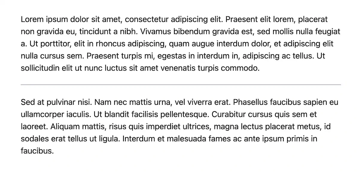
Another way to manually break up content is to use a horizontal rule, or <hr> tag. It’s typically styled as a horizontal line. This can be helpful when you want to separate content—like a new section or a new scene, in the case of a story. Here’s what it can look like.
Code and pre-formatted text
I’ve been using these tags a lot on the pages you’ve been reading in this book. Consider this paragraph:
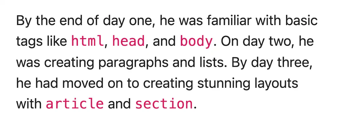
<p>
  By the end of day one, he was familiar with basic tags like <code>html</code>,
  <code>head</code>, and <code>body</code>. On day two, he was creating
  paragraphs and lists. By day three, he had moved on to creating stunning
  layouts with <code>article</code> and <code>section</code>.
</p>
That will display the code bits in a monospaced font and a different color, like this.
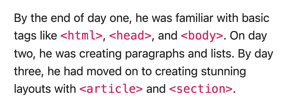
You’ve seen me include the less-than (<) and greater-than (>) symbols in my code elements on the pages of this book (like this, <a>). That takes a little bit of extra work. Like if I want to mention an <a> tag, I can’t simply write <code><a></code> because the browser will think I’m trying to make a literal link inside the <code> tag. To include the less-than and greater-than symbols (sometimes called “angle brackets”), we’ll need the HTML entities < and >, respectively. That will tell the browser we want to render the actual symbols.
<p>
By the end of day one, he was familiar with basic tags like
<code><html></code>, <code><head></code>, and
<code><body></code>. On day two, he was creating paragraphs and lists.
By day three, he had moved on to creating stunning layouts with
<code><article></code> and <code><section></code>.
</p>That gives us the following.
As we saw earlier, when rendering your content, the browser ignores most of the whitespace in your code. But sometimes, you want to preserve the exact spacing and line breaks. A fun example is ASCII art, which is when you make art with plain text characters.
    ___       ___       ___       ___
   /\__\     /\  \     /\__\     /\__\
  /:/__/_    \:\  \   /::L_L_   /:/  /
 /::\/\__\   /::\__\ /:/L:\__\ /:/__/
 \/\::/  /  /:/\/__/ \/_/:/  / \:\  \
   /:/  /   \/__/      /:/  /   \:\__\
   \/__/               \/__/     \/__/
The above should appear as the letters “HTML” using a 3d effect. It works because it uses a monospaced font and preserves all the whitespace. How did I do it? I used the <pre> tag, which is for pre-formatted text. Use it like this.
<pre>
    ___       ___       ___       ___
   /\__\     /\  \     /\__\     /\__\
  /:/__/_    \:\  \   /::L_L_   /:/  /
 /::\/\__\   /::\__\ /:/L:\__\ /:/__/
 \/\::/  /  /:/\/__/ \/_/:/  / \:\  \
   /:/  /   \/__/      /:/  /   \:\__\
   \/__/               \/__/     \/__/
</pre>
If you’d like to play with more ASCII text art, check out this text art generator.
Asides
The <aside> tag is fun since Simple.css styles it in an interesting way. These are useful for callouts or asides to the main content. For example, I included an aside that lists ingredients in my blog post about donuts.
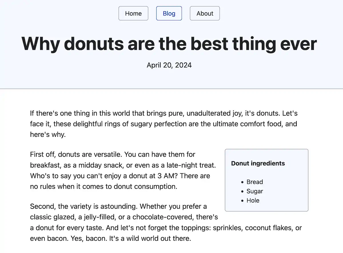
Simple.css will style the aside as a rounded box and shift it to the side. This is a neat way to add extra notes or secondary content to a page.
Mark, strikethrough, deletion, insertion
Here are some more text formatting tags for you. Use <mark> to highlight text. If you want strikethrough unwanted text, wrap it in the <s> tag. If you want to explicitly show edits to a document, prefer the <del> tag for indicating a deletion and the <ins> tag to show inserted text. For example, this is from my donut post.

Fill out our blog index page
Okay, we’ve covered a variety of tags you can use to mark up different types of content. You can take some time and play with these. There’s no rush! I’ll be right here when you’re ready. Once you have two or three blog posts, let’s put them on the main blog page.
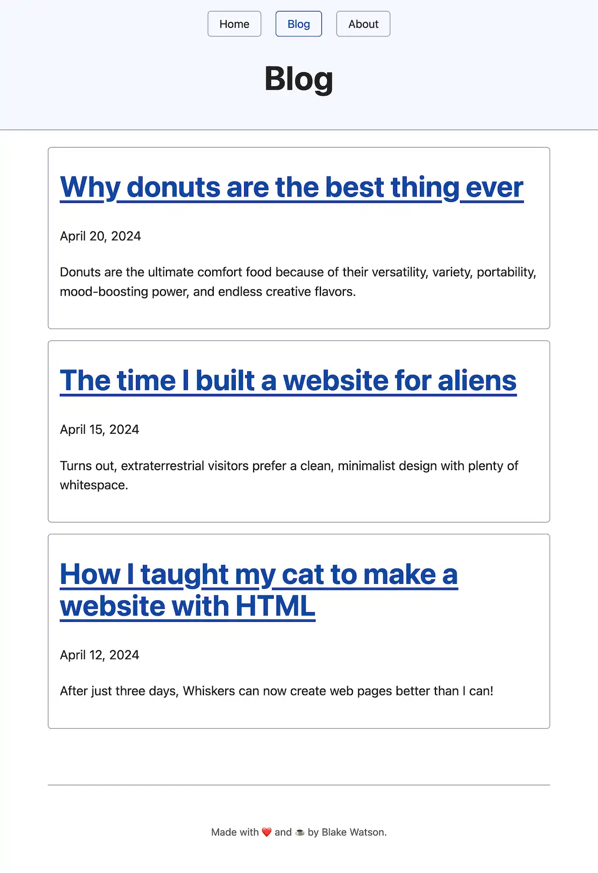
If you open blog/index.html, it looks a bit empty. We’ll fix that now by displaying the title of each blog post, the newest first, the publish date, and a one-sentence summary. Clicking the title of a blog post should take the reader to it.
Let’s use the <article> tag for each one because each represents an independent composition. As a bonus, Simple.css will style these as cards. Let’s use <h2> for the blog post title, inside of which we will put a link (the <a> tag). We’ll use the time tag for the date. We’ll use a regular paragraph, or <p> tag, for the summary. The final markup looks like this.
<main>
  <article>
    <h2>
      <a href="2024-04-20-donuts.html">
        Why donuts are the best thing ever
      </a>
    </h2>
    <p><time datetime="2024-04-20">April 20, 2024</time></p>
    <p>
      Donuts are the ultimate comfort food because of their versatility,
      variety, portability, mood-boosting power, and endless creative flavors.
    </p>
  </article>
</main>
The link in the header will take an href attribute, the link’s destination. Since we’re already in the blog folder, we can use the blog post filename as the destination.
We’re using the <time> tag to provide a machine-friendly version of the date. That could be useful for search engines searching your site or supporting potential browser features that rely on dates. The <time> tag takes an attribute called datetime where you can provide the machine-readable version.
Add an <article> like the above for each blog post you want to link to. You will end up with something like this.
A table of the (HTML) elements
Phew! We covered quite a few tags and added a lot of content during this chapter. It can be a lot to remember. If you ever need to look up how to use a particular HTML tag—or if you want to see what HTML tags are available to you—check out this handy HTML elements reference on MDN. MDN is more or less the official user manual of the web. Just search for any tag, attribute, or concept you want to know more about.
Update the live site (optional)
If you want to upload your changes to Neocities, follow the same process as in previous chapters. Drag and drop the blog folder onto the drop zone to upload the entire folder simultaneously. Since you have updated the nav menu across all pages, you’ll also want to re-upload the Home and About pages.
Of course, you can also keep working locally instead of uploading your progress now. It’s up to you!
Up next
Phew, we’ve finished our whirlwind tour of adding a blog with various tags! Next, we’ll slow our pace and focus on page structure by adding a resume page you can share with potential employers.
Adding a resume (or CV)
In the previous chapters, we’ve learned how to add all sorts of content to our HTML pages. Now, we’ll look at how to add structure to a large page of content. We’ll add a resume page.
Now, a resume is going to look different for different people. If you’re in academia (or not in the US), you might create a curriculum vitae. People who have worked for many years may have an extensive resume, while students in school may not have much of a work history.
Don’t worry if you don’t have a lot of experience. You can add sections highlighting your education, particularly degrees, coursework, and school activities. Or you can focus on part-time or volunteer work you’ve done.
Another option is to make it less like a resume and more like a portfolio of projects if that’s more applicable to you. You can include any relevant skills you have (like HTML!). Try a web search for resume tips. The web is full of resume advice for people at different points in their careers.
But if you’re not feeling the whole resume thing, that’s okay, too. Feel free to take the markup ideas we explore here and use them however you want. It’s your website, and it’s important that you enjoy making it.
Create the resume file
Create a top-level file, resume.html, and copy the contents of one of the other top-level pages into it.
However you go about creating the file, be sure to update the <title>, <h1>, and <nav>. I will put my name as the <h1> and my profession/summary below it in a <p> tag.
<header>
  <nav>
    <a href="index.html">Home</a>
    <a href="blog/index.html">Blog</a>
    <a href="about.html">About</a>
    <a href="resume.html" aria-current="page">Resume</a>
  </nav>

  <h1>Blake Watson</h1>
  <p><em>Experienced Frontend Engineer</em></p>
</header>
A document with sections
A resume is often divided into sections, the common ones being experience, education, and skills. HTML gives us a tool for creating a generic section of a document—the <section> tag. Each section should have a heading per the docs.
It’s worth noting that it’s okay to use only headings here, too, if you want. I’m opting for the <section> tag to give you an example of how to use it and because Simple.css styles them with nice spacing and dividers between them.
I’ll be creating the following sections. But remember, you can have more or less as needed, and they don’t need to be the same as mine or in the same order.
- Skills
- Experience
- Selected projects
- Education
Skills
For this, I will list my relevant skills in short bullet points. I’ll use a level 2 heading, and I’ll wrap the entire thing in a <section>.
<section>
  <h2>Skills</h2>

  <ul>
    <li>HTML / CSS</li>
    <li>JavaScript</li>
    <li>Web standards / accessibility</li>
    <li>TypeScript</li>
    <li>Vue</li>
    <li>PHP</li>
    <li>Sass</li>
    <li>Electron</li>
    <li>Sketch</li>
  </ul>
</section>
Which renders like this.
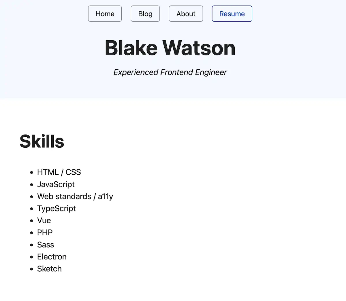
It’s a clean, bulleted list. That said, I feel there’s a bit of wasted space. It would be nice if we could split it into columns. There isn’t a strictly HTML way to do it, but I think it’s worth using a little CSS here to do the trick.
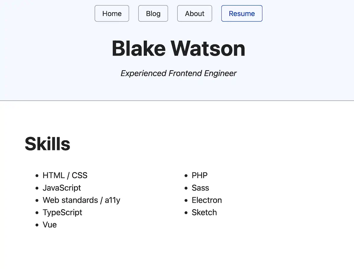
You’ve seen several tags using attributes by now. Every page of our site has links via the <a> tag, and each link has an href attribute, for example. Another handy attribute is style. It allows us to apply CSS directly to an HTML element. I’ll cover CSS a bit more in the bonus chapters at the end of this book, but for now, let’s use the style attribute to split the list into columns.
<section>
  <h2>Skills</h2>

  <ul style="columns: 2">
    <li>HTML / CSS</li>
    <li>JavaScript</li>
    <li>Web standards / accessibility</li>
    <li>TypeScript</li>
    <li>Vue</li>
    <li>PHP</li>
    <li>Sass</li>
    <li>Electron</li>
    <li>Sketch</li>
  </ul>
</section>
That gives us a more pleasing and space-efficient list.
Experience
I’m not a resume expert, but I think I’ll put my work experience next, as it’s probably what a potential employer in my field is most interested in. This will be different if you don’t have much experience or feel that education or other qualifications are more relevant.
Marking up content is as much an art as a science. There’s no single right way to do it. A guiding principle for choosing what tags to use is to ensure that the choices are meaningful and not based solely on appearance.
For example, you might be tempted to use an <h6> somewhere on your page because you want a tiny heading. But unless that heading is six heading levels deep, <h6> isn’t the best choice.
I’ll show you what markup I chose and what it looks like and then explain it.
<section>
<h2>Experience</h2>
<h3>Frontend Engineer</h3>
<p>
<strong>MRI Technologies</strong><br>
<time datetime="2019-08">August 2019</time>–Present
</p>
<ul>
<li>Build and maintain a spacesuit management app for NASA</li>
<li>
Build and maintain a document management system for Collins Aerospace
</li>
<li>Create reactive frontends with Vue, REST APIs, and GraphQL</li>
</ul>
<!-- ...the rest of the jobs go here -->
</section>That gives us a section that looks like this.
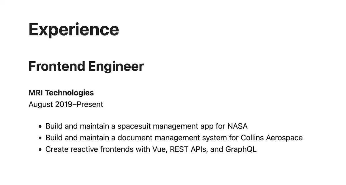
I will list several job roles I’ve had, so I’m using the position title as a heading (level 3, since it comes under the level 2 heading of Experience). Next, I want to display the employer and the time period. I chose to use a single paragraph to display these together. I’m using a manual line break to push the time range to the second line.
Another way to do it is to put the employer’s name in the heading after the job title. I don’t think one way is more correct than the other, and I prefer to reduce the amount of large text on the page.
We wrap the date in a <time> tag and provide the machine-readable date in the datetime attribute. I’m using an HTML entity, – to put a dash between the start and end dates. This is to use the en dash character, which is a slightly longer dash than a regular hyphen (-) and is used for numeric ranges in typography.
Finally, I use an unordered list to provide bullet points about my role and responsibilities.
I’ll go ahead and add the rest of my work experience. I’ll add the complete code for that at the end of the chapter. You can also check out the demo resume and view the source.
Selected projects
Moving on to the next section, I’d like to draw some attention to selected projects I’ve worked on. This is a resume version of a portfolio—a place where I can show websites I’ve made and link to them if applicable. Printed resumes are typically text-based, but since this is a webpage, you could include an image or two in this section.
For these projects, I’ll use the <h3> tag for the project title and put a paragraph description with it. If the project is live on the web, I’ll link to it. Here’s an example.
<section>
  <h2>Selected projects</h2>

  <h3>Mississippi Gulf Coast Community College</h3>

  <p>
    I worked on this website in my role as designer and developer at Mad Genius. I built out several of the dynamic, data-intensive sections like the searchable course catalog and the comprrehensive "A to Z" index. These sections made heavy use of reactive UI, third-party API integrations, and custom WordPress plugin development.
  </p>

  <p><a href="https://mgccc.edu/">mgccc.edu</a></p>

  <!-- ...the rest of the projects go here -->
</section>
Education
Finally, I’ll add my degrees, university, year of graduation, and study area. I use simple paragraphs with <strong> for emphasis and <br> for manual line breaks.
<section>
  <h2>Education</h2>

  <p>
    <strong>Master of Business Administration</strong>, <time>2009</time><br>
    <em>Mississippi State University, Starkville, MS</em>
  </p>

  <p>
    <strong>Bachelor of Business Admiinistration</strong>, Information Systems,
    <time>2007</time><br>
    <em>Mississippi State University, Starkville, MS</em>
  </p>
</section>
Complete example
Here’s the complete code, including the header and main content areas.
<header>
<nav>
<a href="index.html">Home</a>
<a href="blog/index.html">Blog</a>
<a href="about.html">About</a>
<a href="resume.html" aria-current="page">Resume</a>
</nav>
<h1>Blake Watson</h1>
<p><em>Experienced Frontend Engineer</em></p>
</header>
<main>
<section>
<h2>Skills</h2>
<ul style="columns: 2">
<li>HTML / CSS</li>
<li>JavaScript</li>
<li>Web standards / a11y</li>
<li>TypeScript</li>
<li>Vue</li>
<li>PHP</li>
<li>Sass</li>
<li>Electron</li>
<li>Sketch</li>
</ul>
</section>
<section>
<h2>Experience</h2>
<h3>Frontend Engineer</h3>
<p>
<strong>MRI Technologies</strong><br>
<time datetime="2019-08">August 2019</time>–Present
</p>
<ul>
<li>Build and maintain a spacesuit management app for NASA</li>
<li>Build and maintain a document management system for Collins Aerospace</li>
<li>Create reactive frontends with Vue, REST APIs, and GraphQL</li>
</ul>
<h3>Web Developer/Interactive Designer</h3>
<p>
<strong>Mad Genius</strong><br>
<time datetime="2015-05">May 2015</time>–<time datetime="2019-08">August 2019</time>
</p>
<ul>
<li>Sketching, prototyping, and UI design</li>
<li>WordPress theme and plugin development</li>
<li>Reactive UI with Vue and Knockout</li>
<li>Third-party API integrations</li>
</ul>
<h3>Web Developer</h3>
<p>
<strong>Self employed</strong><br>
<time>2007</time>–<time>2015</time>
</p>
<ul>
<li>Communicated with clients</li>
<li>Developed usable, standards-based websites</li>
<li>Made responsive websites</li>
<li>Volunteered on many non-profit projects</li>
</ul>
</section>
<section>
<h2>Education</h2>
<p>
<strong>Master of Business Administration</strong>, <time>2009</time><br>
<em>Mississippi State University, Starkville, MS</em>
</p>
<p>
<strong>Bachelor of Business Admiinistration</strong>, Information Systems, <time>2007</time><br>
<em>Mississippi State University, Starkville, MS</em>
</p>
</section>
</main>You can see how this looks on the demo site, but here’s a full-page screenshot.

Up next
We’ve been creating a lot of content. In the next chapter, we’ll take an intermission and look at how we can run a web server on our computer that more closely resembles a live website.
Intermission: installing a local web server
HTML is an approachable language, which was one reason I wanted to make this web book. It’s forgiving. If you remember the first chapter—that first website we made that was just a sentence or two—you’ll recall that we didn’t use a single HTML tag. But we could still open the file in the browser and see our content. We put that file on the web, and it worked! You can start simply and layer on the complexity as needed.
We’re now at one of those points. In the next chapter, we’ll create a fun page with jokes, tabletop gaming resources, and embedded YouTube videos.
Unfortunately, YouTube videos won’t work with the way we’ve been previewing our site—opening HTML files with the web browser. For the most part, that’s a perfectly okay way to preview HTML. But in cases where we are fetching data from other websites—like streaming video—we’ll need to mimic a real-life web server.
A web server is a program that makes a website available at an address. When you visit that address with a web browser, you get the website. We’ll install and run one of these so that our website is available at a local address—that is, one that’s only accessible to our computer, not everyone on the internet.
I’ll give you several options based on the operating system and technical knowledge needed. So you don’t need to read everything. Use the links below to jump to the section that applies to you.
- Visual Studio Code (cross-platform)
- macOS
- Windows and cross-platform
- Python and PHP (cross-platform)
Visual Studio Code (cross-platform)
Microsoft publishes a VS Code extension called Live Preview. It runs your site on a local web server and auto-refreshes as you change it. You can install it from that link or click the extensions icon and search for it.
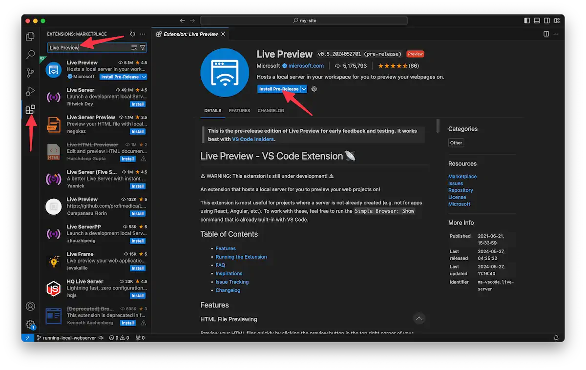
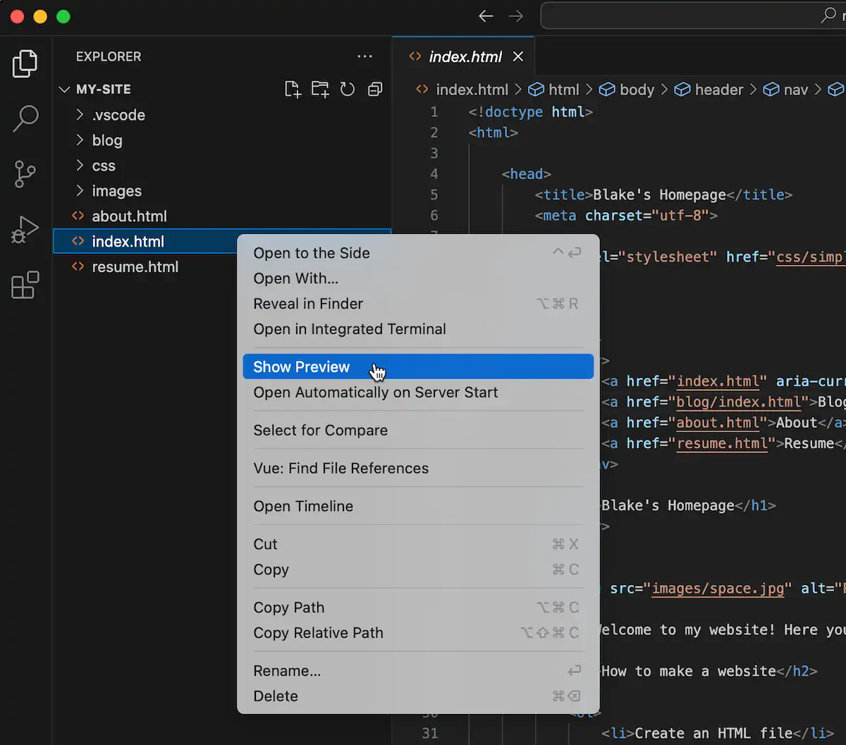
Once installed, you’ll notice a Show Preview option when you right-click a file.
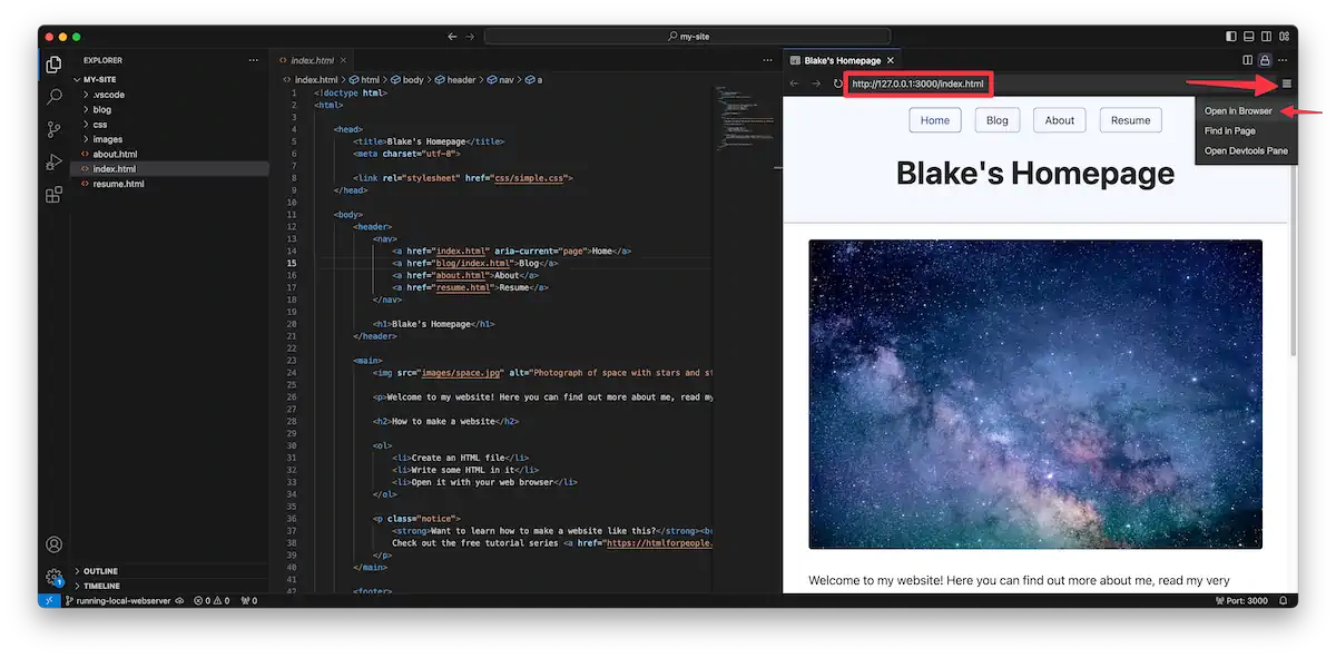
Clicking it will open a side panel with a web view at a local address. You can either use that preview, open it in the browser by navigating to the address, or click Open in Browser in the address bar menu.
macOS
I’m a Mac user myself, so I can highly recommend the excellent WorldWideWeb app. It’s free for our purposes but has a Pro upgrade that will automatically reload the page when you make changes.
It works by telling it your website folder and then clicking the play button.
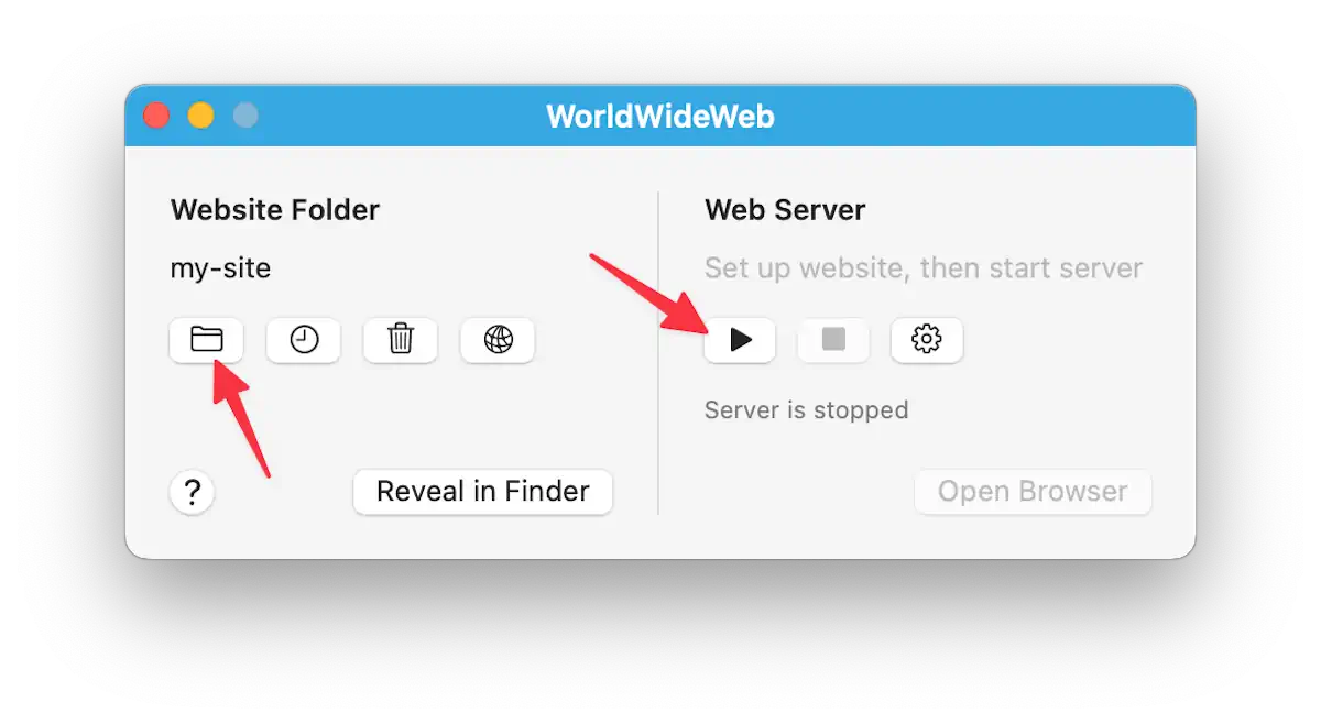
Once you click the play button, your site will be available at some address. Click Open Browser to visit that URL in your default browser.
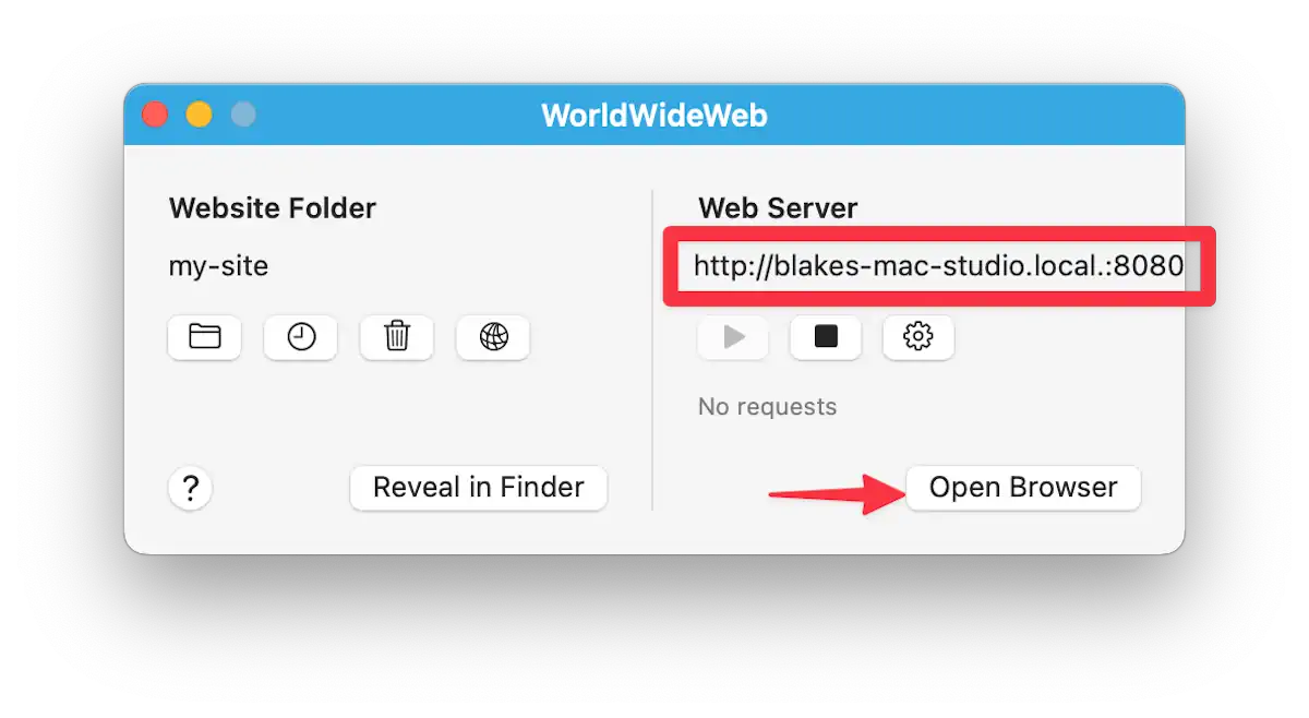
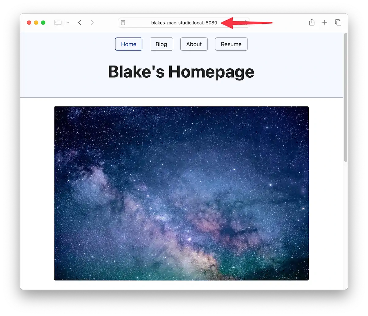
And now notice that we’re seeing our site at our shiny new web address.
Windows and cross-platform
For Windows users, I have two options for you. If you’re using Visual Studio Code, I recommend jumping to that section and checking out Microsoft’s Live Preview extension.
Otherwise, try Simple Web Server. Once you’ve installed it, you can click the button to create a new server.
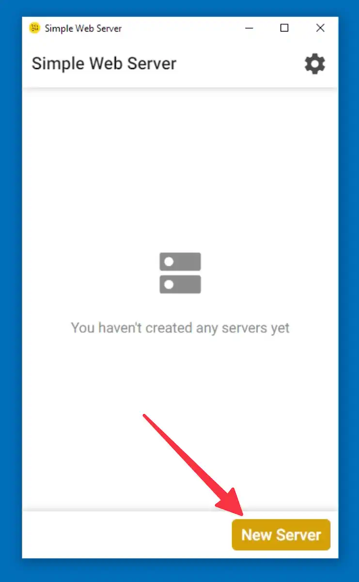
You can then point it to your website folder by clicking the folder icon button and selecting the appropriate folder.
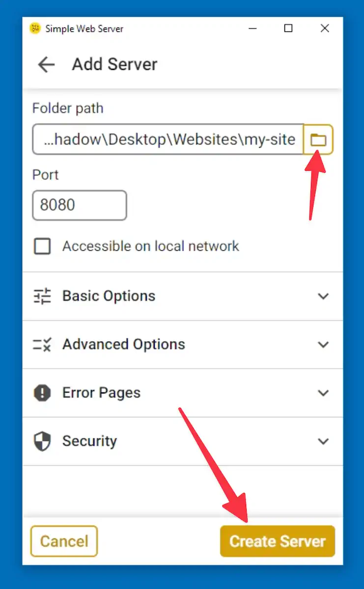
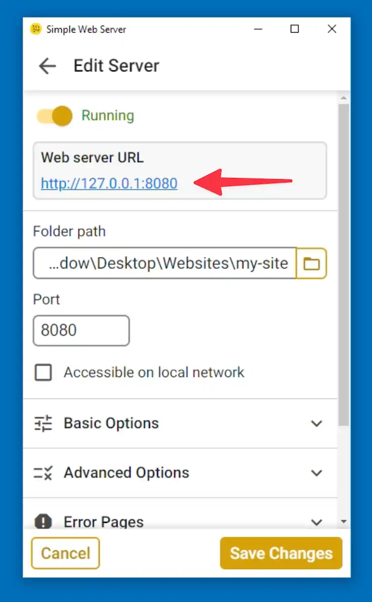
Once you have created the server, you’ll see it in the server list. Click it to open it. From there, you’ll see the URL where your site is available, and you can click the link to open it in your default browser.
Python and PHP (cross-platform)
This is a more technical option. You don’t have to be an elite hacker, but you will need to run a command-line program from your terminal app.
Python
If you don’t have either on your machine, Python is the easiest to set up. Go to the Python downloads page and download the installer for your system (get version 3).
Open a terminal window and cd to your website directory. Then, run this command to start the Python development server.
python3 -m http.serverThis will make your site available at localhost on whatever port it specifies (usually 8000). So your site address would be http://localhost:8000.
PHP
Installing PHP is out of scope for this book, but it’s available for nearly all systems. PHP was born as a website technology and, as I’ll discuss in a bonus chapter, PHP is handy for reusing HTML snippets (like the nav menu) across multiple pages.
If PHP is on your system, you can run the PHP development server similarly to the Python example above.
php -S localhost:8000This will make your site available at http://localhost:8000.
Relative vs. absolute URLs
Thus far, since we’ve been opening our website files directly in the browser, we’ve needed to use relative URLs. Relative URLs are written from the perspective of the current file. For example, if I am on a sub-page and want to link to a top-level page, I need to use the .. syntax to “move up” a level and find the destination page.
When running a web server, we can use absolute URLs. An absolute URL is always written from the perspective of the topmost level (the topmost level meaning the folder that we told the web server to use). No matter what sub-page I’m on, I could link to the website homepage as follows.
<a href="/">Go to the homepage</a>The slash represents the topmost level (I could also have written /index.html but that isn’t needed because web servers will automatically use it if it exists). If I wanted to link to the about.html page, I could do that as follows.
<a href="/about.html">Go to the About page</a>The cool thing is that it doesn’t matter what page I’m on—it can be a top-level page or a sub-page. This path will always lead to the About page, no matter where the current page is. Say we’re on a page that’s nested down in a folder.
<!-- imagine we are currently on a blog page /blog/my-post.html-->
<h1>My blog post</h1>

<!-- instead of this, which *does* work -->
<a href="../about.html">About</a>

<!-- we can do this -->
<a href="/about.html">About</a>
We didn’t use absolute URLs earlier because we weren’t using a web server. Had we tried to use absolute URLs when opening our website directly in the browser, the slash would have pointed toward the top-level folder of your entire computer, which is certainly not what we wanted.
Now that we’re using a web server, I’ll leave it up to you if you’d like to go back and change all the paths, but it does make copying and pasting the menu easier. Creating links between pages is more straightforward when using absolute URLs.
Up next
Now that we have a local web server, our website can interact more easily with other websites. Next, we’ll make a page with assorted fun stuff, including embedded videos from YouTube!
Adding a fun page
Alright, it’s time for some fun! Well, hopefully, all of it has been fun. But I still want to show you a handful of things you can do with HTML. I’ve saved this page for last because we’ll use some of the more complex HTML tags.
Create the file
Let’s create fun.html at the top level of the site folder. Use content from the homepage as a starting point, then change the <title> and <h1> to Fun or similar. Clear out the contents of the <main> tag.
Now, we’ll divide this page into multiple sections similar to the resume.
Jokes
First up, let’s add a section for some jokes.
<section>
  <h2>Jokes</h2>

  ...Jokes will go here
</section>
The idea is to show the setup of the joke but hide the punchline behind a click. You can demo the live version here. We’ll use the <details> and <summary> elements to achieve this behavior. They work like this.
<details>
  <summary>This content will show up by default</summary>

  <p>
    Clicking the above content will cause this hidden content to become visible.
  </p>
</details>
Here’s a video demo of this element in action.
I’m going to add three admittedly corny jokes.
<section>
  <h2>Jokes</h2>

  <details>
    <summary>Why wouldn’t the skeleton cross the road?</summary>
    <p>It didn't have the guts.</p>
  </details>

  <details>
    <summary>Why was the math book sad?</summary>
    <p>It had too many problems.</p>
  </details>

  <details>
    <summary>Why don't scientists trust atoms?</summary>
    <p>Because they make up everything!</p>
  </details>
</section>
This is a silly example, but the <details>/<summary> elements are helpful whenever you want to make it easier for people to skim content and dig deeper where they choose. For example, a Frequently Asked Questions (FAQ) list.
Using tables for tabletop gaming
Next up, let’s make use of the HTML table. The <table> tag and its related tags give us powerful ways to display information. For learning purposes, we’ll create a small one. But if you need to display a lot of tabular data, check out MDN’s page on tables.
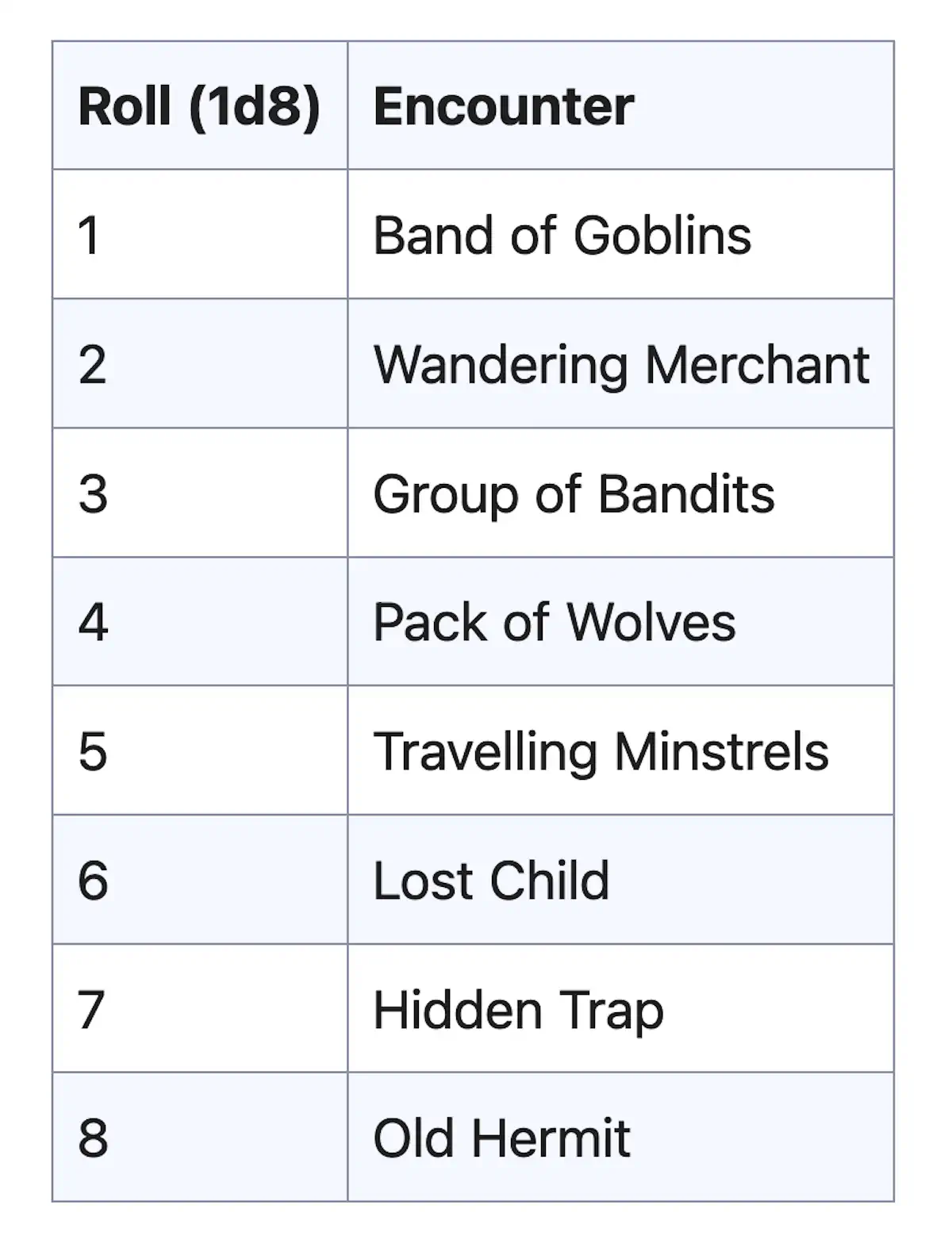
In tabletop RPGs like Dungeons and Dragons, the gamemaster often needs to improvise to create encounters for the adventuring players. One such way is by using a random table. It’s a table that will match dice rolls up with specific items, creatures, or events. We’ll make a table with eight possible encounters the adventuring party might come across. The gamemaster will roll an eight-sided die and use the resulting encounter accordingly.
This is what the final table will look like.
First, I will make a new <section> with a heading and some introductory text about D&D. Then, I will briefly introduce the random encounter table.
<section>
  <h2>D&D stuff</h2>

  <p>
    Dungeons & Dragons (D&D) is a fun tabletop game where you create characters and go on epic adventures with friends. Guided by a Dungeon Master (DM), you'll roll dice to see what happens next. It's all about creativity, teamwork, and having a blast as you tackle quests, fight monsters, and find awesome treasures.
  </p>

  <h3>Random encounter table</h3>

  <p>
    This is a table you can use to randomly decide what enemy or creature the players are going to encounter. Just roll a d8.
  </p>

  ...The table will go here
</section>
We use the <table> tag to create a table. A table can have a head section and a body section.
<table>
  <thead></thead>
  <tbody></tbody>
</table>
The table needs two columns—one for the dice roll and one for the corresponding encounter. Let’s create a table row inside the <thead>. I will fill out the head section and then explain it.
<table>
  <thead>
    <tr>
      <th>Roll (1d8)</th>
      <th>Encounter</th>
    </tr>
  </thead>
  <tbody></tbody>
</table>
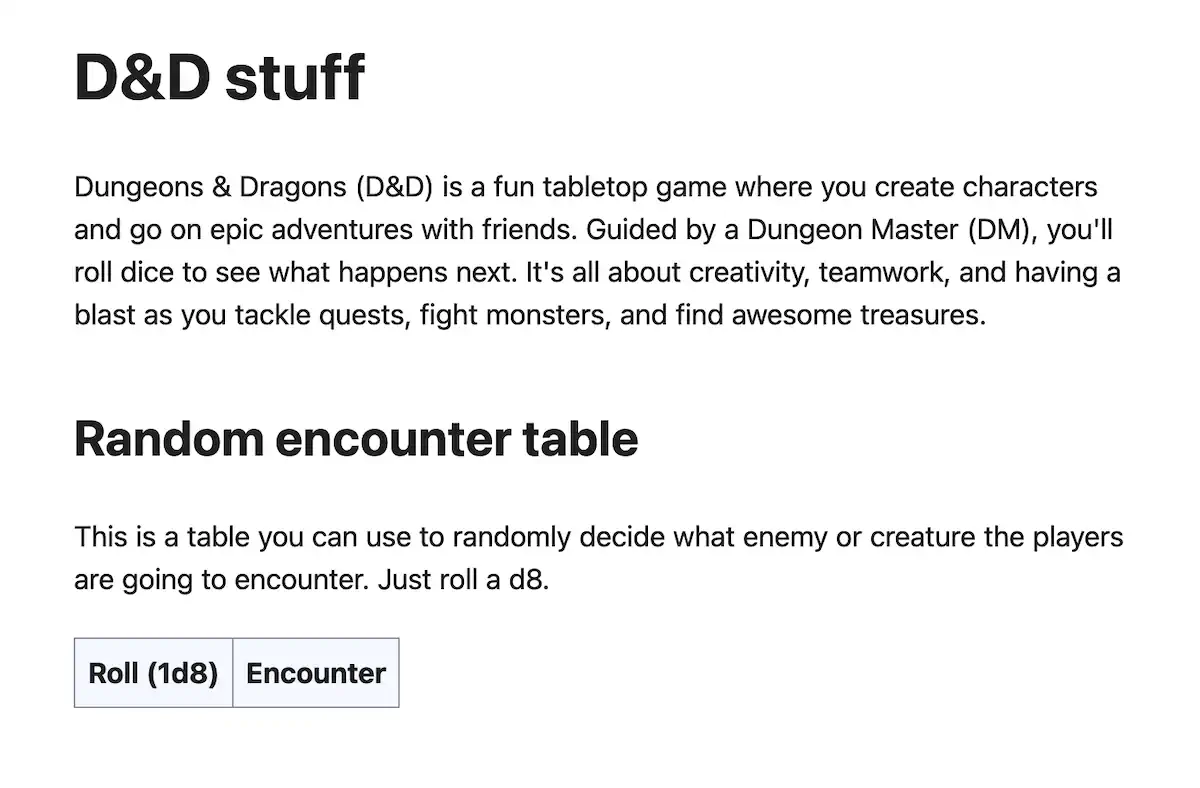
The <tr> tag creates a table row. Inside that row, we’ll add two table cells. Because these are column headings, we will use the table header or <th> tag—one for the dice roll and one for the outcome. This is what it will look like so far.
Next, we can fill out our table using the table data cell or <td> tag. We will put these rows inside the body section.
<table>
  <thead>
    <tr>
      <th>Roll (1d8)</th>
      <th>Encounter</th>
    </tr>
  </thead>

  <tbody>
    <tr>
      <td>1</td>
      <td>Band of Goblins</td>
    </tr>
    <tr>
      <td>2</td>
      <td>Wandering Merchant</td>
    </tr>
    <tr>
      <td>3</td>
      <td>Group of Bandits</td>
    </tr>
    <tr>
      <td>4</td>
      <td>Pack of Wolves</td>
    </tr>
    <tr>
      <td>5</td>
      <td>Travelling Minstrels</td>
    </tr>
    <tr>
      <td>6</td>
      <td>Lost Child</td>
    </tr>
    <tr>
      <td>7</td>
      <td>Hidden Trap</td>
    </tr>
    <tr>
      <td>8</td>
      <td>Old Hermit</td>
    </tr>
  </tbody>
</table>
That’s a lot of tags! Hopefully, you can follow the logic here. Inside the <tbody>, we create eight table rows, each with two table data cells. And that will give us our final table.

HTML tables can also do some things you would do in a spreadsheet program, such as making a cell span multiple columns. We won’t get into that here, but remember that tables have power if you need it.
Embedded video
Last but not least, let’s spice up our Fun! page by adding some videos. I’ll opt for some synthwave vibes. Of course, you are encouraged to grab whatever YouTube videos you like. Some YouTubers select to disallow their videos from being embedded on other sites, so keep that in mind.
I will make a new section for my videos.
<section>
  <h2>Synthwave mixes</h2>

  ...videos will go here
</section>
First, I will grab this music mix called Waves (https://www.youtube.com/watch?v=b6toYA0W4IA). If you visit that page, you will see a share button underneath the video. Clicking that button will give you various choices for sharing the video.
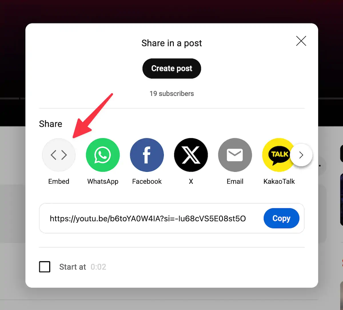
Select “Embed” if it is available. Once you do that, you will see some HTML code and a Copy button. Go ahead and copy the code. You can paste the code after the <h2> tag.
<section>
  <h2>Synthwave mixes</h2>

  <iframe
    width="560"
    height="315"
    src="https://www.youtube.com/embed/b6toYA0W4IA?si=-Iu68cVS5E08st5O"
    title="YouTube video player"
    frameborder="0"
    allow="accelerometer; autoplay; clipboard-write; encrypted-media; gyroscope; picture-in-picture; web-share"
    referrerpolicy="strict-origin-when-cross-origin"
    allowfullscreen
  ></iframe>
</section>
This embed is using the <iframe> tag. I won’t go into great detail about this element, but in short, it is used to display a web page inside another web page. But when I reload the page, I am greeted with this “Video unavailable” error. Why?
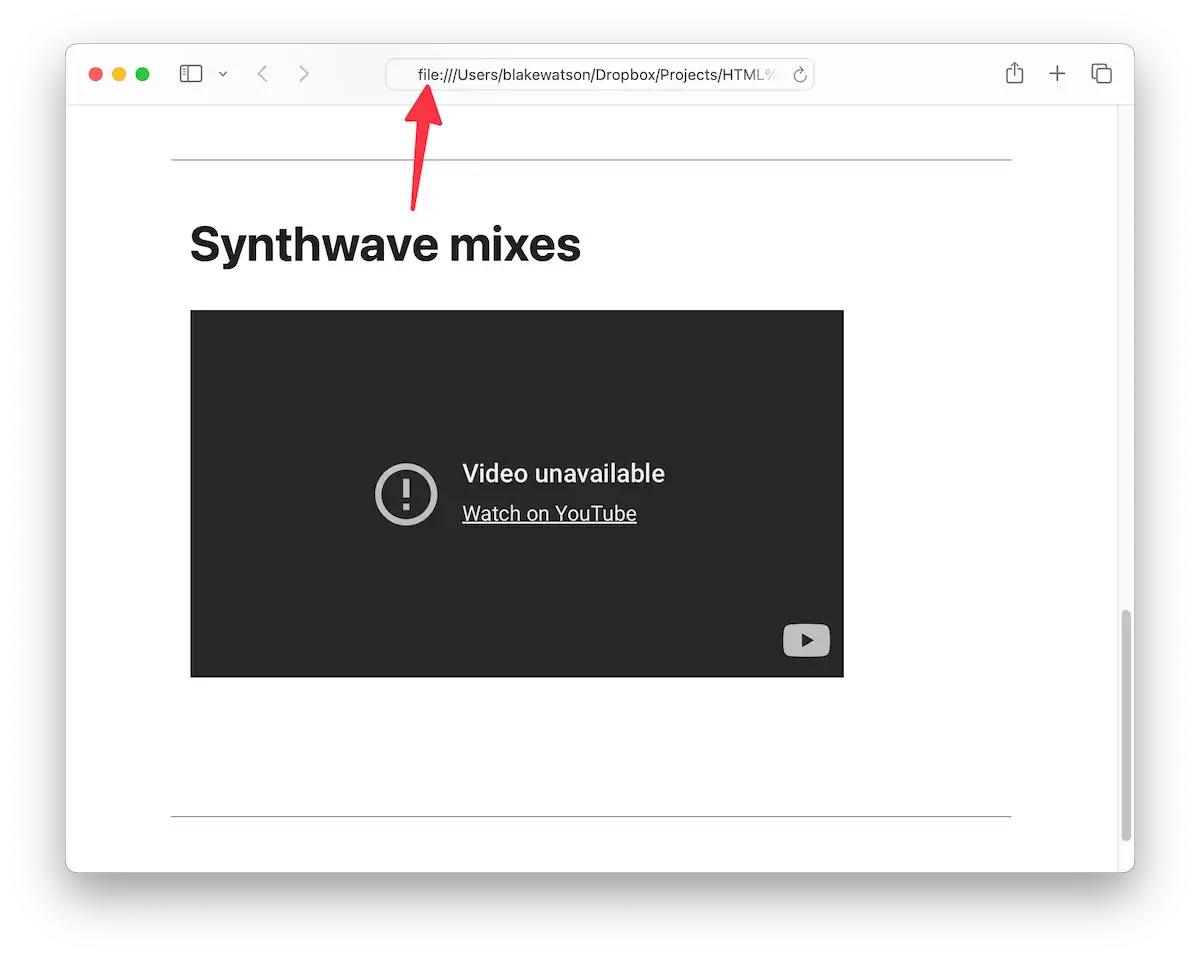
It’s because I still have my website open as a file. We need to fetch data from another website (YouTube), but browser security features prevent us from doing so.
Running our local web server
No worries, though! This is why we installed a local web server in the previous chapter. If you haven’t already done so, start your web server by following whichever method you chose in the previous chapter.
I will use WorldWideWeb for this example. Once I point it to my site folder and click the play button, my server will be running, and I can visit it at the address provided.

Double-check your browser’s address bar to ensure you access the web server version instead of the direct file.
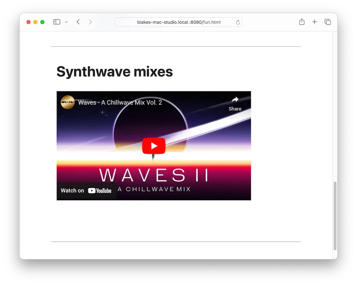
Awesome! I will go grab two more videos to use.
I will do the same thing for these that I did for the first one. Pull up the video page, click Share, then Embed, and copy the code provided. Paste the code for each video below the first one.
So, I embedded my videos, but now I’m noticing something else. It would be nice if these videos spanned the width of my page. Also, let’s see what our website might look like on a phone.
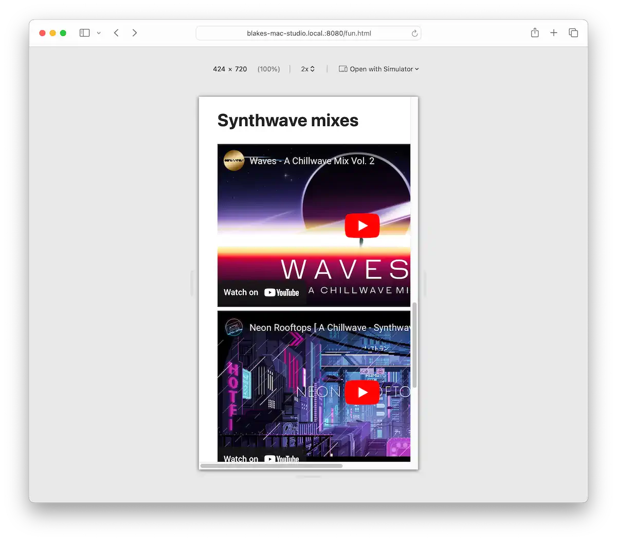
If I view the website using Safari’s responsive design mode and narrow the viewport, I see the embedded videos run right off the right side of the page. Not ideal.
There are multiple ways we could fix this. We’re going to use a third-party solution.
Custom HTML tags
HTML provides a way for us to create our own custom tags. These are called web components. They typically use a mixture of HTML, CSS, and JavaScript to define the look and behavior of the component. Making our own web components is out of the scope of this book, but that’s okay. We don’t need to create one ourselves; we can use web components that other people have made.
We’re going to use Lite YouTube Embed. Feel free to read about what it can do. For our purposes, we just want to install it and have it display a full-width video that scales down properly on phones.
Before we go into how to install this component, let’s look at how we would use it. It provides a new custom tag, <lite-youtube>. You give it an attribute of videoid, which is the ID of the YouTube video. You can find the video’s ID from the URL. This is my URL:
https://www.youtube.com/watch?v=b6toYA0W4IA
                                |_________|
                                 video id
<lite-youtube videoid="b6toYA0W4IA"></lite-youtube>Much cleaner than the <iframe>!
Okay, let’s get this thing installed. We need two files—one JavaScript file and one CSS file. The component developer provides these files, and together, they include all of the code that makes the component look and work properly. I will give you a direct link to both of them. Save the CSS file in your website’s css folder. Then, create a js folder for the JavaScript file.
- JS file: https://cdnjs.cloudflare.com/ajax/libs/lite-youtube-embed/0.3.2/lite-yt-embed.min.js
- CSS file: https://cdnjs.cloudflare.com/ajax/libs/lite-youtube-embed/0.3.2/lite-yt-embed.min.css
Visit each of those and use File > Save Page As… (Ctrl+S on Windows, Command+S on macOS). Once you have the files saved, add them to the page’s <head> section. This is what it should look like.
<head>
  <title>Fun - Blake's Homepage</title>
  <meta charset="utf-8">

  <link rel="stylesheet" href="css/simple.css">
  <link rel="stylesheet" href="css/lite-yt-embed.min.css">
  <script src="js/lite-yt-embed.min.js"></script>
</head>
First, we add the CSS file (the order doesn’t matter). We bring it in the same way we brought in Simple.css, using the <link> tag. We will also bring in the JavaScript code. For that, we use the <script> tag. It takes a src attribute, which is the path to the file.
Once these two files are present, we can use the new component. Back to our example. Let’s say we have this YouTube URL:
https://www.youtube.com/watch?v=b6toYA0W4IA
We need to get the ID from this URL. In a YouTube URL, the ID is the portion that comes after the v=. In this case, it’s b6toYA0W4IA. So we can embed the video using the following syntax.
<lite-youtube videoid="b6toYA0W4IA"></lite-youtube>I will go ahead and do the other two videos this way as well.
<lite-youtube videoid="b6toYA0W4IA"></lite-youtube>

<lite-youtube videoid="rDfS8B2-Mt4"></lite-youtube>

<lite-youtube videoid="yb0DR_qRetA"></lite-youtube>
It’s looking good!
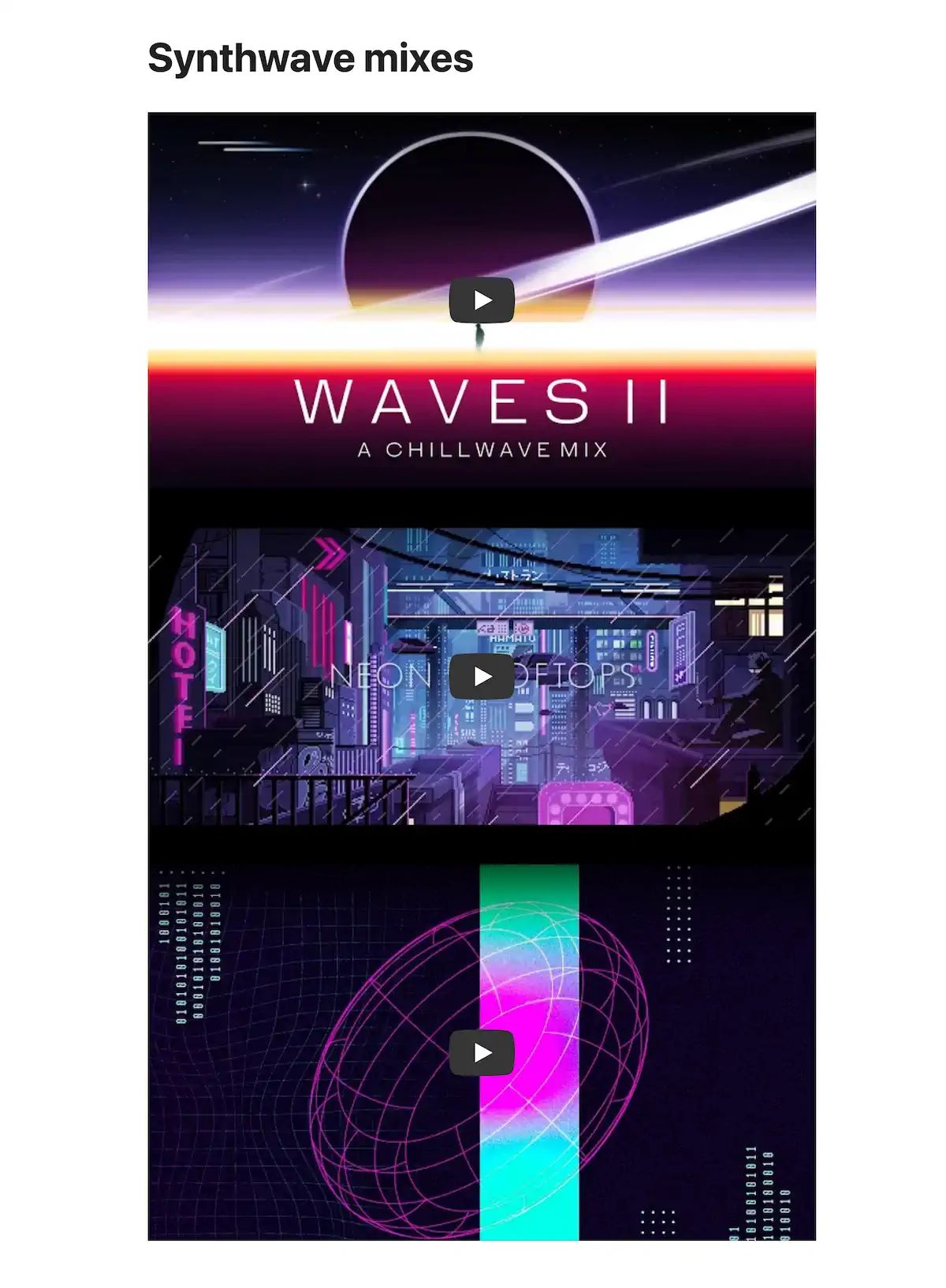
I will add some horizontal rules to create some separation between these videos.
<lite-youtube videoid="b6toYA0W4IA"></lite-youtube>
<hr>
<lite-youtube videoid="rDfS8B2-Mt4"></lite-youtube>
<hr>
<lite-youtube videoid="yb0DR_qRetA"></lite-youtube>
And let’s check out what they look like at mobile size.
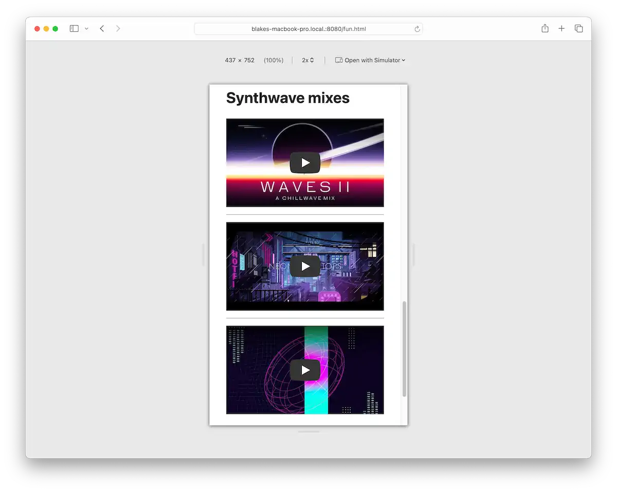
Nice!
Full code example
To see this page in action, check out the live demo. Here is the complete code for the Fun! page.
<!doctype html>
<html>
  <head>
    <meta charset="utf-8">
    <title>Fun - Blake's Homepage</title>

    <link rel="stylesheet" href="css/simple.css">
    <link rel="stylesheet" href="css/lite-yt-embed.min.css">
    <script src="js/lite-yt-embed.min.js"></script>
  </head>

  <body>
    <header>
      <nav>
        <a href="index.html">Home</a>
        <a href="blog/index.html">Blog</a>
        <a href="about.html">About</a>
        <a href="resume.html">Resume</a>
        <a href="fun.html" aria-current="page">Fun</a>
      </nav>

      <h1>Fun</h1>
    </header>

    <main>
      <section>
        <h2>Jokes</h2>

        <details>
          <summary>Why wouldn't the skeleton cross the road?</summary>
          <p>It didn't have the guts.</p>
        </details>

        <details>
          <summary>Why was the math book sad?</summary>
          <p>It had too many problems.</p>
        </details>

        <details>
          <summary>Why don't scientists trust atoms?</summary>
          <p>Because they make up everything!</p>
        </details>
      </section>

      <section>
        <h2>D&D stuff</h2>

        <p>
          Dungeons & Dragons (D&D) is a fun tabletop game where you create characters and go on epic adventures with friends. Guided by a Dungeon Master (DM), you'll roll dice to see what happens next. It's all about creativity, teamwork, and having a blast as you tackle quests, fight monsters, and find awesome treasures.
        </p>

        <h3>Random encounter table</h3>

        <p>
          This is a table you can use to randomly decide what enemy or creature the players are going to encounter. Just roll a d8.
        </p>

        <table>
          <thead>
            <tr>
              <th>Roll (1d8)</th>
              <th>Encounter</th>
            </tr>
          </thead>
          <tbody>
            <tr>
              <td>1</td>
              <td>Band of Goblins</td>
            </tr>
            <tr>
              <td>2</td>
              <td>Wandering Merchant</td>
            </tr>
            <tr>
              <td>3</td>
              <td>Group of Bandits</td>
            </tr>
            <tr>
              <td>4</td>
              <td>Pack of Wolves</td>
            </tr>
            <tr>
              <td>5</td>
              <td>Travelling Minstrels</td>
            </tr>
            <tr>
              <td>6</td>
              <td>Lost Child</td>
            </tr>
            <tr>
              <td>7</td>
              <td>Hidden Trap</td>
            </tr>
            <tr>
              <td>8</td>
              <td>Old Hermit</td>
            </tr>
          </tbody>
        </table>
      </section>

      <section>
        <h2>Synthwave mixes</h2>

        <lite-youtube videoid="b6toYA0W4IA"></lite-youtube>
        <hr>
        <lite-youtube videoid="rDfS8B2-Mt4"></lite-youtube>
        <hr>
        <lite-youtube videoid="yb0DR_qRetA"></lite-youtube>
      </section>
    </main>

    <footer>
      <p>Made with ❤️ and ☕️ by Blake Watson.</p>
    </footer>
  </body>
</html>
Publish the site
You did it! With this page completed, you’ve finished the main web book. Following the same steps as in previous chapters, update your Neocities site with this new page. Remember to update your nav menu on all your other pages.
Up next
Next, we’ll revel in our accomplishments, and I’ll point you toward more learning resources, including the bonus chapters on this site.
Achievement unlocked: Hypertexter
Congratulations to you—you made a freaking website using HTML! What started as a sentence or two written in Notepad became a full-blown, multipage website. You learned all sorts of stuff:
- Creating HTML pages
- Structuring content with headings and sections
- Linking to other webpages
- Formatting text
- Quoting text with block quotes
- Displaying data with tables
- Hiding content behind a clickable summary
- Creating secondary content using asides
- Embedding images
- Embedding video
- Using third-party web components
- Putting a website on the internet
- …and more besides!
I hope you feel empowered to create your own custom websites. But even if you don’t create websites from scratch, familiarity with HTML is helpful. Many content management systems allow you to put custom HTML on a page. Even knowing how to use the <a> tag to create a link is its own little superpower.
So, where to now?
Bonus chapters
We’ve completed the main content I wanted to cover in HTML for People. That said, I have a few topics I’d like to expand upon as an appendix to the main book.
- Customizing Simple.css. Even without learning much CSS, you can change the appearance of your Simple site by overriding a few variables.
- CSS basics. This side quest teaches you how to make a nicely designed webpage from scratch using CSS.
- Reusable HTML with PHP. We’ll look at how to reuse chunks of HTML—like a nav menu—using PHP includes. This is a programming-lite introduction to dynamic websites.
Resources from this book
I peppered in quite a few links along the way, pointing you to various demos and documentation. For convenience, here is a list of the main ones.
- Blake’s Homepage demo. This is my version of the site this book teaches you how to make. If you followed along and made your own site, I’d love to hear about it.
- Blake’s Homepage source code. This is the code repository for the demo site. Here, you can browse all the code and download it if you’d like.
- Blake’s Homepage, PHP version. This is another version of the source code where I converted the site to PHP as described in the bonus chapter, Reusable HTML with PHP.
- Planets of the Solar System demo. This is a demo of the page we’ll build in the bonus chapter, CSS basics.
- Planets of the Solar System source code. This is the code repository for said webpage.
Helpful resources and documentation
- MDN. If you need details about a particular HTML tag, CSS property, or other specific technical info, this is the best place to get it. MDN is more or less the official user manual for website making.
- Neocities and Neocities FAQs. I chose to use this web hosting service in the book because it’s free and has a similar ethos (people-focused website creation). The FAQs have a lot of good information and insight into the service if you want more information about it.
- Neocities Tutorials: A list of tutorials and resources published by Neocities. Check out their fantastic HTML course.
- Simple.css. This is the CSS framework we used throughout the book. The site has documentation on how to use Simple.css and a demo of various HTML elements.
- Butterick’s Practical Typography. An excellent book about typography and design. If you’re short on time, check out Typography in ten minutes.
- EntityCode. Here’s a reference of HTML entities you can use to reproduce special characters and symbols.
- Coolers color contrast checker. A nice tool for making sure your text and background colors have enough contrast to be legible.
Web hosts for static websites
In addition to Neocities, other good choices exist for hosting your HTML websites.
- Yay.boo: Silly name, really easy website publishing. You drag and drop a folder, pick a name, and your website is online. The free tier puts a yay.boo link in the corner of your site.
- Glitch: This is a good option if you’d rather code everything directly in the browser. Build it, then publish.
- Netlify: More sophisticated, but has a drag-and-drop-folder-to-publish feature and gives you more developer-centric features.
Code editor alternatives
I used Visual Studio Code as my code editor throughout this book. And for good reason—it’s free and massively popular. But it’s not the only code editor around.
I use a Mac, so I’m not as familiar with editors for other systems, but I know a few that you should check out and evaluate yourself. Some are free, some are paid, and some are both.
- Sublime Text: Cross-platform with an unlimited free trial (will occasionally nag you to pay). Sublime Text was the standard in web development until VS Code took the throne. It’s still quite good, though. Super fast and lightweight. The plugin-in/extensions system is more difficult to use, but you may not need any if you do basic HTML/CSS, as it has good support for those right out of the box.
- WebStorm: One of the many paid (free for non-commercial use) IDEs (integrated development environments) from JetBrains. It’s cross-platform and has a ton of features. It’s pricey but has a 30-day free trial. People love it. I haven’t used it much, so I can’t say much except that it has a solid reputation.
- Zed: Cross-platform (Mac and Linux, with Windows “coming soon”) and free. This one feels like a mix of VS Code and Sublime Text and has a lot of hype around it at the time of this writing.
- Nova: Mac-only and paid (but with a free trial). This is the sequel to Coda, a beloved web dev editor for Mac by the same developer (Panic). Panic apps are always fantastic, so give Nova a look if you’re on a Mac.
- NotePad++: Free and open source editor for Windows. I can’t say much about it other than it has been around for a long time.
- BBEdit: One of the oldest Mac apps around that is still actively developed. BBedit is paid but has a free trial and a free-forever mode that limits you to a particular feature subset.
- Glitch: Yes, this is the same one listed above under web hosts. Glitch is a good option if you want to work “in the cloud.” It provides a web-based interface for making websites, including creating files and editing code. Everything is in the browser, which is a good option if you don’t want to bother downloading and installing things on your computer.
- Many, many more. There are far too many to list, but if none of these suit your fancy, query your favorite search engine and brace yourself for the deluge of results.
Customizing Simple.css
Simple.css gives us a foundation for a nice, clean website. But it also provides a means of customization without a ton of extra work on our part. It uses a feature of CSS called custom properties (often called variables). These variables allow us to change colors and fonts in one place with minimal coding needed.
Peeking inside Simple.css
Let’s open the simple.css file we previously added to our site to see what variables we can access. Don’t be deterred by how much code is in the file. We’re only concerned with a little bit of it. At the top of the file, you will see some code that looks like the following.
/* Global variables. */
:root,
::backdrop {
  /* Set sans-serif & mono fonts */
  --sans-font: -apple-system, BlinkMacSystemFont, 'Avenir Next', Avenir,
    'Nimbus Sans L', Roboto, 'Noto Sans', 'Segoe UI', Arial, Helvetica,
    'Helvetica Neue', sans-serif;
  --mono-font: Consolas, Menlo, Monaco, 'Andale Mono', 'Ubuntu Mono', monospace;
  --standard-border-radius: 5px;

  /* Default (light) theme */
  --bg: #fff;
  --accent-bg: #f5f7ff;
  --text: #212121;
  --text-light: #585858;
  --border: #898ea4;
  --accent: #0d47a1;
  --accent-hover: #1266e2;
  --accent-text: var(--bg);
  --code: #d81b60;
  --preformatted: #444;
  --marked: #ffdd33;
  --disabled: #efefef;
}
We’re getting into some CSS syntax here, but it’s perhaps not as scary as it first appears. Let’s break it down.
In CSS, the browser ignores text between /* and */. It’s a way to write notes to yourself—or others reading your source code—called comments. In this case, the comments help to separate the code into related groups.
The bit that says :root means that the following block of code—the part between the squiggly brackets, {}—applies to the whole page. Ignore ::backdrop for now.
Inside the squiggly brackets, we find a list of properties. We’ve seen CSS properties in a previous chapter. For example, we used columns: 2 on the resume page to arrange a bulleted list into two columns. In that case, columns is a property and 2 is a value.
Any property that starts with -- is a custom property, or variable. It’s a way to reuse a value in multiple places. For example, if we had a variable --accent: blue, we could simultaneously use the --accent color in multiple elements. And if we ever decided to make the accent another color, say red, we could update it in one place—by writing --accent: red—and every element using the --accent variable will be updated automatically.
Looking back at the Simple.css code above, we see that we have two groups of variables. There are properties related to the fonts used, followed by a list of color-related variables representing what Simple calls the “default (light) theme.”
We’ll look at fonts later. Let’s first look at the colors.
In this case, most of the color variables are represented as hex codes. All you need to know about hex codes is that they are one of several ways to specify a color in CSS. Go to almost any search engine and search for “color picker.” You’ll be greeted with a widget you can use to pick out a color and retrieve its hex code along with other formats.
Okay, so how do we set our own colors? Do we change them here inside simple.css? You could do that; it would work. But there’s a better way.
Creating a custom stylesheet
CSS stands for Cascading Style Sheets. The cascading bit is particularly useful. Putting it simply, it means the order of CSS rules matters—rules that come later override rules before them. For our purposes, it means we can create our own CSS file, and so long as it’s processed by the browser after simple.css, the rules we write there will take precedence. So we’re not changing simple.css. We’re overriding it.
Create a file in your assets/css folder called custom.css.
Now, let’s hook it up to the site. You’ll need to do this for every page on your site, but let’s start with the homepage, the top-level index.html file. In the <head> section, we’re already referencing simple.css with a <link> tag. Let’s do the same for our new custom.css file right underneath. Order matters here. We want our stylesheet to come after Simple’s so we can override its variables.
<head>
  <title>Blake's Homepage</title>
  <meta charset="utf-8">

  <link rel="stylesheet" href="css/simple.css">
  <link rel="stylesheet" href="css/custom.css">
</head>Now, let’s add some overrides. In our custom.css file, we’ll first set up a :root code block similar to the one in simple.css. Then let’s take one of the variables, say --bg (the background color), and set it to red.
:root {
  --bg: red;
}If you reload the page, you should see an admittedly hideous red background. Let’s pick a better color. You can search for a color picking tool of your choice on the web, use one of the many named CSS colors, or, if you are using Visual Studio Code, use the built-in color picker by hovering over a color value.
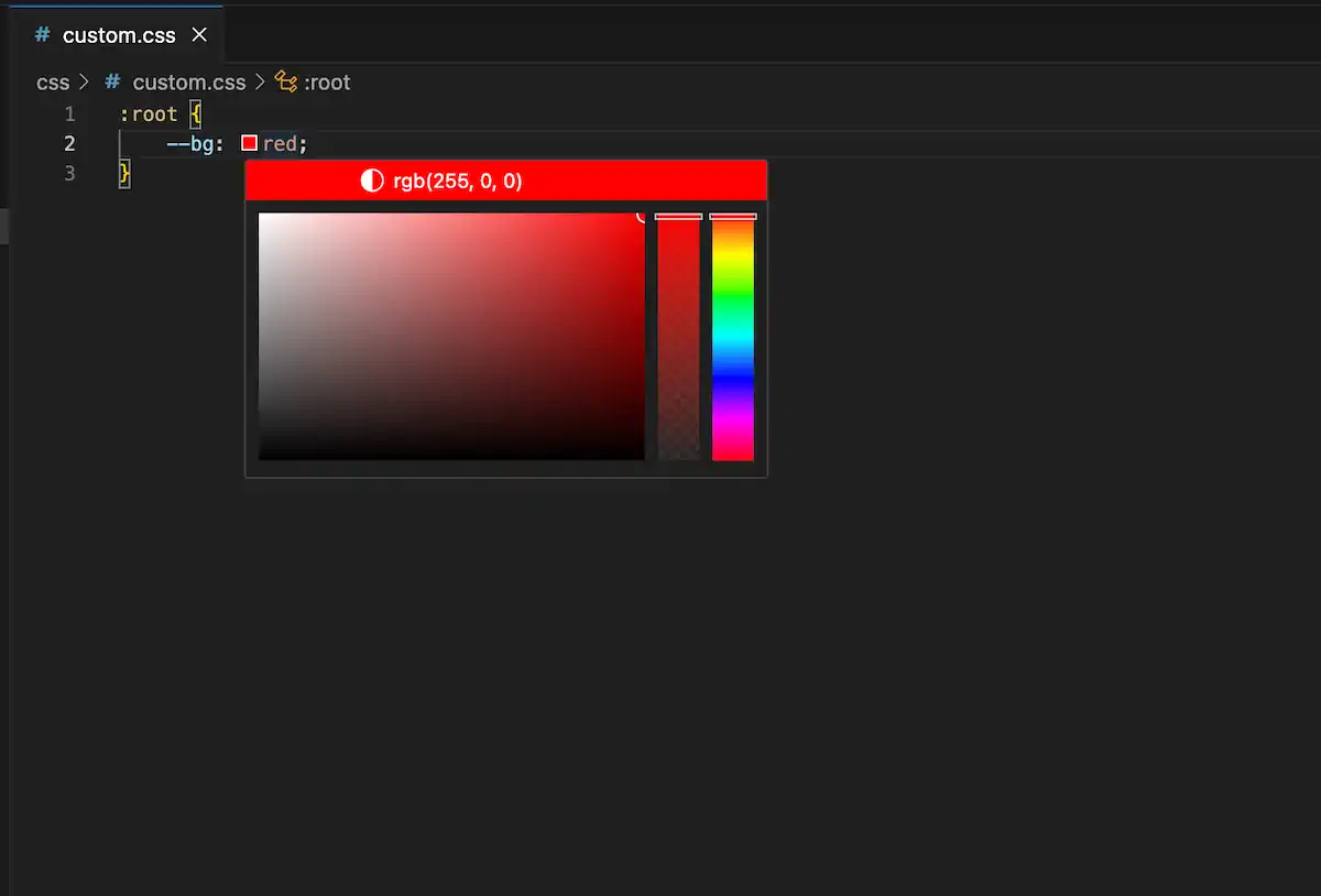
But before picking out colors, let’s talk about dark mode.
Dark mode
Simple automatically supports light and dark modes based on the visitor’s system setting. You may have noticed this if you have turned on dark mode in your system settings. If we look at the simple.css file, we can see the dark mode version of all of the variables just below the other variables we looked at previously.
/* Dark theme */
@media (prefers-color-scheme: dark) {
  :root,
  ::backdrop {
    color-scheme: dark;
    --bg: #212121;
    --accent-bg: #2b2b2b;
    --text: #dcdcdc;
    --text-light: #ababab;
    --accent: #ffb300;
    --accent-hover: #ffe099;
    --accent-text: var(--bg);
    --code: #f06292;
    --preformatted: #ccc;
    --disabled: #111;
  }
  /* Add a bit of transparency so light media isn't so glaring in dark mode */
  img,
  video {
    opacity: 0.8;
  }
}
This block uses a CSS feature called media queries. In this case, the @media rule specifies that the style rules inside the block should apply if the user has indicated a preference for dark mode.
The first rule sets the default color scheme to dark and then redefines the color variables that apply to the root document (i.e., the whole page). The second rule makes images and video slightly transparent so as not to appear “so glaring in dark mode.”
We don’t know whether visitors to our website prefer light or dark mode, so we should set appropriate colors for both modes. If you want, you could copy over these two code blocks (i.e., the “Global variables” block and the “Dark theme” block) from simple.css into your custom.css file and then proceed to change the color values as desired. Or you could specify only the ones you want to change. Either way, ensure you have the right colors in the right section.
An example customization
For the default light theme, I decided to stick with only named CSS colors as a fun exercise. You can think of named colors like a box of crayons—there are many, but they don’t represent every possible color. But they are an easy way to refer to colors in a human-friendly way.
On the other hand, the dark mode colors needed a more nuanced touch. I used the built-in color picker in Visual Studio Code to select a few specific colors. They are represented in the rbg format here because that’s what the editor did by default when I selected the colors.
This is the code I put in my custom.css file.
:root {
  --bg: mintcream;
  --border: darkslategray;
  --accent-bg: honeydew;
  --text: darkslategray;
  --accent: mediumvioletred;
  --accent-hover: mediumvioletred;
  --marked: mediumspringgreen;
}

/* Dark theme */
@media (prefers-color-scheme: dark) {
  :root,
  ::backdrop {
    color-scheme: dark;
    --bg: rgb(17, 18, 18);
    --border: rgb(80, 90, 90);
    --accent-bg: rgb(35, 35, 36);
    --text: ghostwhite;
    --accent: lightskyblue;
    --accent-hover: lightblue;
    --marked: gold;
  }
}
Here is a side-by-side preview of the blog index page’s appearance in light and dark modes.
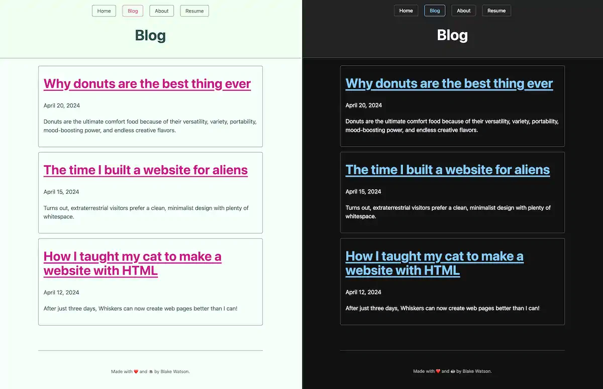
Choosing accessible colors
Some color combinations can make text hard to read because of limited contrast. You want to ensure there is plenty of contrast between your text color and your background color.
You can rely on your eyes to an extent, but everyone is different. Fortunately, there are standards around how much contrast text should have. You can use a handy contrast checker like this one. Give it two colors, and it will tell you if there is sufficient contrast between them.
Changing the font
I glossed over this earlier, but you may have noticed a couple of variables related to fonts above the color variables defined in simple.css. One of them, --sans-font, is responsible for most of the text on the page (the other one, --mono-font, is used for things like showing code, as I am doing in this paragraph).
If you aren’t familiar, sans-serif fonts are those that don’t have serifs, the little feet-like protrusions you find on other fonts like Times New Roman. Simple uses the --sans-font variable for most text on the page by default, but we can override it with whatever we want.
First, let’s talk about fonts on the web.
Fonts on the web
Your site’s visitors can only see fonts installed on their system. That means if you, the author of the webpage, specify in CSS some random font you downloaded from a website, you will see that font on the webpage. But your visitors will see a fallback, unless they also happen to have that font installed.
That’s why multiple fonts are typically specified in CSS. If the first font specified isn’t available on the visitor’s computer or device, the browser will try the next one, and so on.
body {
  /* the first font needs quotes because the name includes spaces */
  font-family: "Some Rando Font", Georgia, serif;
}
The above style rule sets the font for the <body>. The browser will first try to use “Some Rando Font.” If that isn’t available on the visitor’s device, it will attempt to use Georgia instead. If that isn’t available, we’ve told the browser to use whatever default serif font it has available.
Here’s a good reference for finding fonts commonly found on people’s devices to see your options. You always want to provide a handful of decent fallbacks as well.
Sometimes, you have a font that you really want visitors to see even though you know they aren’t going to have it installed on their system already. Fortunately, there is a way to deal with this. They’re called web fonts. They are too involved to cover here, but I will cover them briefly in the next chapter, CSS basics. In short, it’s a method of automatically providing the font to your visitors.
Overriding the font variable
Let’s use a serif font. Even though Simple calls the variable --sans-font, there is nothing magical about the variable name. We can set it to whatever we want. Let’s use Georgia, which is always a pleasure to read.
We can override Simple’s --sans-font variable inside the :root block so that it applies to the whole page.
:root {
  --sans-font: Georgia, "Times New Roman", serif;
  --bg: mintcream;
  --border: darkslategray;
  --accent-bg: honeydew;
  --text: darkslategray;
  --accent: mediumvioletred;
  --accent-hover: mediumvioletred;
  --marked: mediumspringgreen;
}
We specified the font, Georgia, but we also provided two fallback options. We specified Times New Roman as our second choice. Note that this one needs to be inside quotes because the name has spaces.
We use a CSS keyword, serif, for the third option. That tells the browser to use its default serif font, whatever that may be. Often, it will be Times New Roman. Other keywords you have available here are sans-serif, monospace, and cursive, among others
Here’s a look at one of the blog posts set in Georgia.
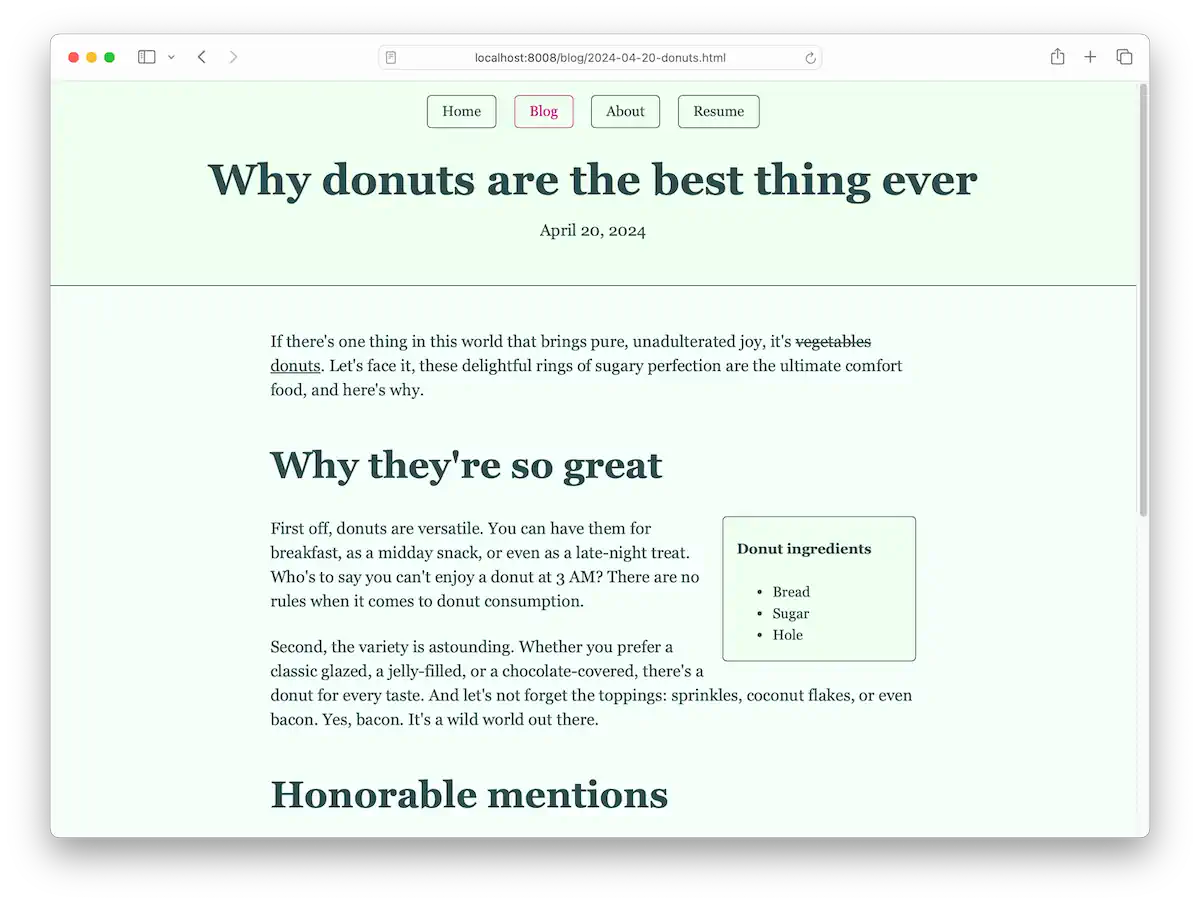
Make it yours
I chose Simple.css for this book because it makes HTML look good without any extra work. But I also chose it because it can be customized with a handful of CSS variables. Even though it’s just colors and fonts, there are endless possibilities for making your site unique.
I encourage you to explore the world of color and experiment with different combinations. In the next bonus chapter, I’ll cover even more CSS so you can go beyond Simple and write your own styles.
CSS basics
For this chapter, we won’t be using our Simple.css site. We’ll be writing our own styles, and for that, I want to use a simpler page. You can apply what you learn here to your Simple site. But for this chapter, I want to show you how to start from scratch to make a nice webpage.
We’ll look specifically at styling typographic elements to make a pleasant, readable webpage. But CSS can do much, much more. All of the sophisticated designs you are used to seeing on pages across the web are done with CSS. It is a potent tool. If this chapter gives you a taste for it, I encourage you to explore CSS beyond what we cover here.
Introducing the planets of the solar system
I put together this straightforward HTML page that uses a handful of typographic elements and presents a good starting point for applying styles. You can use any content you want if you have something in mind. But you are also welcome to use the same HTML page I will use.
You can see the source code either in your browser with the view source command or by checking out the code on GitHub. And you can see the end result here if you want a sneak peek of what it’ll look like.
This page introduces the planets in the solar system and gives a little information about each one. It is super simple and basic on purpose. It is placeholder text I don’t intend for anyone to read seriously (but the information is accurate to the best of my knowledge).
Starting point
I made an index.html and put the following code in there. It assumes that you have a styles.css in the same directory. It also assumes you have an image, PIA06193~large.jpg, in the same directory. You can get this image from NASA’s website.
Expand to see the full HTML code
<!DOCTYPE html>
<html lang="en">
  <head>
    <meta charset="UTF-8">
    <title>Planets of the Solar System</title>
    <link rel="stylesheet" href="styles.css">
  </head>
  <body>
    <main>
      <h1>Planets of the Solar System</h1>

      <p class="intro"><span class="caps">Our solar system</span> is a vast and fascinating place, consisting of the Sun and the various celestial bodies that orbit it, including eight major planets. Each planet offers unique characteristics and features. In this article, we will explore the distinctive attributes of each planet, providing an overview of what makes them unique (and learn a little <abbr title="Cascading style sheets">CSS</abbr> while doing it).</p>

      <h2>Mercury</h2>
      <p>
        Mercury is the closest planet to the Sun and the smallest planet in our
        solar system. It has a very thin atmosphere and its surface is covered
        with craters.
      </p>

      <h2>Venus</h2>
      <p>
        Venus is the second planet from the Sun and is known for its thick,
        toxic atmosphere and extreme surface temperatures. It's often called
        Earth's "sister planet" because of their similar size and composition.
      </p>

      <h2>Earth</h2>
      <p>
        Earth is the third planet from the Sun and the only known planet to
        support life. It has a diverse climate and surface, with large bodies of
        water, mountains, and forests.
      </p>
      <blockquote>
        <p>
          The Earth is a very small stage in a vast cosmic arena. Think of the
          rivers of blood spilled by all those generals and emperors so that in
          glory and triumph they could become the momentary masters of a
          fraction of a dot.
        </p>
        <cite>— Carl Sagan</cite>
      </blockquote>

      <h2>Mars</h2>
      <p>
        Mars, the fourth planet from the Sun, is often called the "Red Planet"
        due to its reddish appearance. It has the largest volcano and canyon in
        the solar system.
      </p>

      <h2>Jupiter</h2>
      <p>
        Jupiter is the fifth planet from the Sun and the largest in the solar
        system. It has a Great Red Spot, which is a giant storm, and dozens of
        moons.
      </p>

      <h2>Saturn</h2>
      <p>
        Saturn, the sixth planet from the Sun, is famous for its extensive ring
        system. It's the second-largest planet in the solar system.
      </p>

      <figure>
        <img src="PIA06193~large.jpg" alt="This grand mosaic consists of 126 images acquired in a tile-like fashion, covering one end of Saturn's rings to the other and the entire planet in between.">

        <figcaption>
          Source: <a href="https://images.nasa.gov/details/PIA11141">https://images.nasa.gov/details/PIA11141</a>
        </figcaption>
      </figure>

      <h2>Uranus</h2>
      <p>
        Uranus is the seventh planet from the Sun and has a unique blue-green
        color due to methane in its atmosphere. It rotates on its side, making
        it unique among the planets.
      </p>

      <h2>Neptune</h2>
      <p>
        Neptune is the eighth and farthest known planet from the Sun in our
        solar system. It's known for its deep blue color and strong winds, some
        of the fastest in the solar system.
      </p>

      <h2>Additional Resources</h2>
      <p>
        For more information about the planets, visit the
        <a href="https://solarsystem.nasa.gov/planets/overview/"
          >NASA Solar System Exploration</a
        >
        website.
      </p>

      <h2>Other Major Bodies</h2>
      <ul>
        <li>Pluto</li>
        <li>Ceres</li>
        <li>Haumea</li>
        <li>Makemake</li>
        <li>Eris</li>
        <li>Ganymede</li>
        <li>Titan</li>
        <li>Europa</li>
      </ul>

      <h2>Sample Code</h2>
      <pre><code>function getPlanetInfo(planet) {
    const planets = {
        Mercury: 'The smallest planet and closest to the Sun.',
        Venus: 'Known for its thick, toxic atmosphere.',
        Earth: 'The only planet known to support life.',
        Mars: 'The Red Planet with the largest volcano.',
        Jupiter: 'The largest planet with a Great Red Spot.',
        Saturn: 'Famous for its ring system.',
        Uranus: 'Unique for its sideways rotation.',
        Neptune: 'Known for its deep blue color and strong winds.'
    };
    return planets[planet] || 'Planet not found';

}</code></pre>
</main>

    <footer>
      <p>
        A demo website for learning CSS. Part of <a href="https://htmlforpeople.com/">HTML for People</a> by <a href="https://blakewatson.com/">Blake Watson</a>. Check out the <a href="https://github.com/blakewatson/css-basics">source code on GitHub</a>.
      </p>

  </body>
</html>
Since the styles.css file is empty, we get only the browser default styles. This is what it looks like:
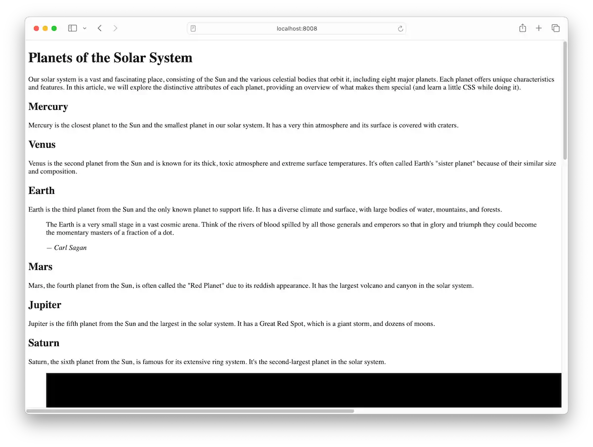
Good ol’ Times New Roman and lines of text that run the entire width of the browser window. It doesn’t look great, but there’s something nice and quaint about it. And, crucially, it’s not broken. Many sites are overdone with gratuitous designs, megabytes of images and JavaScript, and user-hostile behaviors (you know, like, “I see you’ve only read two sentences of this article, but I just know you must be dying to subscribe to my newsletter so let me just show you this here giant pop-up.”).
So we’re going to fancy ourselves web doctors of a sort. First, we will do no harm. We’ll improve the page’s readability and make it pretty (well, what I think is pretty, anyway—feel free to diverge and add your own styles as we go). But we’ll refrain from doing anything so drastic that it makes the page harder to read than it is right now.
The style tag
We can write CSS directly in our index.html file using a special HTML tag, <style>. We can put the <style> tag inside of the <head> section of our file. Like this:
<!DOCTYPE html>
<html>
  <head>
    <title>My website</title>
    <meta charset="utf-8">

    <style>
      CSS code goes here
    </style>
  </head>

  <body>
    ...
  </body>
</html>
This is perfectly valid, but if you have more than one page on your website, you would have to copy and paste your <style> tag onto each page to have the same styles on every page. Instead, it’s common to put all your CSS in a separate file and then link that file to every page with a <link> tag in your website’s <head> section.
<link rel="stylesheet" href="styles.css">First steps to improving the page
If you haven’t already, create a style.css file. This is where we’ll write all our custom CSS. If you’re not using my starting HTML code, you’ll need to add the <link> tag to your page’s <head> section to hook up your styles to the page, as described above.
We can immediately achieve some big wins with only a few lines of CSS. For example, one problem is that the page is too wide on a desktop browser window. Long lines of text are hard to read. Let’s fix it by giving the page a maximum width. According to Butterick’s Practical Typography, we should be able to fit between two and three alphabets on one line. I’m going to make it 65 characters wide.
main {
  max-width: 65ch;
}
This CSS rule targets the <main> element on our page and instructs it to never exceed our stated width.
Ignoring the giant image of Saturn—which we’ll deal with in a bit—it looks much better already. But modern sensibilities prefer a centered page, so let’s do that while we’re here.
main {
  margin-inline: auto;
  max-width: 65ch;
}
In left-to-right languages like English, margin-inline is the horizontal, or left and right, margin. By setting it to auto, we’re saying, “I don’t care how wide the left and right margin is, just make it equal.” The browser knows how wide we want the page, so it will calculate the margin needed to make it equal on both sides, centering the page.
We also have a <footer> element that lives outside the <main> element, so we’ll style it separately with the same width and margin.
footer {
  margin-inline: auto;
  max-width: 65ch;
}
And to round off this line of thinking, let’s prevent the image of Saturn from bursting out of the page.
img {
  max-width: 100%;
}
The max-width can be stated as a percentage of its containing element. Setting it to 100% means, “Don’t let image elements go wider than their containers.”
And now our page is looking much nicer.
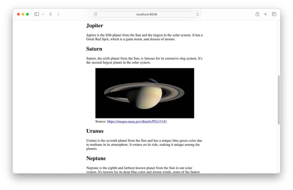
Anatomy of a CSS rule
Take a look at one of our rules so far. This rule limits the width of images to the width of their containers.
img {
  max-width: 100%;
}
What’s going on here is a sort of two-part thing. First, we specify what elements on the page we want to affect. That’s the part before the squiggly brackets ({}). It’s called the selector because it selects elements on the page to change.
The part inside the brackets is where we put the properties we want to change. Each declaration consists of a property and a value. In this case, there’s one declaration. The property is max-width, and the value is 100%.
Text size, line height, and spacing between elements
The default font size is a little small. I’ll target the html element (i.e., the entire document) and set the font-size and line-height.
html {
  font-size: 20px;
  line-height: 1.45;
}
One of the units we can use for sizing things is the pixel unit, px. I’m just now learning that 1px equals 1/96th of an inch (although that varies with the display’s pixel density). Huh. You never stop learning.
There are all kinds of ways to set the size of text. We’ll see some more ways in a bit.
I’ll set the line-height using a unitless value of 1.45. This is a number that looks good. Consult Butterick’s Practical Typography and your own eye to find a good line height for your specific font. I’m using a unitless number instead of something like px because of how child elements will inherit the value, but you don’t need to worry too much about that right now.
Moving on, I’d like to ensure elements have equal spacing between them. I will target everything inside the <main> element using a universal selector, the asterisk (*).
main * {
  margin-block-start: 0;
  margin-block-end: 1rem;
  /* or we could use the shortcut syntax like this */
  margin-block: 0 1rem;
}
A selector can be a chain of things. For example, main p selects every <p> element inside the <main> element. But I want to target everything in the <main> element, so I use the asterisk.
I’m setting the margin above and below every element. Similar to margin-inline, which controls horizontal space around elements, margin-block controls the vertical space around elements (in left-to-right languages). I’m setting the margin above elements to 0 and the margin below them to 1rem. The rem is a unit equal to the font size of the root element (the <html> element). Since I set the root font size at 20px, that’s what the value of 1rem becomes.
The cool thing about the rem unit is that, by allowing us to base values off the document’s font size, it makes our designs feel more cohesive.
Our text looks nice.
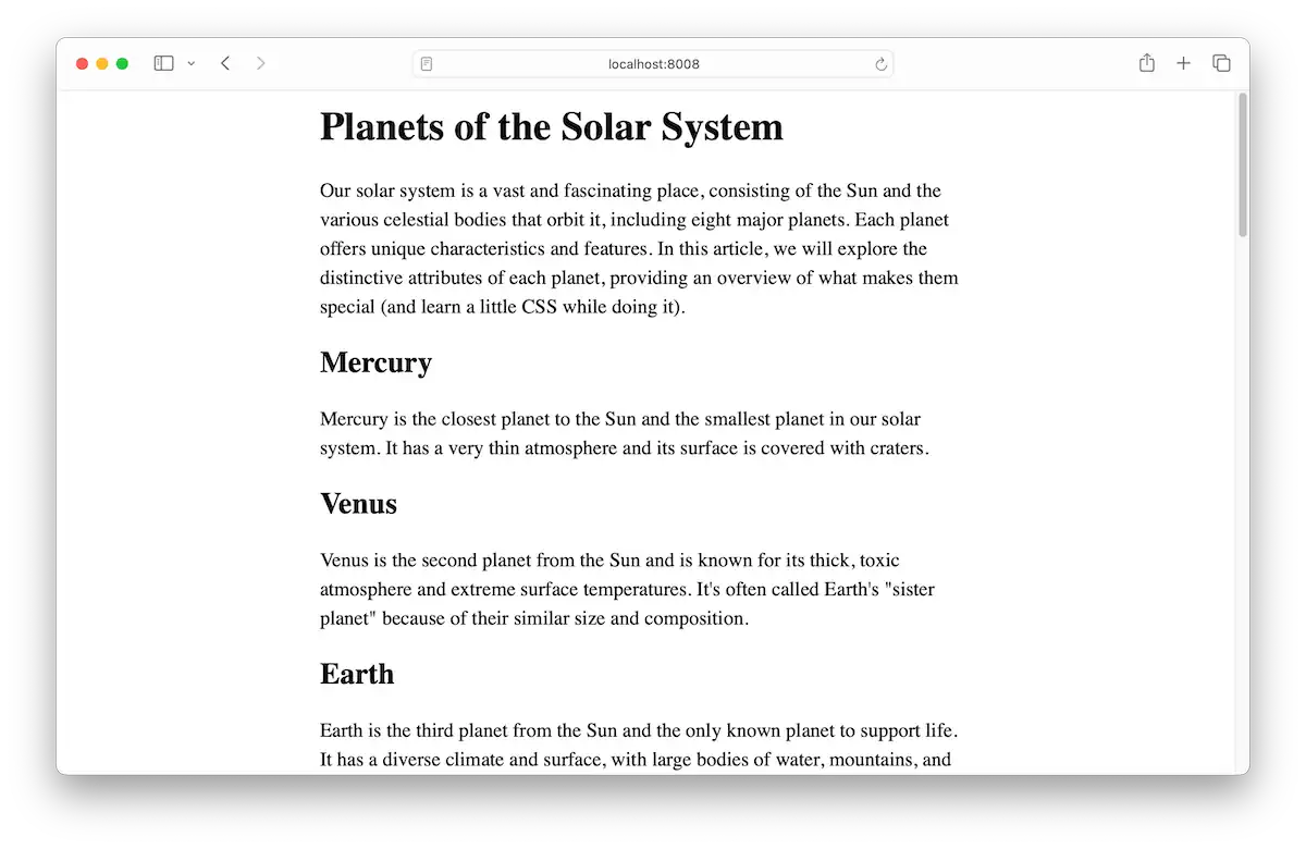
Nothing against Times New Roman, but it’s very… default looking. We can do better.
Installing webfonts
You can only use a font if your visitors have it available on their devices. While there are some common system fonts and common default fonts, we have another option for customizing the font. Web fonts are those that are made available by being downloaded with the rest of your website. In addition to the document, CSS files, JavaScript files, images, and so on, custom fonts can also be downloaded.
Web fonts need to be in a specific format, and installed a certain way, for lack of a better term. Typically, people will use a service like Google Fonts (free) or Adobe Fonts (paid). There are a lot of options, including hosting the fonts on your own server next to your other website files. Just ensure that your font license covers it.
For simplicity, we’ll use a couple of fonts from Google Fonts. Head over to fonts.google.com. Search for “Oswald” and select it from the results. Then click Get Font.
After selecting it, don’t download anything yet. Do a search for “source sans.” Source Sans 3 is the available version at the time of this writing. Select it and click Get Font.
Once you have both fonts selected, click Get embed code. We’re looking for the block labeled Embed code in the <head> of your html.
Copy and paste the embed code into your website’s <head> section.
<head>
  <meta charset="UTF-8">
  <title>Planets of the Solar System</title>

  <link rel="preconnect" href="https://fonts.googleapis.com">
  <link rel="preconnect" href="https://fonts.gstatic.com" crossorigin>
  <link href="https://fonts.googleapis.com/css2?family=Oswald:[email protected]&family=Source+Sans+3:ital,wght@0,200..900;1,200..900&display=swap" rel="stylesheet">

  <link rel="stylesheet" href="styles.css">
</head>
Add a font-family declaration to the html block to check that it’s working.
html {
  font-family: 'Source Sans 3', sans-serif;
  font-size: 20px;
  line-height: 1.45;
}
This will set the font for the whole document. The browser will first try Source Sans 3. If, for some reason, that font isn’t available (if, say, Google Fonts is down), then sans-serif will instruct the browser to use whatever sans-serif font is available. You can put other fallback fonts in the font stack. Just separate them with commas, as you see above.
Refresh the page, and you should see the new font! But let’s do a better setup and properly integrate both fonts.
Setting up colors and variables
If you read the Customizing Simple.css chapter, you’ll remember it used CSS variables to control color and fonts. We’ll do that here too. This will make it easier to customize things later (which you may want to do if you don’t like my choices).
:root {
  --text-color: #303036;
  --muted-text-color: #5e5e67;
  --heading-color: #cd2807;
  --link-color: #028090;
  --background-color: #fffdf7;

  --heading-font: 'Oswald', sans-serif;
  --body-font: 'Source Sans 3', sans-serif;
}
You can name variables whatever you want so long as they start with a --. Here, I’m setting up several colors and a couple of fonts.
Once I have defined these variables, I can use them to apply my fonts and color to the text.
html {
  font-family: var(--body-font);
  font-size: 20px;
  line-height: 1.45;
  color: var(--text-color);
  background-color: var(--background-color);
}
Use the var function to use the variables we created.
Heading styles
I’m using an <h1> for the page title and <h2> elements for the sub-headings. Let’s target those and apply some styles.
h1 {
  border-block-start: 10px solid var(--heading-color);
  margin-block-start: 4rem;
  margin-block-end: 2rem;
  font-family: var(--heading-font);
  font-weight: normal;
}

h2 {
  margin-block-start: 1.5rem;
  margin-block-end: 0.5rem;
  font-family: var(--heading-font);
  font-size: 1.2em;
  font-weight: normal;
  color: var(--heading-color);
}
I’m doing several things here. I’m adding a little extra margin above <h2> elements and a good bit of extra space above the <h1>.
I like how Oswald—the font I’m using for headings—looks without bolding. So I’m setting font-weight to normal rather than bold, which is the default for headings.
For the <h1>, I’m keeping the default font-size. For the <h2>, I’m setting the font-size to 1.2em, which is to say 1.2 times the current font size.
A handful of typographic changes transformed our page, and it has an entirely different feel.
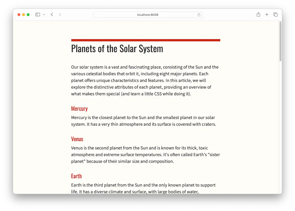
We could almost stop here. There’s nothing too terrible going on. But let’s style some of the elements we’ve not covered yet.
Links
If you’re using my HTML document, you’ll notice a handful of hyperlinks or <a> tags. One links to the source of the Saturn image I used, and the other to the NASA Solar System Exploration website. The rest are in the site footer.
Let’s style these a bit. I’ve chosen a blue-green color and set it as a variable, which we saw earlier.
:root {
  /* ... other code ... */

  --link-color: #028090;

  /* ... other code ... */
}
I’ll use that to set the color of all <a> elements, like so:
a {
  color: var(--link-color);
}
It’s not a hard rule, but most people correlate blue underlined text as a clickable link. I’ve decided not to stray too far from that. But I would like to add a little effect where the underline disappears when I hover over it.
We’ll use the :hover pseudo-class selector to set that up. These are typically used for styling elements in different states—for example, a text input that is disabled (:disabled) or, in our case, a link that is being hovered over by a mouse pointer.
a:hover {
  text-decoration: none;
}
The property we want is text-decoration. By default, links have a text-decoration of underline. You have a few options here, but I’m going with none.
This gives us a subtle visual interaction with the link.
Abbreviations
On the subject of hover effects, there is one that you may not have noticed. If you look at the HTML in the first paragraph, you’ll find the following sentence.
In this article, we will explore the distinctive attributes of each planet,
providing an overview of what makes them unique (and learn a little
<abbr title="Cascading style sheets">CSS</abbr> while doing it).
The <abbr> tag helps visitors know what certain abbreviations or acronyms stand for. When you hover the term, CSS, in the document, you’ll get a helpful tooltip showing what it stands for. You put the abbreviation inside the tags, then use the title attribute for the full text.
Let’s give it some text-decoration to hint that visitors can interact with it.
abbr {
  text-decoration: underline;
  text-decoration-style: dotted;
  text-decoration-color: var(--heading-color);
  text-decoration-thickness: 2px;
}
We’re giving it an underline like links have by default. But we’ll make it the red color we’re using for headings and use the dotted style to help differentiate it from a link. I decided to increase the thickness a bit, too, to make it easier to see.
Blockquotes
I’d be remiss not to quote Carl Sagan in an article about the solar system—even if this is just a technical demo. So, I included an epic excerpt of his in the section about Earth.
It’s serviceable as-is—it’s already indented and looks like a quote. But we can improve on this for sure. I’ll show you the code, then explain what I’m doing.
blockquote {
  margin-inline: 1.5rem 0;
  border-inline-start: 4px solid var(--heading-color);
  padding-inline: 1rem;
  font-size: 0.9rem;
  color: var(--muted-text-color);
}
I want to rein in the indentation and make it more consistent by basing it on the document’s font size. In left-to-right languages, margin-inline controls the left and right margins. I’m providing two values, 1.5rem and 0, to specify the left and right margins, respectively. The left margin will be 1.5 times the document font size, and we’ll remove the right margin entirely.
A perhaps all-too-common stylizing of a <blockquote> element is giving it a thick left border that uses an accent. I see no reason to be a nonconformist here, so I’ll slap a left border there using border-inline-start. Remember, inline refers to the horizontal axis. And start means the first one (which is left for me; end would be the right one).
I’ll set it to be a solid line that’s 4px wide and uses the heading color, which we’ve established as the accent color for our palette.
But we have a problem. If we stopped there, we’d have a border that bumps right up against the text. Ew.
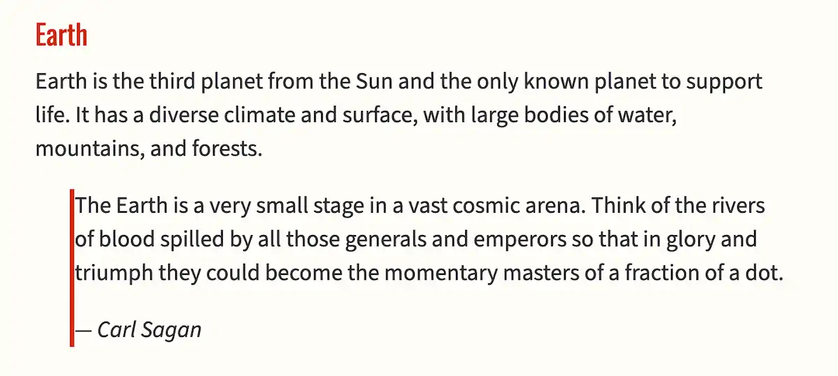
Fortunately, we can fix that by adding some padding. I’ll give you a quick intro to the box model. Every element has space outside of it (margin), space around the inside of it (padding), and an optional layer that separates the two (the border).
With that knowledge, we’ll add some space inside the element, which will push the content away from the border. We’ll make both left and right padding the same by setting padding-inline to just one value, 1rem, which is equivalent to the document’s font size.
Finally, I’ll round off the effect by making the font size slightly smaller and the text color slightly lighter. The final result is a nice-looking blockquote with a bit of flair.
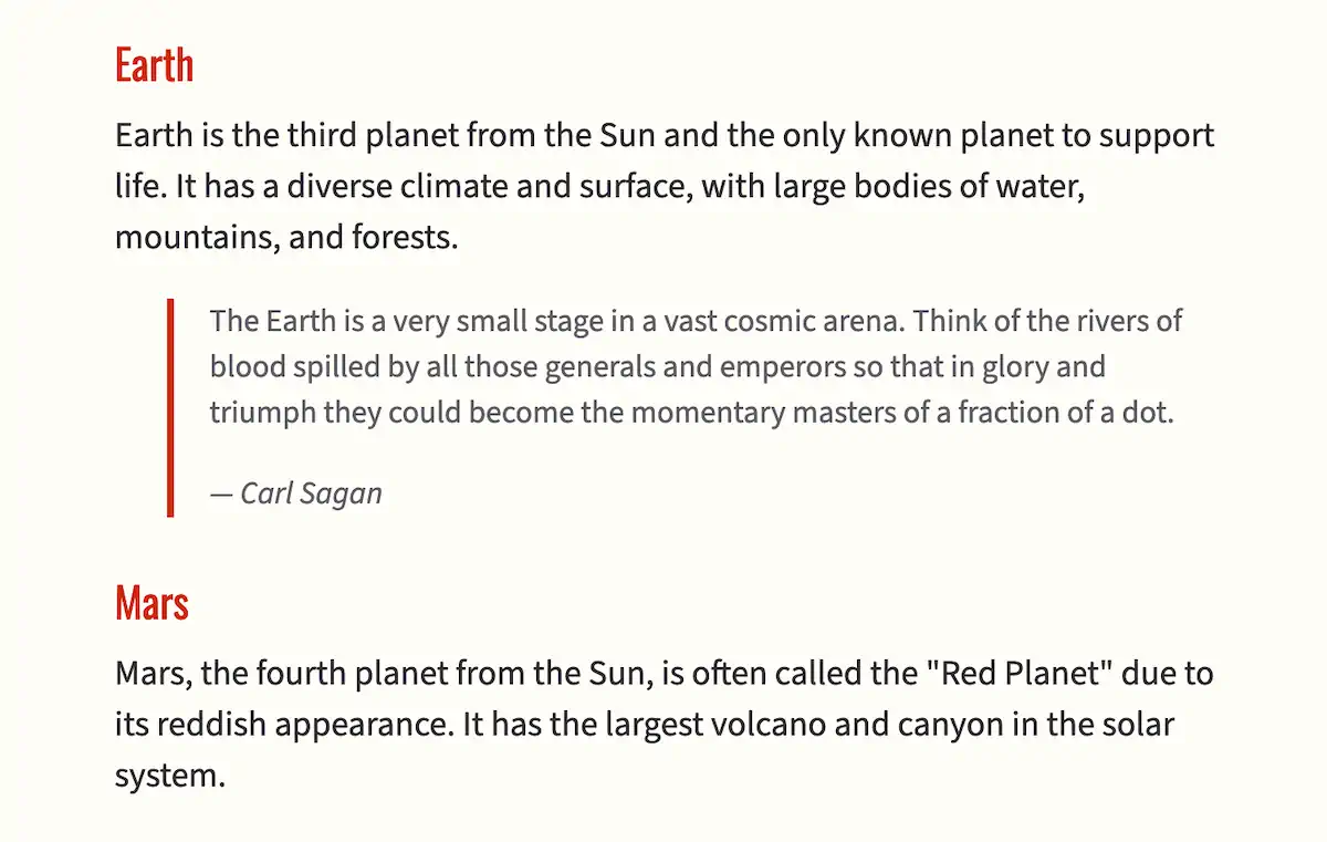
I designed this blockquote style to fit most use cases, but you could go in another direction—pithy callouts with large italicized text, for example.
Lists
Let’s make quick work of the bulleted list of Pluto and the gang. We’ll give the list a little indentation, as is common with bulleted lists. Remember, HTML has numbered lists, too. We’re not using one on this page (if you’re using my HTML markup), but we might as well write the style for both types of lists.
You already know that the selector targets the elements we want to style. But you can also have multiple selectors! We can target the <ul> element and the <ol> element and give both the same indentation by doing the following.
ul, ol {
  padding-inline-start: 1.5rem;
}
You add multiple selectors by separating them with a comma. This creates a selector list. The padding we’re using to achieve the indentation effect will be applied to unordered lists (bulleted) and ordered lists (numbered).
Let’s also adjust the spacing between the individual list items (<li> elements). I like to use half of whatever I’m using for paragraphs because I want list-items closer together than paragraphs, but still with a bit of space between. Since I used 1rem for spacing out my paragraphs and other elements, I’ll use half of that, 0.5rem, for the bottom margin.
li {
  margin-block: 0 0.5rem;
}
Remember, margin-block is the top and bottom margin in a left-to-right language like English. We can set both values at the same time. The above is equivalent to:
li {
  margin-block-start: 0;
  margin-block-end: 0.5rem;
}
That means, for left-to-right languages, the margin above the list item is zero, and the margin below is about ten pixels (0.5rem means 0.5 times the font size of the root element, which we defined as 20px).
The spacing should look pretty good now, but let’s do something that would make 2000s-era web designers jealous. Let’s change the color of the bullets. This used to be tricky, but now it’s easy peasy.
li::marker {
  color: var(--heading-color);
}
The ::marker bit is called a pseudo-element because it represents a piece of an HTML element. The ::marker is a part of the list item or <li> element. It contains the bullet (or number) of the list item. We can target it with our selector and change the color to our red heading color.
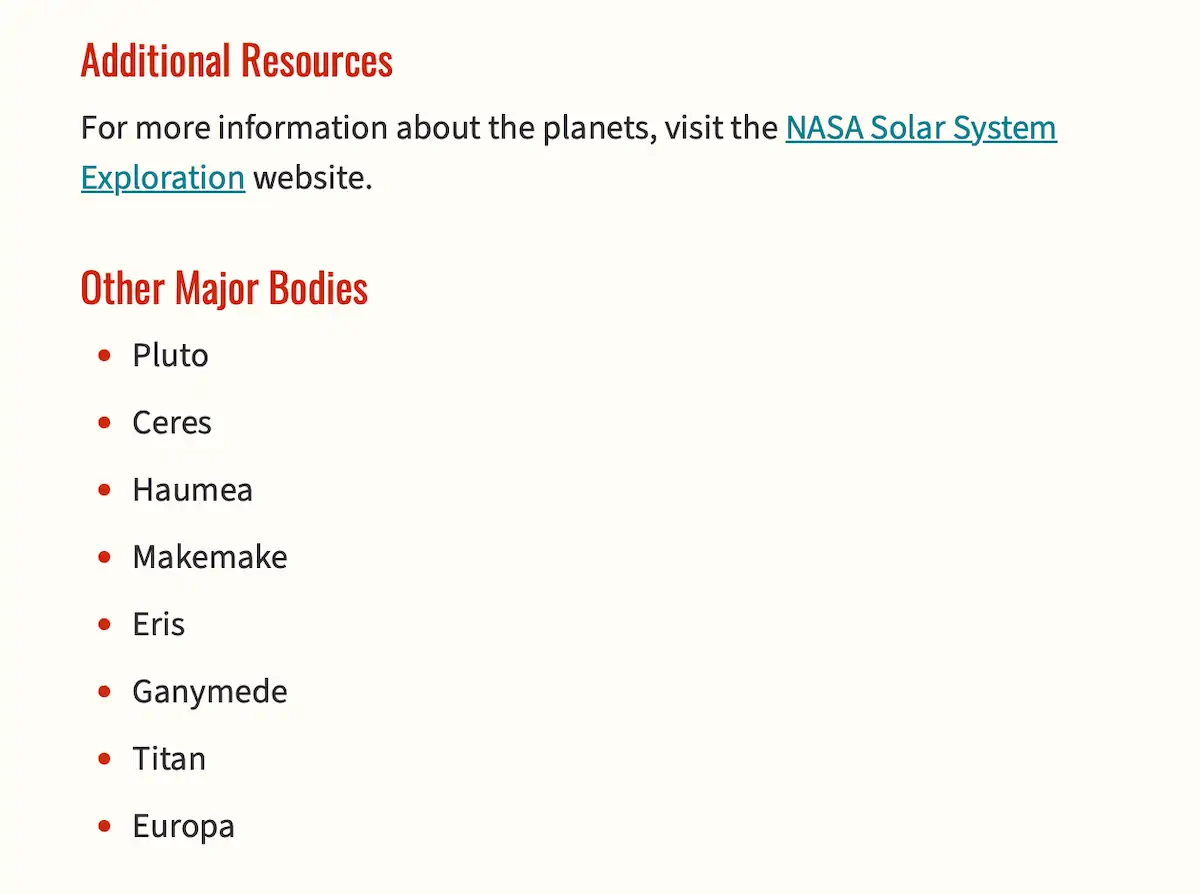
Looking good!
Pre-formatted text
Most of the time, in our HTML documents, we don’t care about preserving the exact spacing of everything. In fact, that would be counterproductive since we typically indent HTML or include empty lines to make the code more readable. But sometimes, we want to display text exactly as it is formatted. Examples include ASCII art and computer code.
We typically display this kind of text with the <pre> tag in HTML. It preserves all the spacing and uses a monospaced font to make everything consistent. It’s often combined with the <code> tag to signify that the text is computer code. I’ve included some planet-related JavaScript code as an example.
We’ll style the <pre> tag as follows.
pre {
  padding: 1rem;
  background-color: #edebe7;
  border-radius: 4px;
  overflow-x: auto;
  font-size: 0.75rem;
}
We want the code to appear as if it’s inside a container, so we will supply padding all the way around. Next, we’ll set a light background color that’s just visible against our page background but not so dark as to hurt the contrast of the text. Sharp boxes look a bit unnatural, so we’ll add a small border-radius, which is just a fancy term for how much we want to round the corners.
We could have long lines of code, so we need to specify what should happen if a line of code overflows the side of the container. In this case, we will set it to auto, which will cause the browser to show a horizontal scrollbar on the element if needed.
Finally, monospaced code can look large, so we’ll tone it down by saying it should be three-fourths of standard text size.
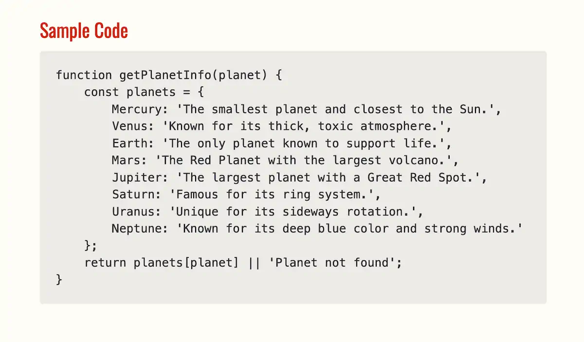
Better image styling
Here’s what the image of Saturn looks like right now.
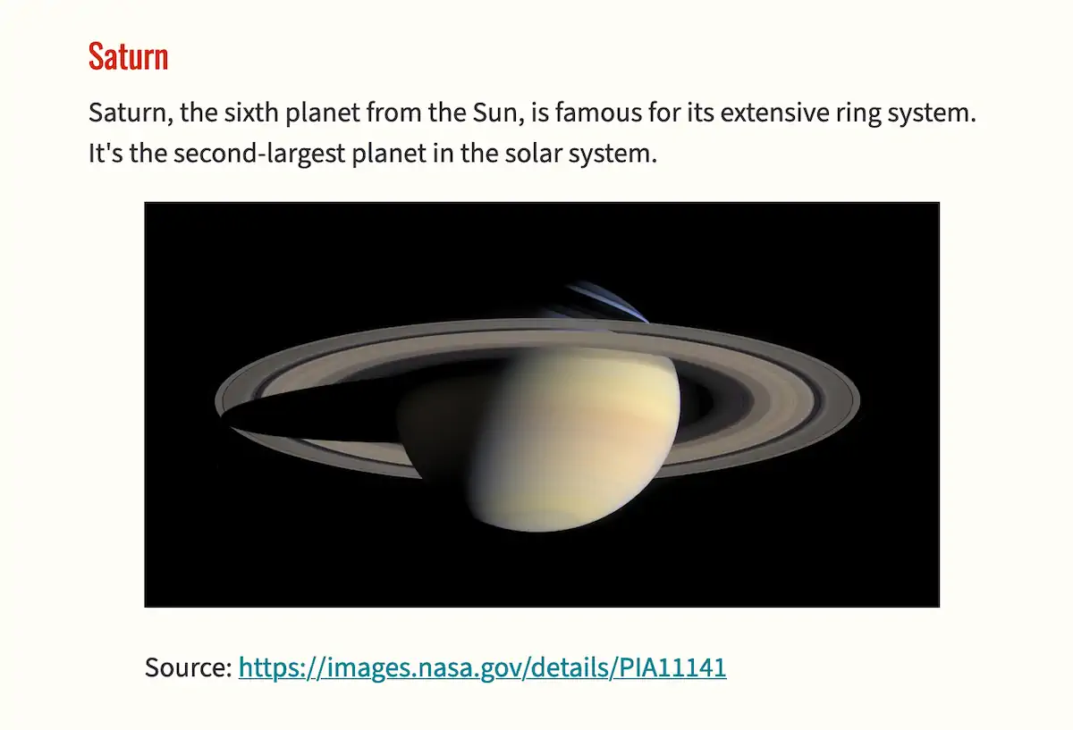
It’s not too bad, but it looks like the <figure> tag is adding margin on either side. I want the image to be full-width. I also want the photo caption to be smaller.
figure {
  margin-inline: 0;
}

figure img {
  display: block;
  margin-inline: auto;
  border-radius: 4px;
}

figcaption {
  margin-block-start: 0.5rem;
  font-size: 0.8rem;
}
We’ll remove the inline margin from the <figure>. Then we’ll target images that are inside figures (we only have one, but this could be a nice pattern to use if we add more) and do the following:
- Set
displaytoblock. Images are set toinlineby default, but the behavior ofblockworks more like you would expect an image like this to work. - Set the inline margin to
autojust in case we use an image smaller than the width of the page—it’ll be centered in that case. - Setting
border-radiusto4pxwill round the image’s corners just a touch. - Finally, we’ll reduce the margin above the caption and reduce the
font-sizeto 80% of the document’s font size.
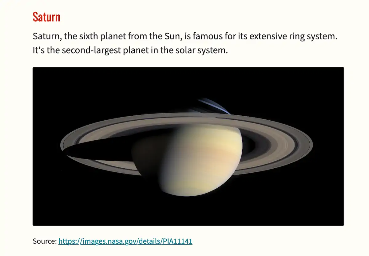
Looking classy! Minor adjustments can make a big difference.
The footer
We already have some footer styles—earlier, we set the width and ensured it was centered. But we can improve it by giving it some space to breathe, giving it a little top border, shrinking the text, and using a muted text color.
footer {
  margin-block-start: 3rem;
  margin-inline: auto;
  padding-block: 1.5rem 3rem;
  border-block-start: 2px solid var(--heading-color);
  max-width: 65ch;
  color: var(--muted-text-color);
}
Some of this should start to look familiar. We’re creating some margin above the element with margin-block-start. We’re adding a 2px wide border above the footer using our go-to red heading color. Using padding-block, we’re adding some space between the text and the border and a good chunk of padding below to provide breathing room at the bottom of the page. Finally, we’ll use the same muted text color we used on the blockquote.
Since we already added the margin we want to the <footer> element itself, let’s remove all the margin on stuff inside the footer. We’ll use our friend, the universal selector (*).
footer * {
  margin: 0;
  font-size: 0.9rem;
}
This selector will target everything inside the <footer> tag. We’ll set margin to 0 and shrink the text to 90% of the document font size.
Extra typographic fun
We could totally stop here, but… let’s have some fun.
Looking at the first paragraph in the markup, I gave it a class of intro. Let’s give it a bit of emphasis by making the text a little larger.
.intro {
  margin-block-end: 2rem;
  font-size: 1.2em;
}
When we put a period before a term in a CSS selector, that means we want to target every element that has that class (a class of intro in this case). This will make the font-size larger than the document’s default text size. And with the larger font, it needs some extra margin underneath.
Okay, cool, but now let’s get really extra. Look at the markup again, and you will notice I wrapped the first three words in a <span> tag with a class of caps.
.caps {
  text-transform: uppercase;
  font-size: 0.78em;
  font-weight: 600;
  letter-spacing: 0.1em;
}
This will give us that fancy bookish effect where the first few words are in small caps. Usually, you would want to use a font with proper small-caps, but we can do a decent forgery since Source Sans 3 is a variable font.
The text-transform declaration will make all the letters uppercased. It’s better to do that with CSS than manually typing all caps, as it’s more of a style thing. For the font-size, I just played around with it until I got it to feel right. Mostly, I wanted the caps to be the same height as the intro text’s lowercase letters (i.e., the x-height).
To help with balance, I’m increasing the font-weight a bit. In addition to values like normal and bold, you can use the numerical values 100 to 900 if the font supports it—and our variable font does.
Finally, you benefit from increasing the space between letters when using all caps. I’m using the em unit, which is based on the current font-size. This is useful because if you change the font-size in the future, the spacing will change proportionately.
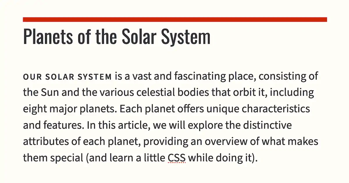
And there we go. From its humble beginnings as a stark unstyled page with quaint appeal, it’s now looking like an authoritative article.
Limitless potential
These are just the styles I chose based on my preferences. You could go in all sorts of different directions. I’m not necessarily trying to push a style on you—though I did point you toward some generally good typographic principles to follow. I just wanted to give you a taste of how you can apply your own styles to a page.
The magic of CSS is that you could take my exact HTML code—no changes—and create an entirely different design from that same starting point. That’s the premise of a web experiment called CSS Zen Garden, where people submit designs based on identical markup.
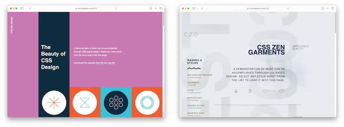
I hope this bonus chapter gave you a taste of what’s possible with CSS. Much like with HTML, even a little CSS knowledge is valuable—a simple change of font and color, for example, can make a huge difference. I encourage you to continue exploring CSS if you want to create custom designs. It’s a rewarding skill to have.
Reusable HTML with PHP
Throughout this book, one annoying thing we’ve had to deal with is updating the navigation menu on every page every time we change the menu. Imagine if we didn’t need to do that and instead could keep our navigation menu in one place, in one file, and have it magically appear on every page.
That’s what we’ll do in this bonus chapter with the help of PHP. PHP stands for PHP: Hypertext Preprocessor. Yes, the acronym is part of the name, which is pretty weird. But back in the day when it was first created, it stood for Personal Home Page, as that was its initial use.
PHP is a programming language that powers much of the web, mainly because the CMS, WordPress, was built with it. PHP is a full-blown programming language, meaning it can do almost anything. Hypertext preprocessor is a good description of what it typically does.
When you visit a static website, like the ones we’ve made in this book, the server gives you the HTML file you requested via the URL. When you visit a website powered by PHP, a PHP script is run on the server, which will return some (usually) HTML code to the browser. So, in both cases, you get HTML back. What’s the difference?
The PHP site can dynamically generate HTML based on the URL and other data from the browser’s request. For example, I could have a site where the user has a profile at example.com/user/blake. With plain HTML, I would need to create that file for each user. However, with PHP, I could generate the page on the fly by reading the username in the URL and constructing the appropriate HTML to send back.
PHP also allows you to implement more complicated web features, like accepting user data and saving it in a database. These could be as simple as displaying a dynamic hit counter or as sophisticated as a social network.
If that sounds complicated, don’t worry. We won’t be deep-diving into constructing a bunch of HTML with PHP. We’ll be looking at one particular function of PHP that is useful for our purposes—the include statement.
How to run PHP
Neocities, the service we’ve been using to host our personal website, doesn’t allow you to run PHP. This is for the best, as it doesn’t fit the ethos of Neocities and would make a pleasant, simple service more complicated. Fortunately, there are a ton of affordable services that offer PHP.
I recommend what’s called shared hosting. Long story short, this usually means the service will manage its servers and give you, the customer, a folder on the server where you can upload your files (and typically include access to various services).
Most shared hosts offer the same services, but here are a few of the ones people recommended when I asked on Mastodon.
And then there’s NearlyFreeSpeech.NET, the web host I’ve used for years. I won’t call it beginner-friendly, but the interface is the simplest, and there’s no annoying ads or upselling.
Once you have an account at one of these (or some other) web host, you should be able to upload files either directly through their website or by connecting to your server with FTP.
The particulars of this fall outside the scope of this book, but there are tons of resources on getting up and running with a shared web host. A few web searches should put you on the right track.
The cool thing about PHP is that it is straightforward to start. Just take one of the pages of your website and change the file extension from .html to .php. You just created a perfectly valid PHP file—no changes necessary.
Making a webpage dynamic
If all you do is change the file extension, everything will stay the same for the visitor. They will receive the HTML just as they did before. But now that you have a PHP file, you can put dynamic bits into your webpage by inserting them in PHP tags.
For example, here is a webpage that will display the current year.
<!DOCTYPE html>
<html lang="en">
    <head>
        <meta charset="utf-8">
        <title>My website</title>
        <link rel="stylesheet" href="https://unpkg.com/sakura.css/css/sakura.css" type="text/css">
    </head>
    <body>
        <h1>My website</h1>

        <p>The current year is: <?php echo date('Y') ?></p>
    </body>
</html>
Even if you never edit this file again, it will always be up to date (as long as the server is) because PHP injects the year into the HTML code when the page is requested.
Let’s break down the dynamic part of this. First, PHP code is written between PHP tags (<?php and ?>).
PHP code inside these tags is executed on the server before the HTML is sent to the browser. The echo statement is how you let PHP know you want it to output something to the page. The date function returns the current date—in this case, we’re telling it that we only want the year.
So, the date function runs, returning the current year. That bit of text is then processed by the echo statement, which inserts it into the document.
The actual PHP code isn’t sent back to the browser, and your visitors will never see it. Instead, it will appear as regular HTML, with the current year displayed as if you had typed it yourself.
Reusing parts of your site
One thing that makes PHP incredibly useful is its ability to reuse parts of HTML in multiple places.
Consider the website I’ve been building throughout this book. It has this navigation on every page (ignoring the aria-current attribute, which changes depending on what page you’re on).
<nav>
  <a href="/index.html" aria-current="page">Home</a>
  <a href="/blog/">Blog</a>
  <a href="/about.html">About</a>
  <a href="/resume.html">Resume</a>
  <a href="/fun.html">Fun!</a>
</nav>
We must maintain this navigation (“nav”) menu on every page. It isn’t too bad for a small website with a handful of pages. But imagine if you had dozens of pages. If you decided to add something to your nav menu, you’d need to go back to every single page and make the identical change in each spot. With PHP, we can reuse our nav menu code.
First, create a file called nav.php. You can place it anywhere in your project, but I will put it in an includes folder just to be organized.
Copy your nav menu from the homepage (index.html) and paste its contents into the nav.php file. Remove the aria-current="page" attribute for now, as we’ll need to make that part dynamic later.
You should have a nav.php file that looks something like this:
<nav>
  <a href="/">Home</a>
  <a href="/blog">Blog</a>
  <a href="/about.php">About</a>
  <a href="/resume.php">Resume</a>
  <a href="/fun.php">Fun</a>
</nav>
The above is not just an excerpt. That is the entire contents of nav.php. Unlike other HTML files, which need a <head>, <body>, etc., PHP files can contain a fragment of HTML.
Now, let’s use it. Rename index.html to index.php. Delete the entire <nav> block and replace it with the following line of PHP.
<header>
<?php include "includes/nav.php" ?>
<h1>Blake’s Homepage</h1>
</header>When you load the page, things should look the same as they did before. You should see your nav menu. But the magic is that you’re using your PHP version. Now, you can start converting the rest of your pages.
Converting HTML pages to PHP
The steps are generally the same for each page.
- Change the file extension from
.htmlto.php. - Replace the
<nav>tag with the PHP include statement.
For top-level pages, the PHP include statement will look like this:
<?php include "includes/nav.php" ?>If you’re editing a sub-page (like the blog), you must adjust the path by using .. syntax to move up a level.
<?php include "../includes/nav.php" ?>Once you’ve done that for each page, you’ll reuse the navigation menu. If you need to update the menu in the future, you can edit nav.php.
You could do this for other repeatable elements of your site. For example, much of the website’s <head> section is the same on every page. The footer might be the same on every page. And so on.
Bonus: dynamically highlighting the current nav link
When we moved our nav menu to PHP, we lost something. Previously, we set the aria-current attribute on the appropriate nav link to signify which page is the current page in the nav. This is good for accessibility and adds some visual cues for sighted users. But how do we set the current page if the navigation is one file? How do we know which page in the list is the current one?
Consider this the bonus section of this bonus chapter (that’s right, a bonus within a bonus). I will be introducing some programming concepts. I only have a little time to cover them, as programming in PHP or any other language is really outside of the scope of this book. That said, with some reasonably light code (which I am totally fine with you stealing), you can implement aria-current automagically.
First, let’s recap what this attribute means. If a visitor goes to the About page, we want that link in the nav menu to be styled to indicate that it represents the current page (or announced by a screen reader if the visitor happens to be using one). We would use the attribute aria-current="page" in that case.
We also have another scenario. If someone visits a blog post, we would like to highlight the Blog link in the navigation. It’s not exactly the current page—they aren’t on the blog listing page, where the link is pointed, but rather an individual blog post. Still, it would be nice to highlight the Blog link because it represents the current section of the site—the post is a sub-page of the blog. In that case, we could use aria-current="true". This is less specific and more semantically correct.
Okay, so how can we add this automatically with PHP?
There are many ways you could do this—and none of them are necessarily more right than any other—but here is what I think is the least complicated way of doing it.
This technique will require us to call a function on each nav item. It looks like this.
<nav>
    <a href="/" <?php aria_current('/') ?>>Home</a>
    <a href="/blog" <?php aria_current('/blog') ?>>Blog</a>
    <a href="/about.php" <?php aria_current('/about.php') ?>>About</a>
    <a href="/resume.php" <?php aria_current('/resume.php') ?>>Resume</a>
    <a href="/fun.php" <?php aria_current('/fun.php') ?>>Fun!</a>
</nav>
We will need a custom function called aria_current (I will give you the code for that function shortly). The function should receive one argument, which should be the text of the href. It will then be the function’s job to compare that bit of text to the visited URL and determine whether it should output, using echo, the aria-current attribute.
You can put the function in the same file above the HTML markup.
<?php
function aria_current($url) {
    // If $url is an exact match for the current URL, return 'aria-current="page"'.
    if ($_SERVER['REQUEST_URI'] === $url) {
        echo 'aria-current="page"';
        return;
    }

    // Otherwise it might be a sub-page, so check if the current URL contains
    // $url. If it does, return 'aria-current="true"' to indicate that the link
    // is an ancestor of the current page. Ignore a lone slash.
    if ($url !== '/' && strpos($_SERVER['REQUEST_URI'], $url) !== false) {
        echo 'aria-current="true"';
        return;
    }
}
?>

<nav>
    <a href="/" <?php aria_current('/') ?>>Home</a>
    <a href="/blog" <?php aria_current('/blog') ?>>Blog</a>
    <a href="/about.php" <?php aria_current('/about.php') ?>>About</a>
    <a href="/resume.php" <?php aria_current('/resume.php') ?>>Resume</a>
    <a href="/fun.php" <?php aria_current('/fun.php') ?>>Fun!</a>
</nav>
Okay, let’s break it down. First, we need to open a pair of PHP tags. Inside, we’ll define a function called aria_current with one argument: a variable called $url.
You can see where I added some notes called comments. Every line that starts with two slashes (//) is considered a comment and is ignored—it’s there just for people who are looking at the code.
The first bit of code is an if statement. PHP has a global variable called $_SERVER with all kinds of information, including which page is currently being visited (what it calls the REQUEST_URI). So we grab that and see if it matches the URL of the given nav item (remember, we are running this function for each nav item). If it does, we will output aria-current="page" using the echo statement. In that case, the output will appear at the point where we called the function (which is inside the <a> tag, where attributes go). After the echo statement, we use return to stop the function from running further—we’re done.
If the first test isn’t true, there is another test we want to try. Is the current page being visited a sub-page of the given nav item?
This test has two parts:
- First, we want to ignore the homepage (
/) because that’s obviously not a sub-page of anything. - Second, we’ll test the URL passed to the function against the visited URL to see if we have a match.
The second part of the test uses a function called strpos. It receives two arguments. The first is a bit of text you want to search through (let’s call it the haystack). The second is a bit of text you are looking for (let’s call it the needle). The function will return the needle’s position in the haystack if found. It will return false if it doesn’t find it at all.
So again, we will look at the built-in global variable $_SERVER['REQUEST_URI']. You can imagine that being something like /blog/my-first-post. We know the visitor is on the blog sub-page if we find /blog inside that path.
The test will pass in that case, and we will output aria-current="true" using the echo statement.
If both of the tests fail, we will output nothing.
To recap, when a visitor loads a page on our website, we run a function on each nav item. If the nav item’s href matches the current URL or is found somewhere in the current URL, we output the appropriate aria-current attribute. Otherwise, we output nothing.
Phew! If you’ve never done any programming before, pat yourself on the back because now you have. If you find this kind of thing fun, explore more PHP or check out JavaScript.
Conclusion
PHP templating with include is a great way to author HTML without repeating code. PHP has a lower barrier to entry than other programming languages, which is one reason I bring it up. However, websites can be made with all sorts of programming languages (JavaScript, Python, and Ruby are other popular choices). This is the world of dynamic websites. It gets pretty wild if you start thinking about all you can do with it.
PHP includes can be helpful even for a small personal website. But it’s okay to stick with plain HTML, too! Editors like Visual Studio Code have robust find-and-replace functionality, which allows you to update many files in one go.
And with that, you’ve finished the last bonus chapter of HTML for People! Thanks for reading.